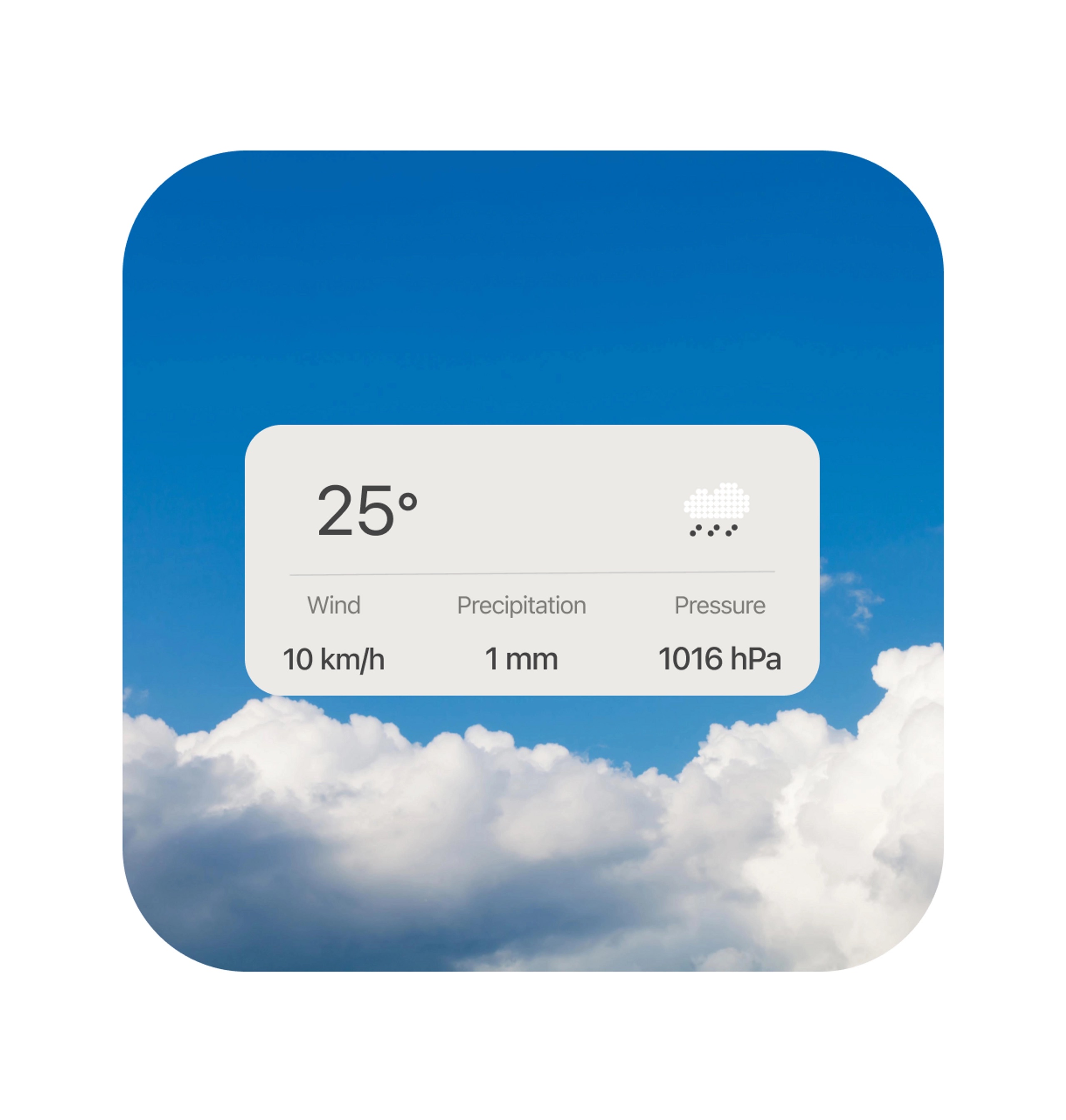
Weather Widget Nothing
Reviews
4 reviews
Thanks for your sub, Matthieu!
I like very much the cleanness of your design here!
However, what I think would help you out is typography greed lesson:
https://app.uxcel.com/courses/typography-basics/typographic-grid-077
The last row looks a bit disconnected from the wind row and makes me think that it is not in the same container!
Keep up creating!
Hey Matthieu,
Fantastic job on this! I really love the minimalism and color choices—definitely keep exploring this style as widget design has an exciting future ahead! Your presentation is cool with the background, would be great to see it on a device!
Here are a few small refinements that could enhance this great work even further:
- The two sections within your container would feel more balanced if their content were vertically centered. Right now, the top section’s content sits a little low.
- Your rain illustration is a great touch! Consider making it stand out more against the background to improve visibility.
- In the bottom section, the subtexts feel a bit too disconnected from the main label/title—bringing them closer would help with readability and cohesion.
Also, adding a bit more context in the description could strengthen the storytelling behind your vision. Even for a widget, every detail reflects thoughtful design choices!
Keep up the great work—excited to see what you create next!
Hey Matthieu, great job on the Weather Widget! It really captures the clean, minimalist vibe of the Nothing OS.
A few things that stood out to me:
- The rain cloud icon feels a bit off. It doesn’t quite match the modern aesthetic of the rest of the design. Have you considered something less 8-bit? I love pixel art, but it leans more toward gaming iconography—kind of gives me Super Mario vibes. A more streamlined, outlined icon might fit better.
- The layout alignment seems slightly off-centre, sitting a bit low. Centering everything vertically would give it a more balanced look.
- The bottom section could use some tightening. The spacing between the labels and units feels too wide, making them seem disconnected. Bringing them closer would improve readability.
- From a presentation standpoint, it might be worth matching the mockup background to the weather being shown. A rainy background for a rainy forecast, for example, would make the whole design feel more engaging.
Great work so far! A few small tweaks could really take it to the next level.
Hi Mattheiu,
Good design so far. I love the minimalism you wanted to pursue for your design style on the widget. Also, the font hierarchy is great based on their different weights and sizes. Just a few small things I would like to mention are:
- I would suggest considering the rain icon you have used. It's lost due to the color of the white background. It has low visibility at this moment.
- I think you can experiment with some other styles for your icon as well. A minimal and cleaner icon style with only outlined icons can be a great fit for your widget. Just a suggestion.
- The whole layout isn't aligned properly. It seems the layout is a bit off downward from its center.
- For the bottom part, the units and labels are too far apart so they seem like two different entities which is not what you want. Maybe reducing their spacing a bit more will do wonders.
- This one is not from any UX perspective, but just from a regular presentation suggestion. You can change the mockup background considering the weather you are showing in your widget. That will make the whole image more engaging and interesting. For example: you can use a rainy background if you want to show a rainy weather forecast in the widget.
Keep up the good work mate. I wish you all the best.
You might also like
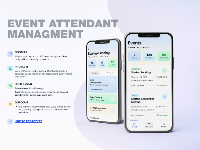
Events Managment App
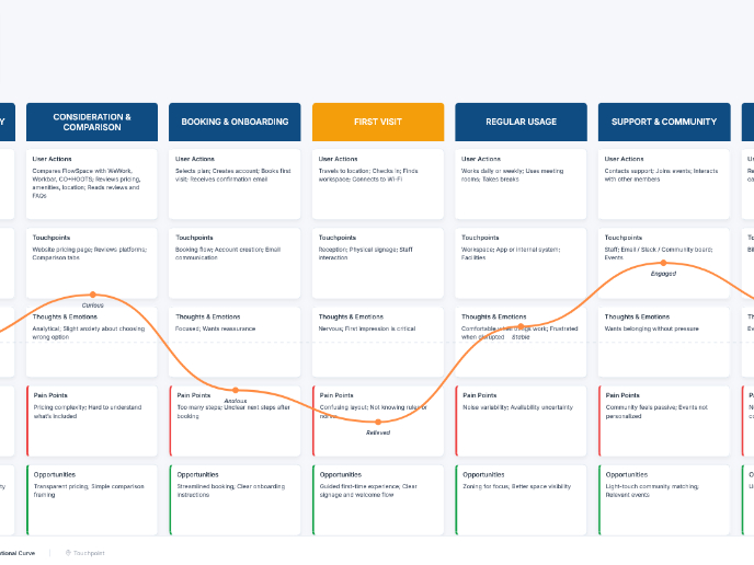
Customer Journey Map — Offsite Co-Working Experience
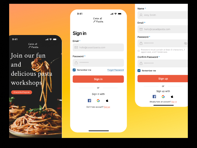
Mobile Onboarding: Casa di Pasta
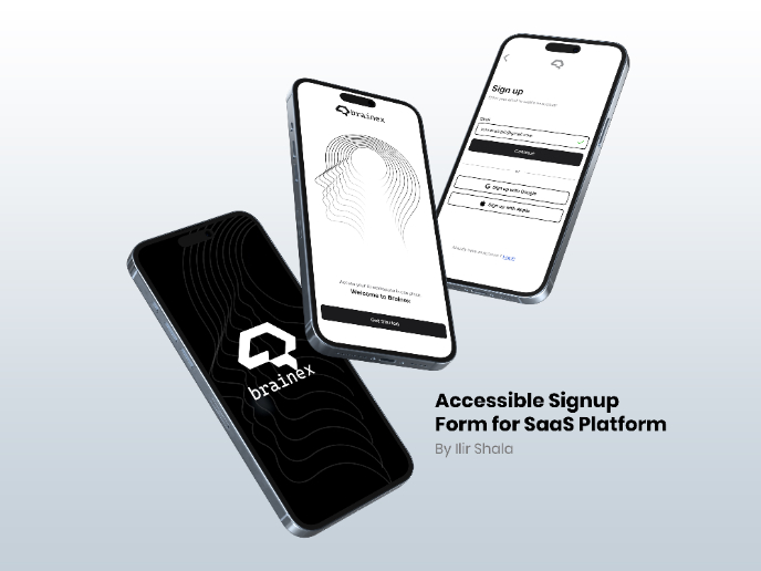
Accessible Signup & Login Experience — Brainex
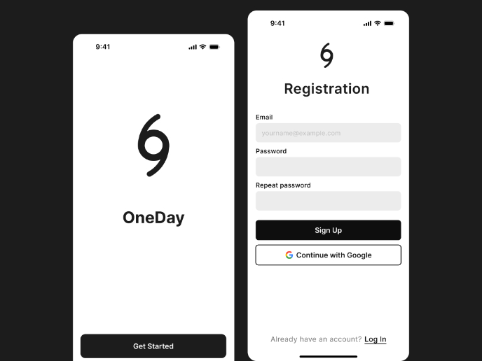
Accessible Signup Form
Accessible Signup Form
Popular Courses

Product Discovery

Product Analytics

