Typography system
From the moment you step onto the scene, you'll be captivated by the bold colors, the gritty textures, and the raw energy, and I believe events need to be designed in a way to reflect that.
I designed with the ux learning paths in my head, but very open to receive feedback and finalize this project.
Struggeling with the typo hierarchy. I'd love to get your tips & tricks and feedback for how to get from desktop scale to a good mobile scale.
I'm eager to learn and get feedback from you guys. Thanks for watching my project!
Tools used
From brief
Topics
Share
Reviews
3 reviews
Hi Rachel,
Fantastic work on your design! The bold typography and striking color choices beautifully capture the vibe and connect perfectly with the intended audience. Introducing a secondary color palette could take your design even further, adding more depth and creating a more balanced visual hierarchy. Overall, this is an incredibly creative and thoughtfully executed project—amazing job, and I’m excited to see what you create next!
Thr type system itself is great but urban typeface choice might need a bit of a different use case due to its legibility.
I will reserve it for bold and large one or two words headers, that way it's still readable.
Alternatively I would replace it with a different typeface with the graffiti characteristics but much legible.
Great job done, nonetheless.
Great design and UI skills! I really like this project, the font is very unique and you can easily get the hang of the vibe and intended audience. Great job.
If I were to recommend something, that would be including a secondary color. The pink is very strong and makes most elements seem similar in hierarchy, it is also a bit overwhelming with so much pink. I would consider preparing a mini color palette for your project, using the lighter pinks for headers and CTAs, while using darker shades of the same pink for text, captions, etc. Additionally, a secondary color (could be complimentary like purple or perhaps a blue) could give the design that extra "something" to make it even more attractive. You could use that added color to highlight the most important word or part of a sentence, like "Street art city tours" - that would definitely catch the user's attention most right away, making it clear what the site is for, as currently it is visible that the site is connected to street art, but you have to read the text fully to understand that you can book city tour tickets here".
Besides that, amazing work! Looks amazing
You might also like
Loginino
Notification microcopy - Project
El Mandoub-GovTech App
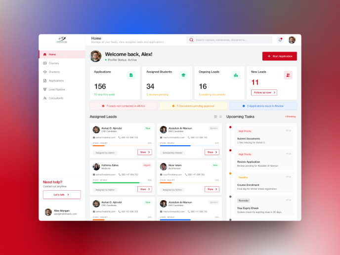
MalishaEdu Counselor Workspace
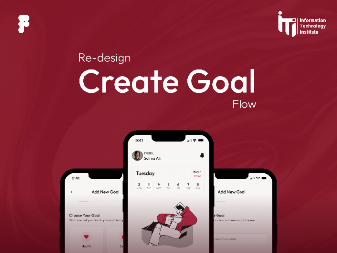
Goal Creation Flow
Portfolio website
Visual Design Courses

UX Design Foundations

Introduction to Figma

