UP9 Landing Page

Landing Section for UP9 WebPage.
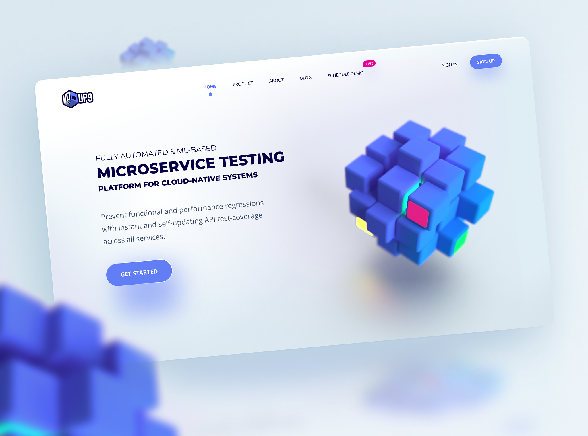
Keeping it simple and playing with a 3d + Glass style was part of the brand exploration of this concept.
Reviews
3 reviews

Hey, Javler! I can only review hero section for now, because you didn't provided full project link. So, regarding a hero, I have several suggestions:
- Try to use mroe descriptive image. For example you can show the interface of this platform. Imhi centered layout and screen at the bottom would be nice.
- The shadow under the image looks a little bit dirty, try to ue the same one near the button.
- Also is a good practise to showcase company logos which are using this product, you can use Logoipsum for that, they have wide selection of modern, free logo designs.
I look forward to reviewing the full project when it becomes available. If you have any questions or need further clarification, please don't hesitate to ask.
Best regards,
Fedir

Love the hero section with the clean style design and 3D images

Hi, your work is gorgeous 😍 yet the above the fold doesn't suffice a couple marketing points:
If there is no scrolling down, the get started button should be bigger. If there is important content hidden until the user scrolls, there needs to be a clear indication that there is something to be scrolled.
Doesn't have to be an arrow, scroll wheel or written, it's enough if a piece of something peeks from the bottom of the page and entices the user to scroll.
You might also like

HealthFlow: Designing a Simple and Insightful Wellness Dashboard


Improving Dating App Onboarding: A/B Test Design

FORM Checkout Flow - Mobile


A/B Test for Hinge's Onboarding Flow


Accessibility Asse


The Fitness Growth Engine

Popular Courses

Introduction to Figma


The Product Development Lifecycle & Methodologies


Product Discovery