UNIVERSALTAXPROFESSIONALS WEBSITE REVAMP [ Informational Website ]

![UNIVERSALTAXPROFESSIONALS WEBSITE REVAMP [ Informational Website ]](https://users-content.uxcel.com/451aa544-1b86-419f-9120-5a6ac83f023f/briefs/universaltaxprofessionals-website-revamp-informational-website-cover-6442-1756604786988.png)
Universal Tax Professionals (often abbreviated as UTP) is a U.S.-based tax and accounting firm that specializes in assisting American citizens and Green Card holders living abroad. I created a new look and feel of the website as a revamp for the old one making it more readable, intuitive, that includes user experiences and making it more professionally inclined to other competitors online and in the industry.
Reviews
4 reviews

Great work, Nico — the visuals and structure are strong; focusing on consistent button styles and simplifying arrows will make the design feel even more polished and professional.

This revamp presents a clear and professional approach to an informational website, which is essential in building trust in a field like tax services.
The layout feels organized, with logical navigation that makes it easier for users to find key resources and connect with the team.
To improve, I’d suggest simplifying content to reduce jargon, strengthening accessibility (contrast, ARIA labels, form validation), and showing how the design adapts on mobile. Adding interactive tools or calculators could also boost engagement.
Overall, it’s a solid and credible redesign that sets a reliable tone for a service-based brand.
Your hero section works well and the photography is excellent - really professional shots integrated smartly into the composition. Just watch those background blurs for contrast issues with overlaid text.
The main problems are consistency issues. Your buttons are all different styles, some rounded, some square, various sizes. For a serious tax firm, stick with one square button style throughout. It feels more professional and trustworthy.
Your arrows are inconsistent too. Different styles and directions without logic. Use simple up/down( or plus and x) arrows for accordions, consistent right arrows for navigation. Every arrow should have clear purpose and matching style.
Too many background color changes make scanning difficult. Limit to two or three background variations maximum so users can focus on content instead of visual shifts.
Some sections have too much text density. Break up paragraphs, increase line spacing, and add more breathing room between sections.
You've got strong design instincts and the visual foundation is solid. Focus on creating a simple design system with consistent buttons, arrows, and spacing rules. Once you nail the consistency, this will feel much more polished and professional. The core design thinking is there, now just tighten up the execution.

Great job on the content and the IA. The colors also serves the purpose. Two things here -
- The 'File Taxes' button is out of place.
- There are two different styles of button which can also be re-looked at

Hello Niko,
Great job on this website revamp! You managed to bring a clear, professional look that reflects trust and expertise, which is crucial for a tax and accounting firm. I especially like how the structure guides the user through key information — from credibility points and client reviews to actionable CTAs. The use of visuals and typography makes the content much easier to digest compared to a typical “finance-heavy” website.
If I were to suggest any improvements, I’d recommend looking at a couple of areas:
Hierarchy of CTAs: some sections have multiple calls to action, which could be streamlined for sharper conversion focus.
Consistency of styles: one detail worth refining is the corner rounding on buttons and UI elements. Right now the border-radius feels a bit inconsistent, and aligning it across components would make the overall system look more cohesive and polished.
Overall, this is a solid, professional redesign that shows you understand both visual clarity and the user journey. Well done!
You might also like
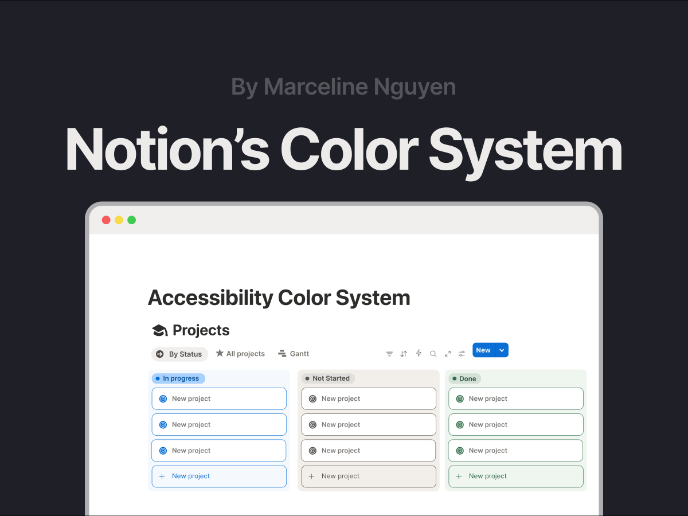
Notion - Accessibility Color System

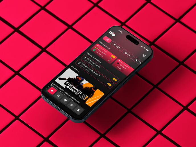
Blip - Esport app design (Light & Dark UI)


Reimagining Asana's Color System


Customer Journey Map for a Co-Working Space


Latios - Free Portfolio Template for UX/UI Designers

Responsive Main Screen

Popular Courses

UX Design Foundations


Introduction to Figma

Design Terminology
