Type Scale for a Therapist Website

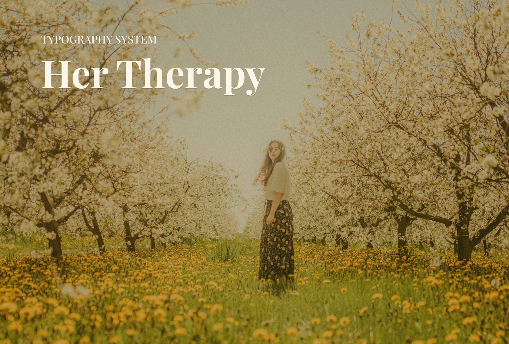
As the product designer for a therapist specialising in hypnotherapy and holistic care for women, I created a typography system that reflects her brand values of calm, trust, and professionalism.
I chose Playfair Display for its elegant and refined headlines, Lora for its warm and highly readable body text, and Inter for its clean and accessible UI elements.
This combination ensures the website feels sophisticated yet approachable, supporting a welcoming and supportive client experience.
Tools used
Topics
Share
Reviews
2 reviews

So comforting and grounded 😌 the earthy tones and choice of typefaces really reflect the brand values beautifully.
I do wish there were more UI examples to show how this typography system carries through across the experience. Would love to see it in context, how does it hold up in actual layouts, forms, or mobile?

Impressive and good start. But at the same point I can't see the detailed of typography rule of use. This is crucial item.
I hope you can open pinterest to get more idea about how brand guidelines looks like. Nice katerina!
You might also like

Beautify Login page WCAG principles


edX Sign-Up Page Redesign


Design Prioritization Workshop


Notion Login Page Accessibility Optimization


Sanyahawa - Landing page Design


Healthy Dashboard

Popular Courses

UX Design Foundations


Introduction to Figma

Design Terminology
