Thrive Studios - Checkout Flow

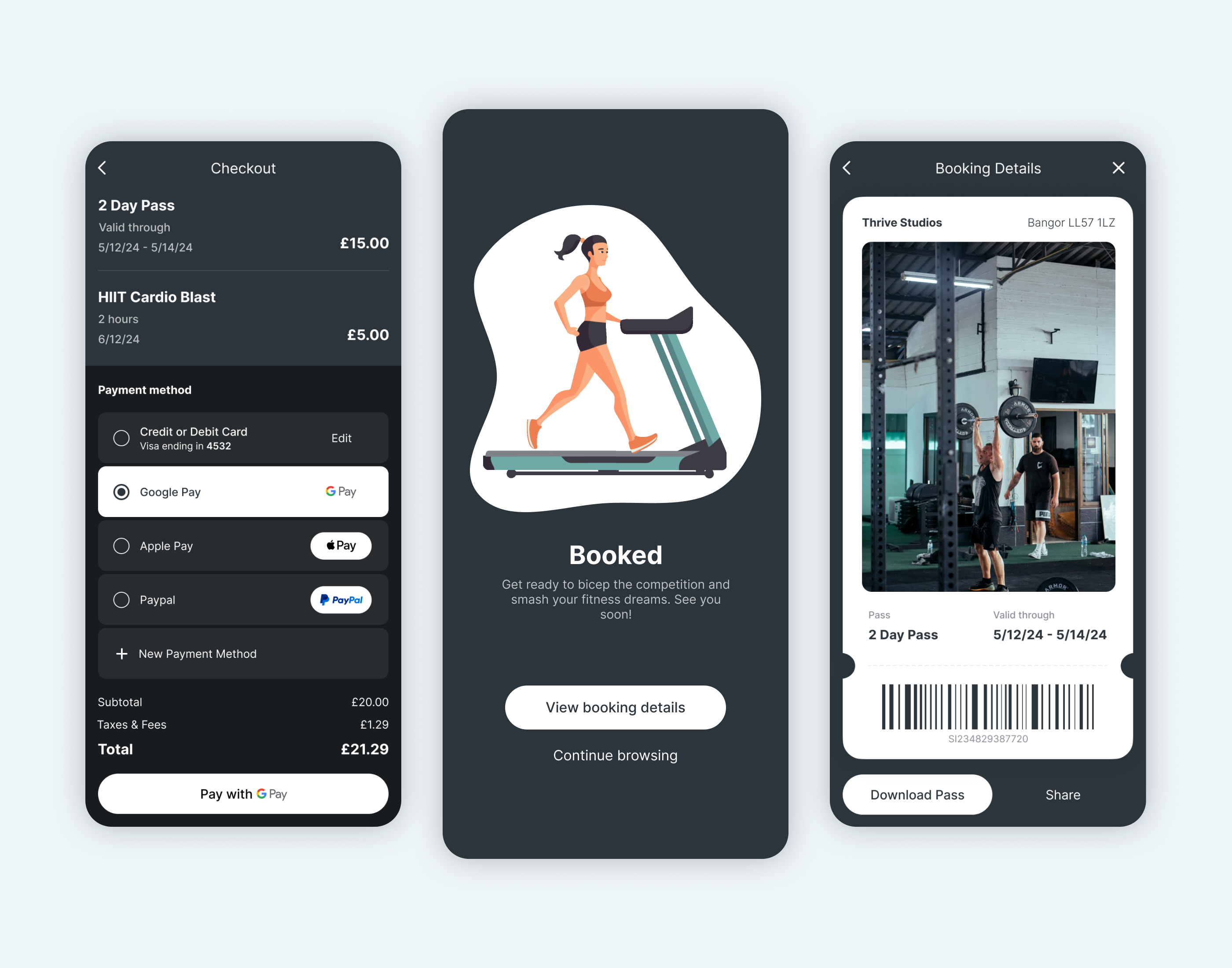
A UI/UX design challenge to design a checkout flow for a hypothetical gym in the UK called Thrive Studios. I designed both dark and light modes and played around with quips to make the checkout experience more fun for users.
Features delightful micro-interactions all created using Figma components.
GIFs taken from IconScout.
Reviews
1 review

I love your checkout flow for buying workouts at the gym — it's very neat, uncomplicated, and straightforward. The booking confirmation screen in particular is fantastic with its cute illustrations and quirky copy, and I really like how the brand voice shines through. One thing that could make it even better is using colors like green and icons like a checkmark to more clearly indicate a successful purchase. This would provide immediate visual confirmation for users. Great job overall!
You might also like

Improving Dating App Onboarding: A/B Test Design

FORM Checkout Flow - Mobile


A/B Test for Hinge's Onboarding Flow


Accessibility Asse


The Fitness Growth Engine

Uxcel Halloween Icon Pack

Popular Courses

Design Terminology


Apple Human Interface Guidelines


Mobile Design