"StitchSavvy" - AI-Powered Personal Fashion Concierge
My goal was to create a high-converting landing page for a fashion service. I brainstormed with DeepSeek (AI) to generate options that would allow me to demonstrate multiple UX principles. We settled on 'StitchSavvy - AI Personal Fashion Concierge' because it:
- Combines trending topics (AI + sustainability)
- Allows demonstration of both tech and fashion UX
- Fills a visible market gap between subscription boxes and fast fashion apps
- Provides clear user problems to solve (morning stress, decision fatigue)
Device Type: Mobile-first responsive design (375x812 viewport)
COMPELLING COPY (That Guides Navigation)
HERO SECTION
Before (Generic, Vague):
Welcome to StitchSavvy
Revolutionizing your fashion experience through cutting-edge technology and personalized curation services designed to optimize your daily wardrobe selection process.
Begin Your Journey
After (Specific, Benefit-Focused):
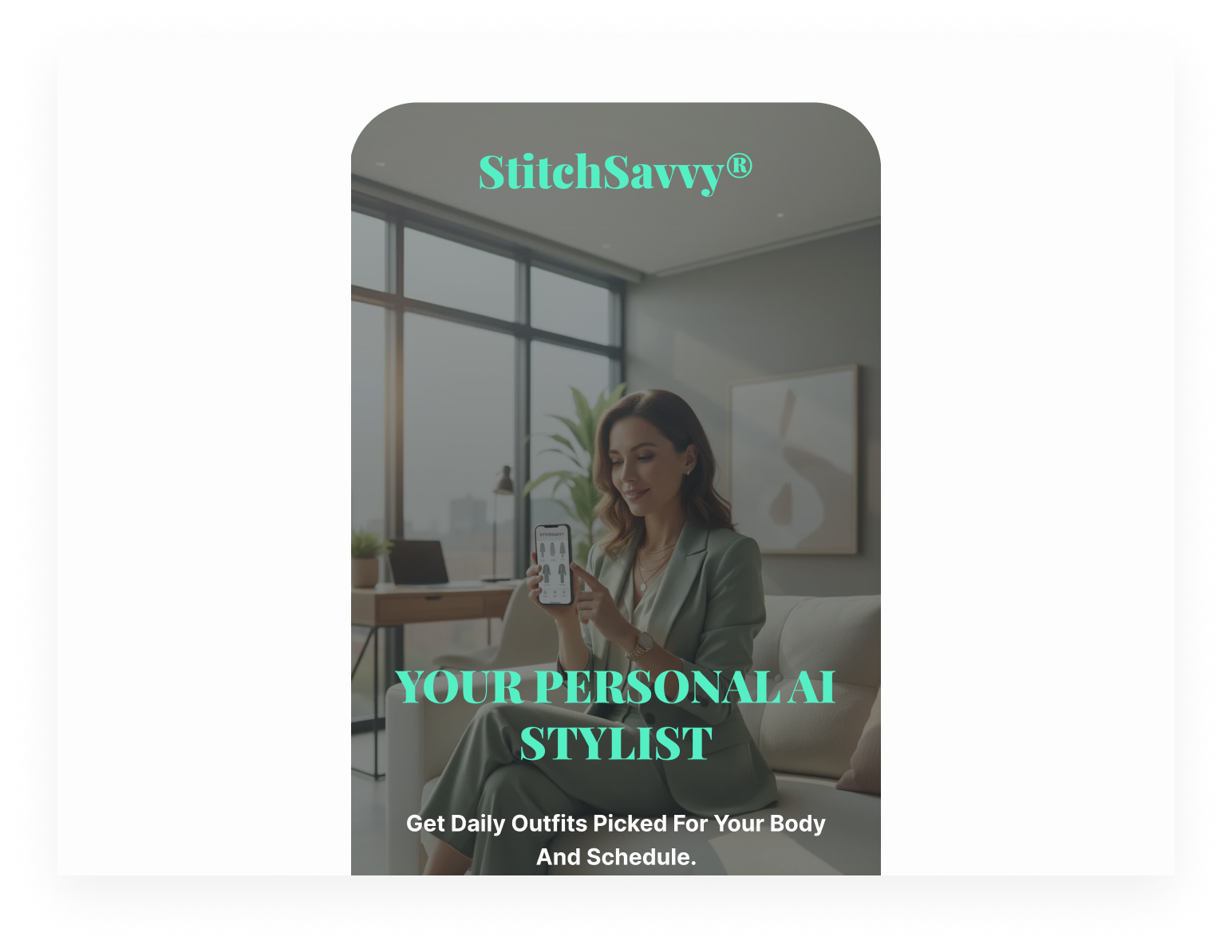
Your Personal AI Stylist
Get daily outfits picked for your body and schedule.
Start Free Style Quiz
(→ Guides navigation: Quiz is the first step)
VALUE PROPOSITIONS
Before (Feature-Focused):
Advanced AI Algorithms
Our technology analyzes multiple data points
---------------------------------
Daily Recommendations
Receive new suggestions each day
---------------------------------
Sustainable Partners
We work with eco-friendly brands
After (Benefit-Focused with Navigation Cues):
🧠 Learns your unique style
Our AI studies what you love to wear
*(Then scroll down to see how...)*
------------------------------
📅 Fresh outfits each morning
Save time deciding what to wear
*(Perfect for your schedule below)*
-----------------------------
🍃 Shop from ethical brands
Feel good about your fashion choice
*(See our partners in the next section)*
HOW IT WORKS
Before (Passive, Corporate):
The process involves completion of an initial style assessment, followed by wardrobe documentation, after which daily ensemble suggestions will be provided, culminating in optional acquisition of complementary items.
After (Active, Conversational with Navigation):
Simple 4-step process:
1. Take our 5-minute style quiz
*(Start this above ↑)*
2. Upload photos of your clothes
*(Quick & private—see our security promise below ↓)*
3. Get daily outfit suggestions
*(Delivered by 7 AM—perfect for busy mornings)*
4. Shop pieces you're missing
*(From ethical brands you'll love)*
SOCIAL PROOF SECTION
Before (Generic Testimonial):
"Great service!" - User123
★★★★★
Featured in various publications
After (Specific, Trust-Building with Navigation):
"Saved me 2 hours each week on outfit planning!"
- Sarah, Marketing Lead
*(Real person, specific benefit)*
★★★★★ 4.9/5 from 2,300+ members
*(Social proof of satisfaction → encourages action below)*
Featured in: Vogue Tech | Forbes Lifestyle | Good On You
*(Credibility established → reduces risk for next step)*
FINAL CTA SECTION
Before (Pushy, Single Option):
Get Started Now!
Limited Time Offer
After (Respectful, Multiple Pathways):
Ready to simplify your mornings?
*(Question engages → requires mental answer)*
See Plans & Pricing
*(For those who need cost info first)*
✓ 30-day satisfaction guarantee
*(Risk reversal for hesitant users)*
Questions? Visit our FAQ →
*(Support for remaining concerns)*
NAVIGATION-GUIDING COPY TECHNIQUES APPLIED
1. Directional Language:
"See how it works below."
"Scroll to see examples."
"Continue to the next step."
"Back to top."
2. Progressive Disclosure Cues:
"First, let's understand your style..." (Hero)
"Here's what happens next..." (Value props)
"See it in action..." (How it works)
"See what others say..." (Social proof)
"Ready to begin?" (Final CTA)
3. Section Transition Phrases:
"Now that you know what we do..."
"Here's the simple process..."
"But don't just take our word..."
"Ready to get started?"
4. Call-to-Action Hierarchy:
Primary: "Start Free Style Quiz" (above fold)
Secondary: "See How It Works" (curiosity bridge)
Tertiary: "See Plans & Pricing" (information seekers)
Quaternary: "Visit FAQ" (hesitant users)
UX WRITING STRATEGY CHECKLIST APPLIED
✅ Goals aligned (quiz sign-ups)
✅ Simple language (Grade 6)
✅ Natural prepositions
✅ Concise, chunked content
✅ Consistent brand voice
✅ Anticipated confusion
✅ Respectful tone
✅ No dark patterns
DESIGN PROCESS EXPLANATION
Approach:
"My design process followed UXcel's recommended learnings, applying 12 Landing Page exercises and 8 UX Writing Strategy exercises systematically:
A. Research & Strategy Phase:
- Competitive analysis revealed a gap in sustainable, AI-powered daily styling
- Target audience: Time-poor professionals valuing convenience and ethics
- Defined core value proposition: "Daily outfits + AI personalization + Sustainability."
B. Visual Design Decisions:
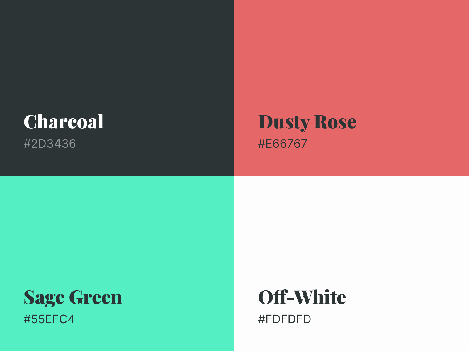
- Color Palette:
- Charcoal (#2D3436): Sophistication, readability
Rationale: Charcoal provides excellent contrast against an off-white background (15:1 ratio), while being softer than pure black, which aligns with the sophisticated, minimalist aesthetic.
- Sage Green (#55EFC4): Sustainability differentiation, primary CTAs
Contrast Note: Sage Green on Charcoal text has a 14.53:1 ratio (WCAG AA & AAA compliant).
Sage Green on Off-white has a 1.45:1 ratio (not compliant for text), so it's used with dark text overlay.
- Dusty Rose (#E66767): Fashion warmth, secondary accents
Rationale: Dusty Rose adds warmth and fashion-forward appeal without being too feminine or overwhelming. It's the "personality" color.
- Off-white (#FDFDFD): Minimalist canvas, reduced eye strain
Rationale: Off-white is warmer than pure white (#FFFFFF), reducing eye strain while maintaining a clean, minimalist appearance. It creates better depth when paired with subtle shadows.
WHY SAGE GREEN (#55EFC4) IS ACTUALLY BRILLIANT FOR STITCHSAVVY
1. Competitive Differentiation
- Industry Norm: Fashion tech is dominated by:
- Black/White/Pink
- Black/White/Blue (Amazon, Zalando)
- Black/White/Gold (luxury brands)
- Sage Green Opportunity: No major competitor owns this color space. It makes StitchSavvy instantly recognizable.
2. Sustainability Signal
- Color Psychology: Green = nature, growth, eco-friendly
- Target Audience: 73% of millennials are willing to pay more for sustainable products (Nielsen)
- Brand Positioning: Unlike competitors who "add" sustainability, StitchSavvy bakes it into the brand identity through color
- Visual Cue: Every time users see the CTA button, they subconsciously reinforce "this brand cares about the environment."
3. Emotional Resonance
- Fresh & Modern: Not "corporate green" (darker, traditional)
- Optimistic: Brighter than olive, more sophisticated than lime
- Calming Effect: Studies show mint/sage greens reduce anxiety - perfect for a service that reduces "outfit anxiety."
- Gender Neutral: Appeals to all genders (unlike pink or blue)
4. Fashion Industry Context
- Emerging Trend: Sage/mint green is rising in fashion:
- Pantone Color of the Year 2022: "Glacier Lake" (blue-green)
- Luxury brands: Bottega Veneta's "Parakeet," Jacquemus' mint
- Sustainability movement: Brands like Reformation use earth tones
- Positioning: Makes StitchSavvy feel forward-thinking rather than following trends
THE COMPLETE COLOR STRATEGY
Charcoal (#2D3436) - The Foundation
Why not black (#000000)?
- Pure black creates harsh contrast, eye strain
- Charcoal is sophisticated, softer, and more premium
- Better for minimalist aesthetic (feels intentional, not default)
- Creates depth when layered (charcoal text on off-white vs. pure black)
Why not a lighter gray?
- Needs sufficient contrast for readability
- Charcoal provides a 12.68:1 ratio of off-white (AAA accessibility)
- Still reads as "black" but with personality
Fashion Context:
- High-end fashion brands often use charcoal/anthracite
- Associated with sophistication, timelessness
- Works with EVERY other color in the palette
Dusty Rose (#E66767) - The Personality
Why not bright pink?
- Bright pink (#FF69B4) is a juvenile, "fast fashion" aesthetic
- Dusty Rose is sophisticated, fashion-forward
- Works across genders (not "girly" pink)
- Earthier, more sustainable feel
Why this specific hue?
- Blue undertone (E6 = 90% red) makes it versatile
- Desaturated enough not to compete with Sage Green
- Warm but not aggressive
- Historical fashion context: "Dusty Rose" is a classic couture color
Psychological Effect:
- Warmth + approachability
- Humanizes the tech aspect (AI can feel cold)
- Subtle nod to fashion without being cliché
Off-white (#FDFDFD) - The Canvas
Why not pure white (#FFFFFF)?
- Pure white creates glare, eye fatigue
- Off-white is warmer, more welcoming
- Creates better depth perception
- Feels more "premium" and intentional
Why this specific off-white?
- #FDFDFD has barely perceptible warmth
- Still achieves AAA contrast with charcoal
- Neutral enough to let other colors shine
- Medical research: Warmer whites reduce digital eye strain
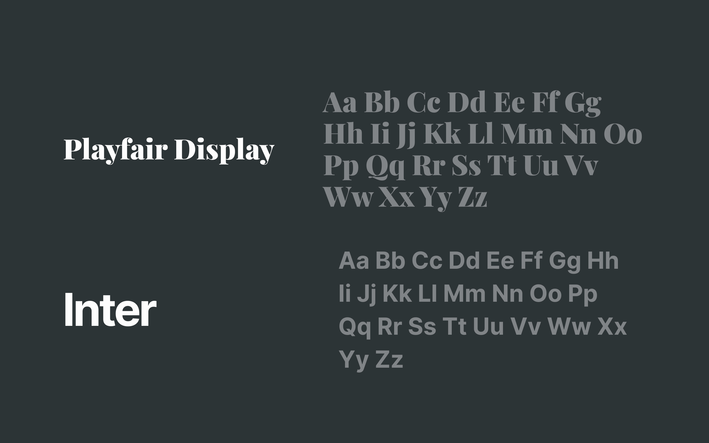
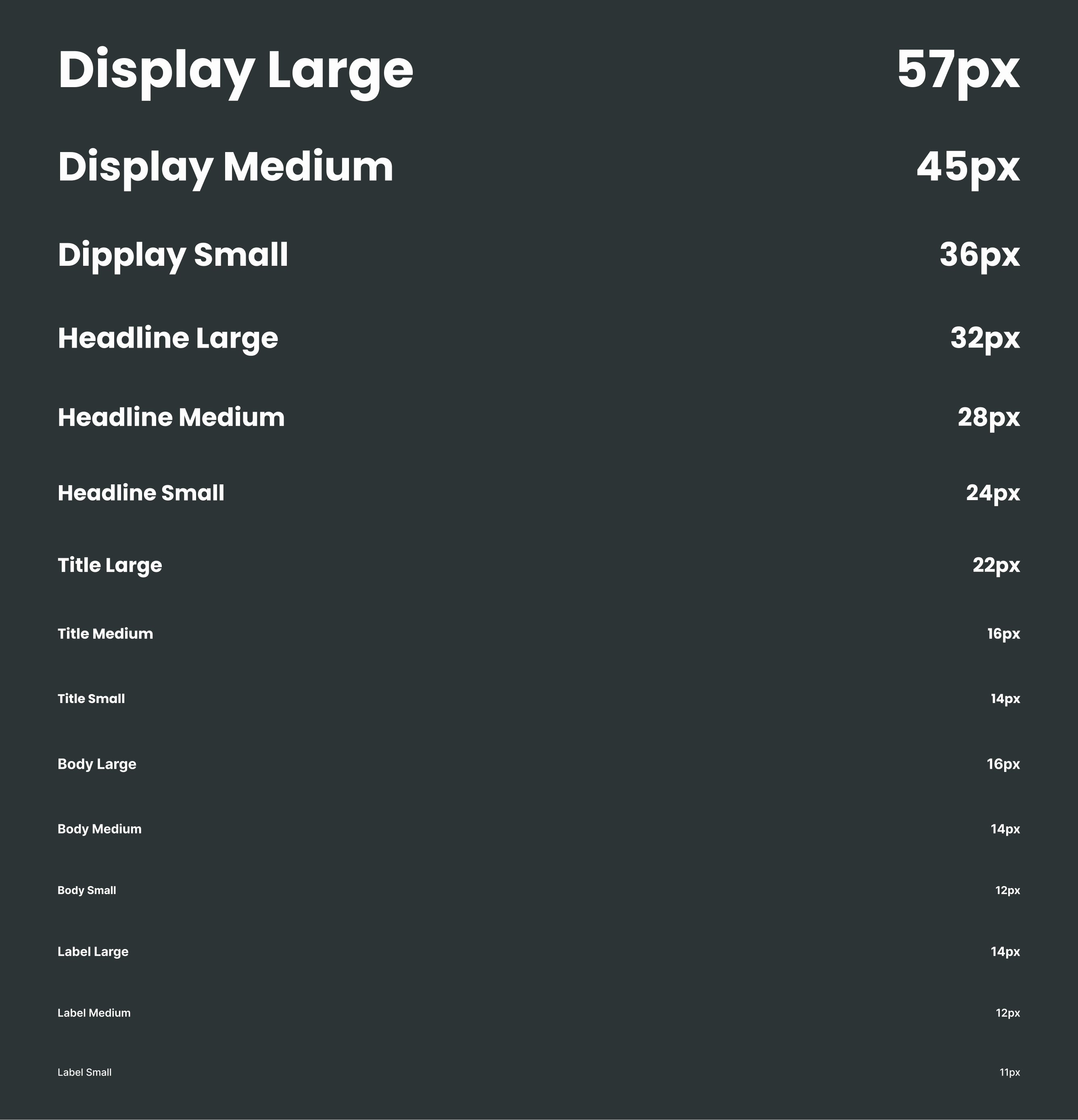
2. Typography:
- Playfair Display (headings): Fashion elegance
- Inter (body): Mobile readability, modern feel
3. Imagery Strategy:
- Hero: Relatable professional using app (aspirational yet achievable)
- Icons: Reinforce value props without text reliance
- Consistent tone: Authentic, diverse, lifestyle-focused
COMPARATIVE ANALYSIS OF INDUSTRY COMPETITORS
Analysis Matrix:
| MetricStitch FixAmazon StyleStitchSavvy (Our Solution) | |||
| Core Offer | Physical box delivery | E-commerce marketplace | Digital daily curation |
| Personalization | Questionnaire-based | Purchase history | AI + wardrobe integration |
| Frequency | Monthly | On-demand | Daily recommendations |
| Sustainability | Optional filter | Limited | Core brand pillar |
| Tech Innovation | Basic algorithm | Search/recommendations | AI-driven daily styling |
| User Experience | App + unboxing | Traditional shopping | Seamless mobile-first experience |
Key Insight: StitchSavvy uniquely combines daily digital convenience with a sustainable fashion focus, filling a market gap between subscription boxes and fast fashion e-commerce.
Interactive Prototype: https://www.figma.com/proto/BR1W7SdKcCbUs5Jr26o4H2/StitchSavvy?page-id=0%3A1&node-id=29-2608&viewport=2%2C26%2C0.09&t=xvVJMTrCAUbfOtzh-1&scaling=scale-down&content-scaling=fixed
Behance Case Study: https://www.behance.net/gallery/242261559/StitchSavvy-AI-Fashion-Concierge-Landing-Page
Reviews
2 reviews
This is a really good start, the design looks really good.
However, the "full project" shows the same thing as the case study, just the scrollable wireframe on a mockup. I would recommend showing your layers in a Figma file if anything in the full case study, but I also would have liked to see more of the process.
You did a good job of describing your design rationale but I don't see any research or ideation. A lot of this comes off as being made / written with AI, so you might want to show more that demonstrates that you made this.
Hi David!
First impression this concept feels premium right away. An AI-powered fashion concierge already sounds elevated, and the design seems to support that curated, personalized vibe ✨🤖
I like how it doesn’t feel cluttered. Fashion + AI could easily become overwhelming, but this feels focused and intentional. It gives that “tailored just for you” energy, which is exactly what a concierge experience should feel like 👌🧵
If I’d take it further, maybe lean even more into personalization visuals like style previews or adaptive recommendations in real time 🔥 That would make the AI angle feel even more tangible. Overall, strong concept and well-aligned execution.
You might also like

Smartwatch Design for Messenger App

Bridge: UI/UX Rebrand of a Blockchain SCM Product

Pulse Music App - Light/Dark Mode

Monetization Strategy

Designing A Better Co-Working Experience Through CJM

Design a Settings Page for Mobile
Content Strategy Courses

UX Writing

Common UX/UI Design Patterns & Flows

