SS Fire Pits

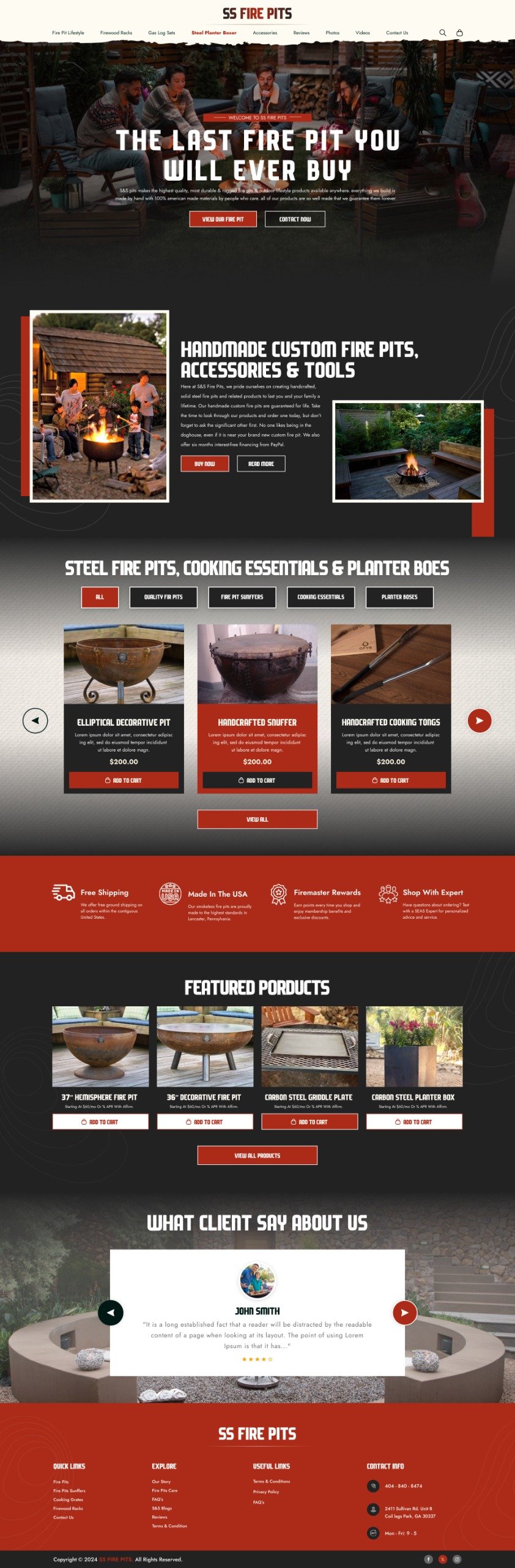
The provided image is a detailed high-fidelity UI design for an e-commerce website, "SS Fire Pits." The project focuses on presenting a premium brand image for custom-made fire pits, cooking essentials, and related accessories.
Visually, the design employs a dark mode aesthetic with a rich black background, contrasting white typography, and warm, inviting orange accents derived from images of burning fire pits. The layout is clean, modern, and highly organized, aiming for an intuitive user experience.
Key sections of the website include:
- Hero Section: A bold headline, "THE LAST FIRE PIT YOU WILL EVER BUY," immediately captures attention, paired with a lifestyle image of people enjoying a fire pit, establishing an aspirational tone.
- Brand Story/Value Proposition: A dedicated area elaborates on the brand's commitment to "Handmade Custom Fire Pits, Accessories & Tools," emphasizing quality, American steel, and craftsmanship.
- Product Categorization: Products are logically grouped into "STEEL FIRE PITS, COOKING ESSENTIALS & PLANTER DOES" using a tabbed interface, showcasing examples like the "Elliptical Decorative Pit" with clear pricing and call-to-action buttons.
- Trust & Service Indicators: A set of four prominent badges highlights key customer benefits: "Free Shipping," "Made in The USA," "Firemaster Rewards," and "Shop With Expert," reinforcing brand credibility and customer support.
- Featured Products: A visually appealing grid displays a selection of "FEATURED PRODUCTS" (e.g., "Hemisphere Fire Pit," "Carbon Steel Griddle Plate"), encouraging exploration and purchase.
- Customer Testimonials: A "WHAT CLIENT SAY ABOUT US" section features a testimonial (placeholder text used here), adding social proof and building user confidence.
- Comprehensive Footer: The footer provides essential navigation links, contact information, social media integration, and legal details, ensuring easy access to information and support.
This project demonstrates a strong understanding of e-commerce UI/UX principles, focusing on visual hierarchy, clear calls to action, and an engaging presentation of premium products.
Tools used
Topics
Share
Reviews
4 reviews

I took a slow walk through your SS Fire Pits landing page today, really looking at it the way a customer would, and honestly the first thing that hit me was the mood. That warm firelight in the hero image immediately gives me that “friends + outdoors + cozy night” feeling. You managed to communicate what the product means emotionally, not just what it is. Love that.
Your headline also came at me pretty confidently — “The last fire pit you will ever buy.” It actually made me stop for a second and think, “Ok, they’re serious about quality here.” Super clear, no guessing needed.
The color choices feel right with the theme too — those richer tones and shadows make the product seem sturdy and premium. Nothing feels disconnected visually, it all belongs to the same world.
A few tiny things popped into my head while scrolling — nothing major:
- The big “Shop Now” and “Learn More” buttons right at the start look pretty equal. I found my eyes bouncing between them instead of being guided toward one clear first step. Maybe give one a bit more weight?
- I kept expecting the logo to be sitting at the top left. I think most of us subconsciously go there to find our way home. Not a huge deal, just a familiar pattern people are used to.
- Just double-check that all the text stays super readable if someone has lower contrast sensitivity. The design is dark and elegant, but sometimes dark-on-dark hides things a bit more than intended.
- I’d also be curious to see a quick line under the headline that talks more about the experience: bringing people together, easy weekend relaxation — something that taps into why someone wants a fire pit in the first place.
- And since you mention things like “Made in the USA,” a couple of snippets from real customers somewhere near the top could add even more trust. It gives the page a human heartbeat.
Those were the only things that stood out. The overall layout feels calm and well-paced. You’ve set a strong tone and identity. The changes I’m mentioning are more like tightening a guitar string than replacing the guitar.
Take care!

Ambreen, seeing this from my watchtower 🔭 I think it only needs a better-polished section divider:
- The cool rough edges between the menu and hero section could use a bit more breathing room. A simple `margin-bottom: 60px;` should do. In the current layout, one of the rough edges is almost cut off and gets too close to the shopping bag!
- The transition from the hero section to “Handmade Custom Fire Pits” is seamless. I’m hoping for the same treatment in the transition to the product section. Extending the gradient stop a bit more might make the section entry feel smoother.
- I’m seeing a similar thing in the transition from Featured Products to Client Testimony. It still looks good, even though the people are no longer in the background roasting s’mores (probably because it’s daylight).
- The thumbnail could use a better portion of the layout to make it feel more inviting
Everything else is fire!
Great project, Ambreen.
I think you created a really interesting website with nice decorative elements, like the background lines and the pattern in the main navigation.
I like the cream color you used for the navigation bar. I actually think you could use it more often throughout the site, as it would make the layout feel more open and balanced.
I’d also suggest slightly reducing the line height on your body text. It feels a bit too large, which might affect readability. What is your current line height value?
My main comment would be about the primary color (red). I’d avoid using it on elements that aren’t clickable or don’t have a specific action behind them. The primary color should stand out and carry meaning. If you use it both for interactive elements and background decorations, it loses its visual importance. You could try introducing a secondary color or using the cream white for decorative details instead.
Overall, great work and a lot of potential here!

Great job!
You might also like

Events Managment App


Mobile Onboarding: Casa di Pasta


Accessible Signup & Login Experience — Brainex


Accessible Signup Form


Auction


Entrant - Analytical Dashboard

Popular Courses

UX Design Foundations


Introduction to Figma

Design Terminology
