Sri Lanka Government Budget – UX & Data Visualization Breakdown

1. Understanding the Objective
Before designing any infographic, the goal must be clear. In this case, the main objectives were: ✅ Summarize the country's revenue & expenditures for 2025
✅ Make complex financial data easy to understand
✅ Highlight key financial figures, including deficit and budget allocation
✅ Create an engaging and visually appealing format
The designer (Chatura Dissanayake) likely wanted to ensure that policymakers and the general public could quickly grasp the information.
2. Data Interpretation & Storytelling
The infographic follows a data storytelling approach to guide the viewer logically:
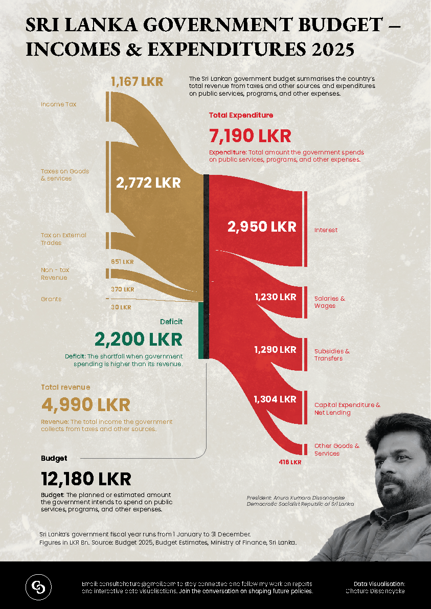
A. Revenue Sources (Left Side - Brown)
- Uses a flow-like shape to represent how income flows into the government.
- Major sources of revenue:
- Taxes on Goods & Services (2,772 LKR)
- Income Tax (1,167 LKR)
- Other minor revenue sources (Grants, External Trade, etc.)
B. Expenditure Breakdown (Right Side - Red)
- Separates government spending into different categories.
- The largest expense is interest payments (2,950 LKR), followed by:
- Salaries & Wages
- Subsidies & Transfers
- Capital Expenditure
- Other Goods & Services
- The designer emphasizes the deficit (2,200 LKR) to highlight the gap between revenue and expenses.
C. Deficit Highlight
- A deficit occurs when expenses exceed revenue, and the infographic ensures this is immediately visible by:
- Placing the deficit figure in bold green text.
- Positioning it in the centre where both revenue and expenses meet.
3. Visual & UX Design Choices
A. Color Scheme (Psychology & Contrast)
🎨 Colors used:
- Brown/Gold (Revenue): Represents stability and finances.
- Red (Expenses): Grabs attention to emphasize spending.
- Green (Deficit): Signals a financial gap that needs addressing.
🔎 Why this works?
- Red is naturally associated with debt or danger, drawing attention to spending.
- Green represents the deficit, subtly implying it's a key figure policymakers should focus on.
- The background has a subtle texture, adding visual depth without distracting from the data.
B. Typography & Readability
- The large, bold numbers make financial figures instantly recognizable.
- Different text weights are used:
- Bold for key figures (7,190 LKR, 4,990 LKR, 2,200 LKR)
- Smaller, supporting text for explanations
- Text hierarchy ensures that even a glance provides valuable insights.
C. Layout & Data Flow
- The Sankey-like flow diagram guides the viewer:
- Left → Revenue (Brown)
- Middle → Deficit (Green)
- Right → Expenses (Red)
- This mirrors how financial transactions work in real life: money flows in, deficits occur, and expenses flow out.
4. Decision-Making & Rationale
A. Why use a flow chart instead of a pie chart?
✅ Better for showing relationships: Flow diagrams make it easy to understand how revenue connects to expenditures.
✅ Easier to track proportions: Each income/expense category has a proportional width, making comparisons intuitive.
✅ Clearer deficit visualization: A pie chart wouldn't make the central deficit section (2,200 LKR) less obvious.
B. Why Use a Black & White Background?
✅ Enhances contrast, making colours (gold, red, green) stand out.
✅ Gives a professional & government-report feel.
C. Why Include a Human Face in the Corner?
✅ Personalizes the data, making it feel more relevant.
✅ Connects viewers to the policymaker (Anura Kumara Dissanayake).
✅ Balances the visual weight, preventing the right side from feeling too empty.
5. Improvements & UX Considerations
🔹 Potential Enhancements:
1️⃣ Make the Sankey flow interactive (if designed for a website) – allowing users to hover over sections for more details.
2️⃣ Add percentage values to show proportions of total revenue/expenditure.
3️⃣ Incorporate tooltips or additional explanations for economic terms.
4️⃣ Use a horizontal layout for better readability on mobile devices.
6. Summary – Why This Infographic Works Well
✅ Easy to read & visually engaging
✅ Effectively communicates financial priorities & challenges
✅ Uses clear data storytelling to guide the user
✅ Balances aesthetics with functionality
Final Thoughts
This infographic is a great example of effective UX in data visualization. It conveys complex financial data in an informative and engaging way, making it useful for government reports, news publications, and public awareness campaigns.
Would you like additional feedback or recommendations on enhancing your UXCel project? 🚀
Reviews
1 review

Great data visualization work! The infographic presents complex budget information in a clear and accessible way. Excellent use of color coding and typography.
You might also like

Pulse — Music Streaming App with Accessible Light & Dark Mode


Islamic E-Learning Platfrom Dashboard

SiteScope - Progress Tracking App


Mobile Button System


FlexPay


CJM for Co-Working Space - WeWork

Popular Courses

KPIs & OKRs for Products


UX Design Foundations


Introduction to Figma