Restaurant Menu Design
Identification of the Project
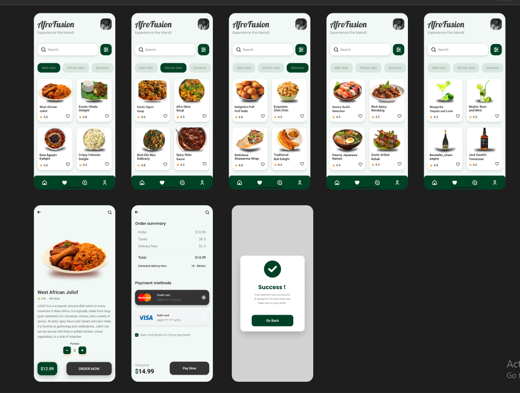
The project at hand involves the design of a restaurant menu list. It is crucial to note that the design of a restaurant menu is not only about listing dishes but also a marketing tool that communicates the restaurant's identity and drives profitability.
Initial Research
I began the project by conducting comprehensive research on various aspects such as the target audience, the type of cuisine offered, the restaurant's theme, and the most popular dishes. The goal was to gather all the necessary information that would aid in creating a menu that not only appeals to the customers' visual and culinary senses but also aligns with the restaurant's overall branding strategy.
Understanding the Target Market
Identifying the target market was the first step. This involved understanding the age group, dietary preferences, and spending habits of the potential customers. This information helped in deciding what dishes to include and how to price them.
Design Decisions
The design of the menu plays a crucial role in the customers' decision-making process. I had to ensure that the design was visually appealing, easy to read, and coherent with the restaurant's theme.
Layout and Organization
The menu was organized according to the type of food ( main course, desserts, etc.). This was done to make it easy for customers to navigate through the menu. I also ensured there was enough spacing between the items to prevent the menu from looking cluttered.
Color Scheme and Typography
Choosing the right color scheme and typography was another vital decision. The colors chosen were in sync with the restaurant's theme to create a consistent experience for the customers. The font used was clear and legible, ensuring easy readability.
Final Steps
After finalizing the design, I conducted usability testing to ensure that the menu was user-friendly and effective. Based on the feedback received, necessary revisions were made to the design.
Reviews
2 reviews

Nice work on your design! 👏 It showcases strong potential and creativity. Here are a few pointers that might help refine it further:
- Center the app name with the profile picture to improve balance.
- Consider adding an "Add to Cart" button on the product card for quicker user action.
- Where would users initiate checkout; I didn't manage to find a cart button.
- The product images are nice. Adding a uniform bleed around them within the card may improve the visual aesthetic.
- Consider including an option for users to add a new card at checkout, perhaps as a third list item for an empty state.
- Enhancing the typographic hierarchy in checkout could improve readability.
- Removing the search icon from checkout could reduce clutter and help users focus on the process.
- Double check some of the product shadows seem a bit off.
These small changes will go a long way in elevating your already neat design. You should also consider prototyping this, it will greatly aid in communicating your vision with stakeholders. Keep up the good work!

worthy project
You might also like

Pulse — Music Streaming App with Accessible Light & Dark Mode


Islamic E-Learning Platfrom Dashboard

SiteScope - Progress Tracking App


Mobile Button System


FlexPay


CJM for Co-Working Space - WeWork

Popular Courses

Introduction to Figma


Design Terminology


UX Writing