Real Estate - Mobile App

Overview
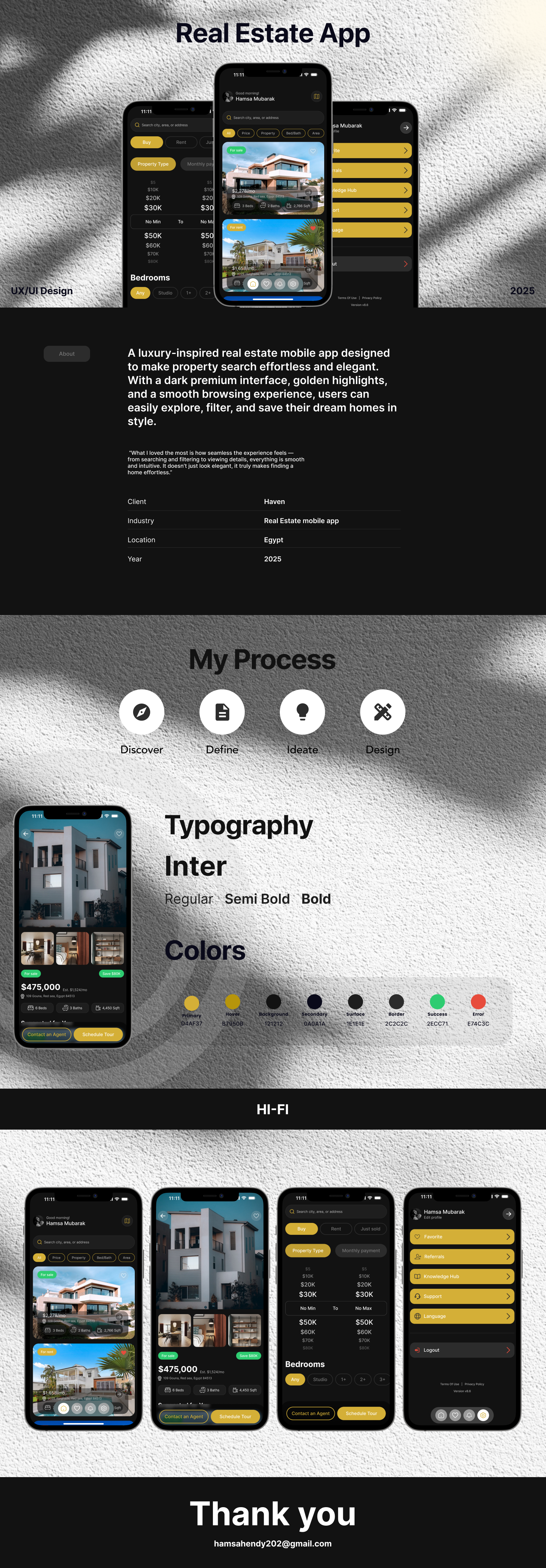
A luxury-inspired real estate mobile app designed to make property search effortless, intuitive, and elegant. With a dark premium interface and golden highlights, the design combines usability with a refined aesthetic to create a smooth browsing experience.
The Challenge
Finding and comparing properties is often overwhelming in existing real estate apps — cluttered UI, inconsistent filters, and lack of a premium experience reduce usability.
The Goal
- Create an intuitive navigation flow for searching, filtering, and saving properties.
- Build a scalable design system with reusable components.
- Deliver a luxury look & feel with a modern dark theme and golden accents.
My Process
- Discover → Analyzed competitors & pain points in existing real estate apps.
- Define → Outlined core flows: search, filters, property details, favorites.
- Ideate → Wireframed low-fi layouts focusing on hierarchy & clarity.
- Design → Developed a complete design system (buttons, chips, tags, info pills, cards, empty states). Applied luxury dark UI with Playfair + Inter typography.
- Prototype → Connected all flows in Figma for a smooth experience.
The Solution
- Home/Discover Page → Search bar + filter chips + property cards.
- Filters → Segmented controls + sliders + dropdowns for quick narrowing.
- Property Details → Hero images, status tags, info pills, clear CTAs.
- Settings → Clean and supportive experience.
The Result
- A refined high-fidelity mobile app that balances luxury aesthetics with usability.
- Reusable design system for future scalability.
- Smooth end-to-end flow: discover → filter → explore → save.
This project reflects my passion for blending storytelling, luxury branding, and user-centered design into functional and elegant digital products.
Tools used
Topics
Share
Reviews
8 reviews

Thanks for the sub, Hamsa!
You did great here with this premium mockup and exquisite look on black. You've chosen well the fonts, they match very well. What i would need you to think about it is:
-the use of colors: you don't have a clear thought about meaning of them. You said you will use green for succes message but you use it for tags and eyebrow text. Try to avoid that, especially in a dark mode theme.
-contact an agent button is different in two screens. Less is more. Try to have the design sistem well established and follow it without bending the rules.
Other than that, keep on practicing and creating!
Great vibes!

Hey Hamsa, congrats on your project!
I really like how you presented everything in detail, especially the way you explained your process. One thing I’d be curious to see is a few alternative versions of the primary color. Right now, I feel like the current choice isn’t reaching its full potential and doesn’t fully align with your semantic colors.
I’d also recommend double-checking the contrast on the overlay content that goes over the property images it feels like it might be a bit too low.
Overall, you did a really great job!

Great project mate, keep up the good work!

Great!!

Hello Hamsa,
Your design is overall very well-executed and visually appealing. The layout is clear, the flow feels intuitive, and the premium look aligns well with the real estate theme. One aspect I would recommend revisiting is accessibility. Specifically, the contrast between the white text and some button backgrounds may not fully meet WCAG standards. Ensuring proper contrast will improve readability and make the design more inclusive for all users. Overall, excellent work with just a small refinement to bring it fully up to accessibility standards.

This is a very strong project. You managed to balance usability with a luxury feel, which is not easy to do. The dark theme with golden accents feels premium, and your use of typography supports that aesthetic well.
I like how you broke the process into clear steps, from research to prototyping. The design system with reusable components is also a smart move since it makes the product scalable.
If I could suggest one thing, it would be to test how the golden highlights perform across different devices and lighting conditions, since accessibility and readability are critical in dark mode designs.
Overall, this is a polished and thoughtful case study that shows both design craft and strategic thinking.

you need to fix some colors! too many colors!

This Real Estate App concept shows a strong sense of luxury and elegance through its dark theme and golden accents. The UI feels premium while still being clean and easy to navigate. I like how the process is clearly explained (Discover, Define, Ideate, Design), and the choice of Inter typography keeps the design modern and readable. love it
You might also like

Smartwatch Design for Messenger App


Bridge: UI/UX Rebrand of a Blockchain SCM Product


Pulse Music App - Light/Dark Mode


Monetization Strategy


Designing A Better Co-Working Experience Through CJM


Design a Settings Page for Mobile
Popular Courses

UX Design Foundations


Introduction to Figma

Design Terminology
