Pulse Metric - Dashboard for solo founders

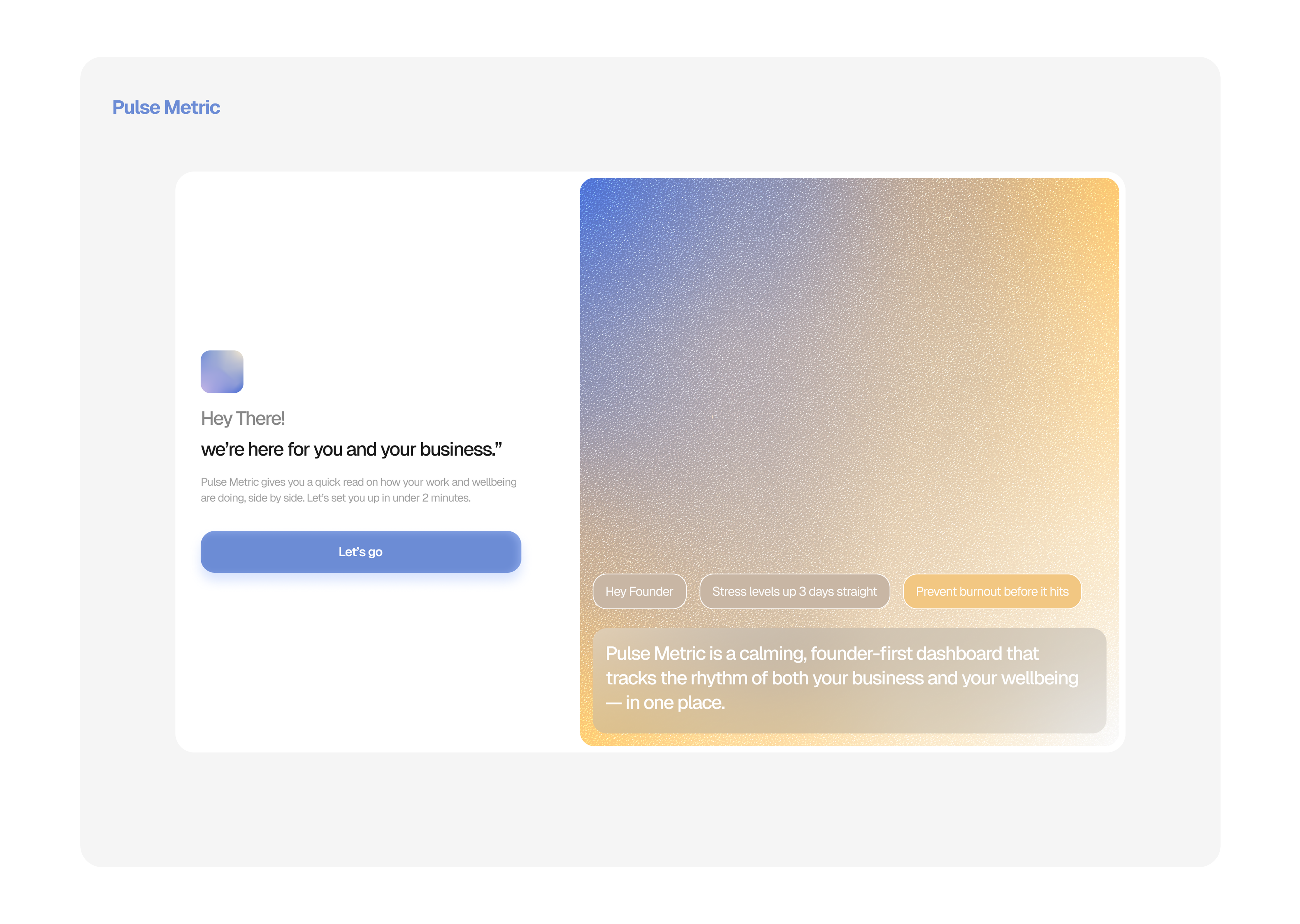
Pulse metric is a platform designed to help solo founders monitor the health and well-being of their businesses. We often celebrate revenue growth, MRR, and customer wins, but we rarely measure what’s happening inside the person running it all. Pulse is designed to help change that.
The designs were made to be calming and not overwhelming, from the onboarding to the dashboard and the flows of updating the founder's wellbeing.
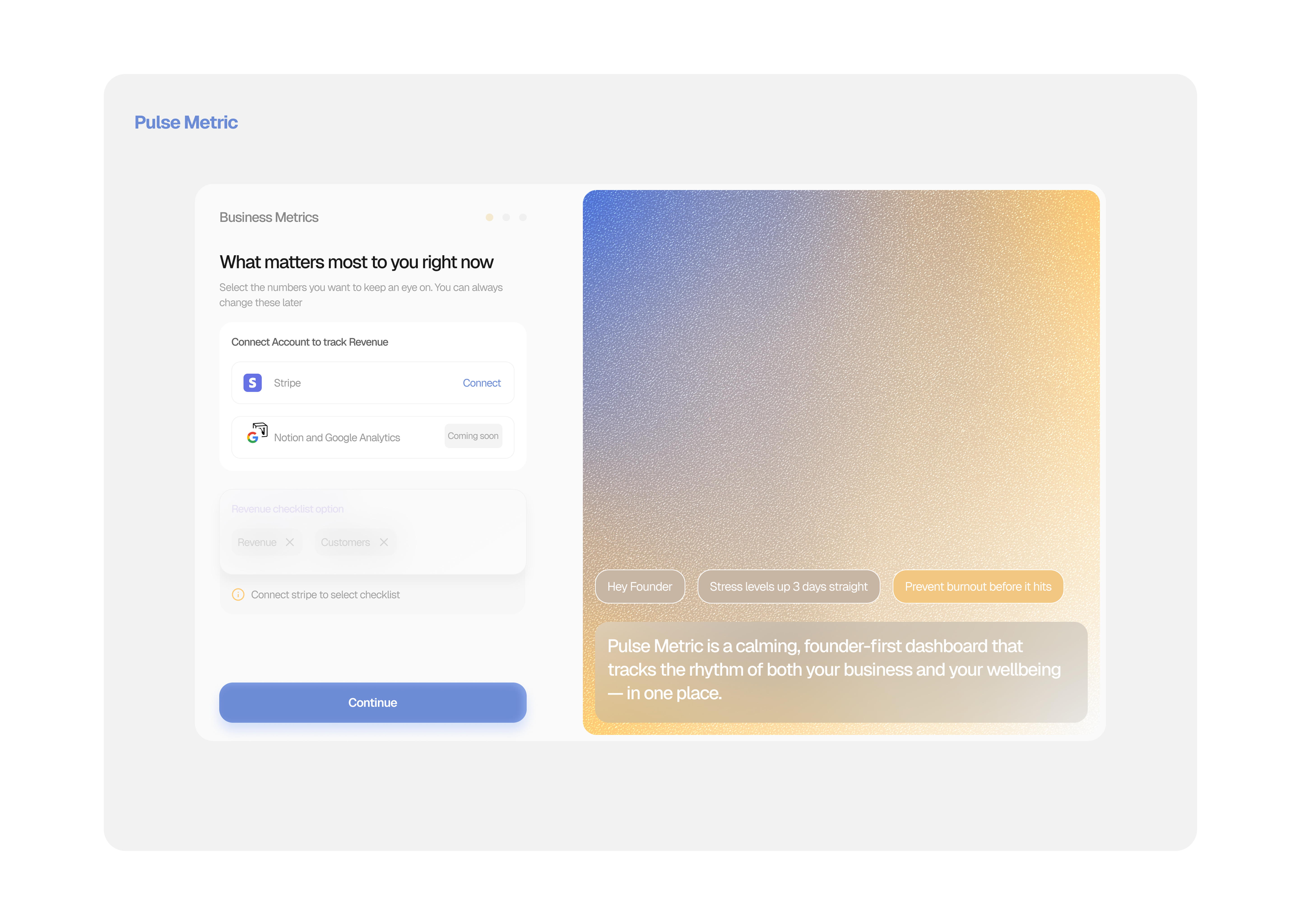
Onboarding with Pulse is frictionless — solo founders can sign in with email or Google, connect Stripe in under a minute, auto-set key wellbeing check-ins, and get their first snapshot, all without jargon or overwhelm.
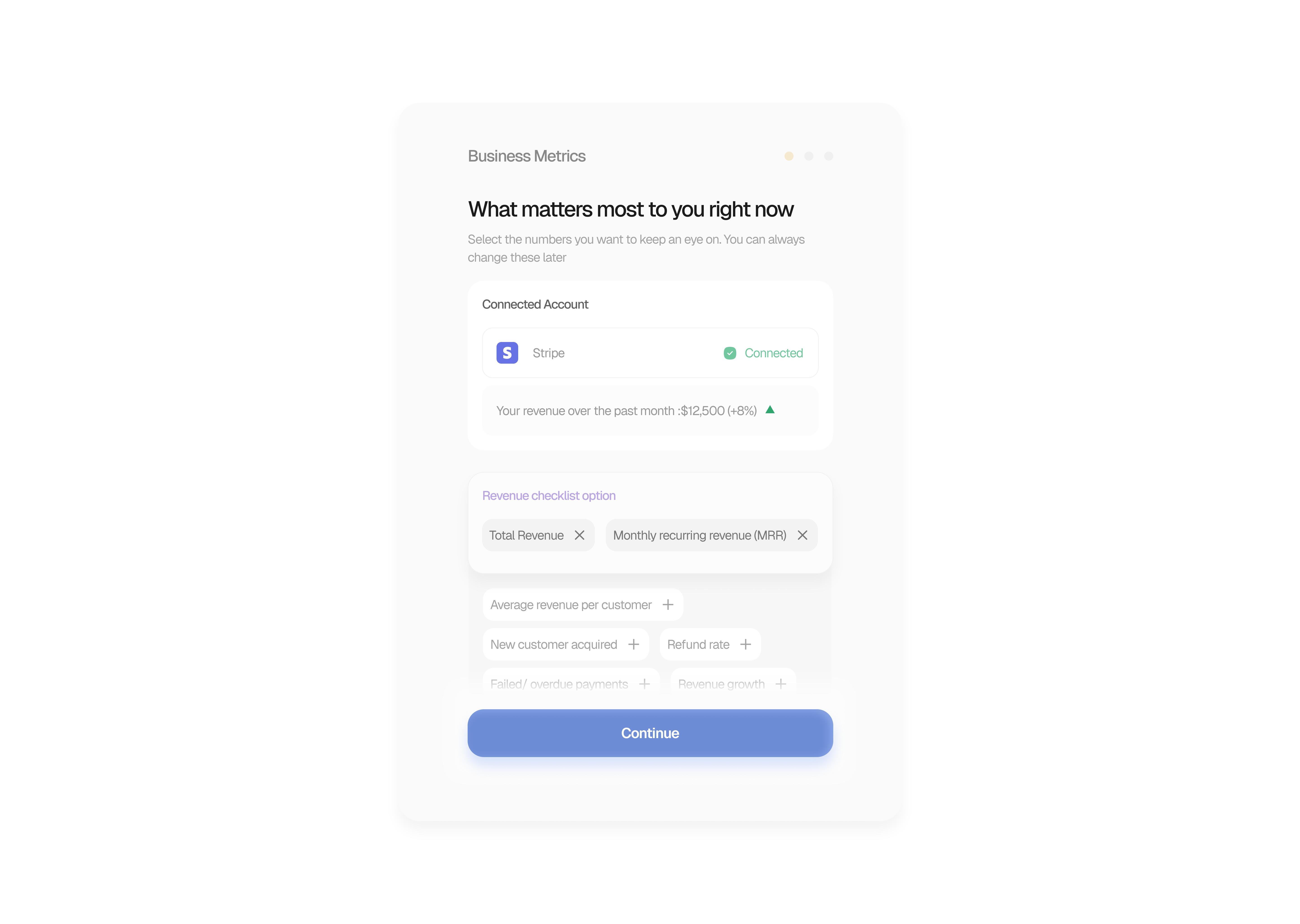
which allows them to easily access the dashboard without fuss. I was able to come up with some exacts for the dashboard before I came to a final iteration. Here are some of the ideas
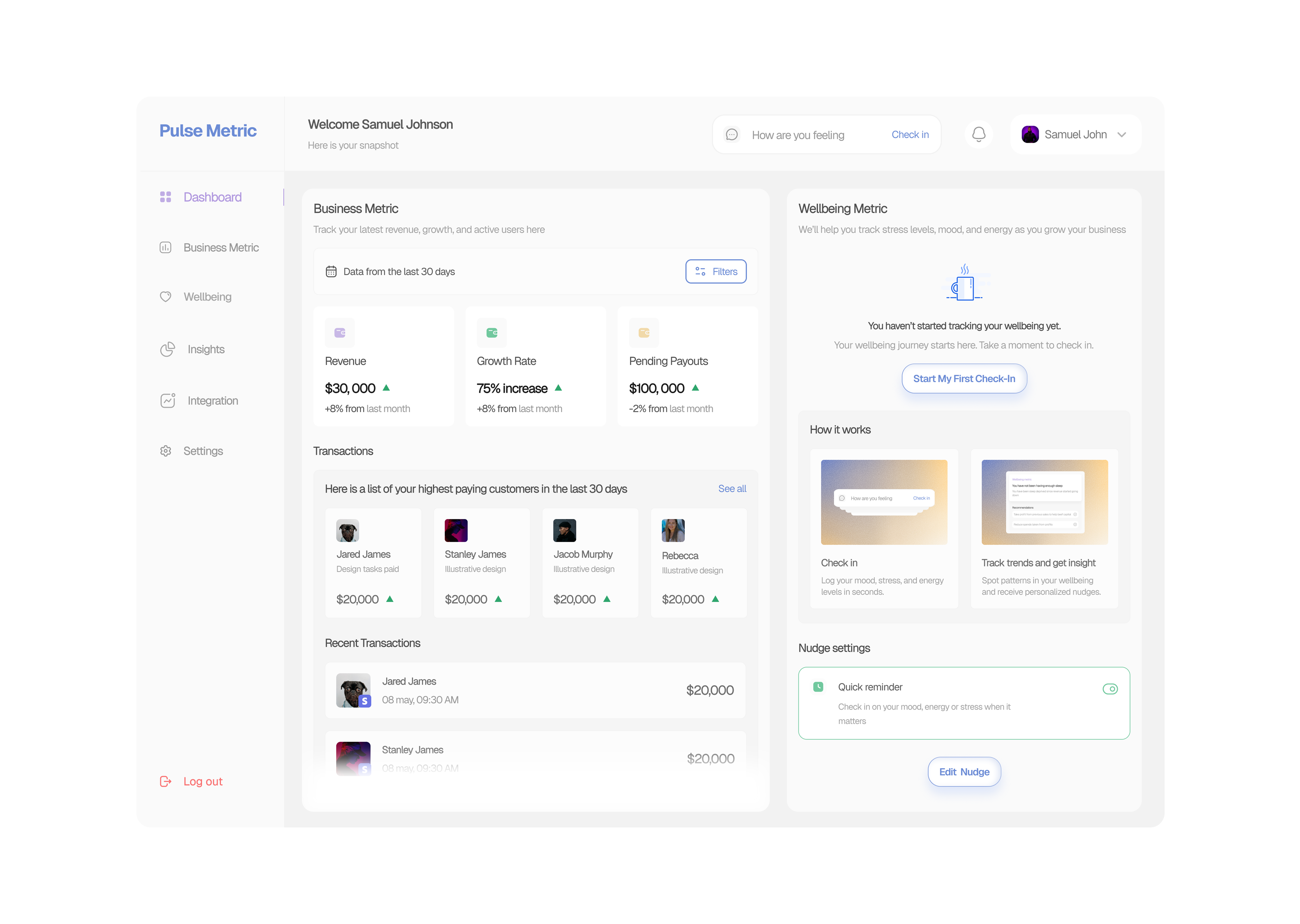
These still share a theme with how the dashboard ultimately looked; the overall goal here was ease, calmness, and I was able to achieve that. I would be working on the business and well-being section. I just couldn't wait to share what I have done so far.
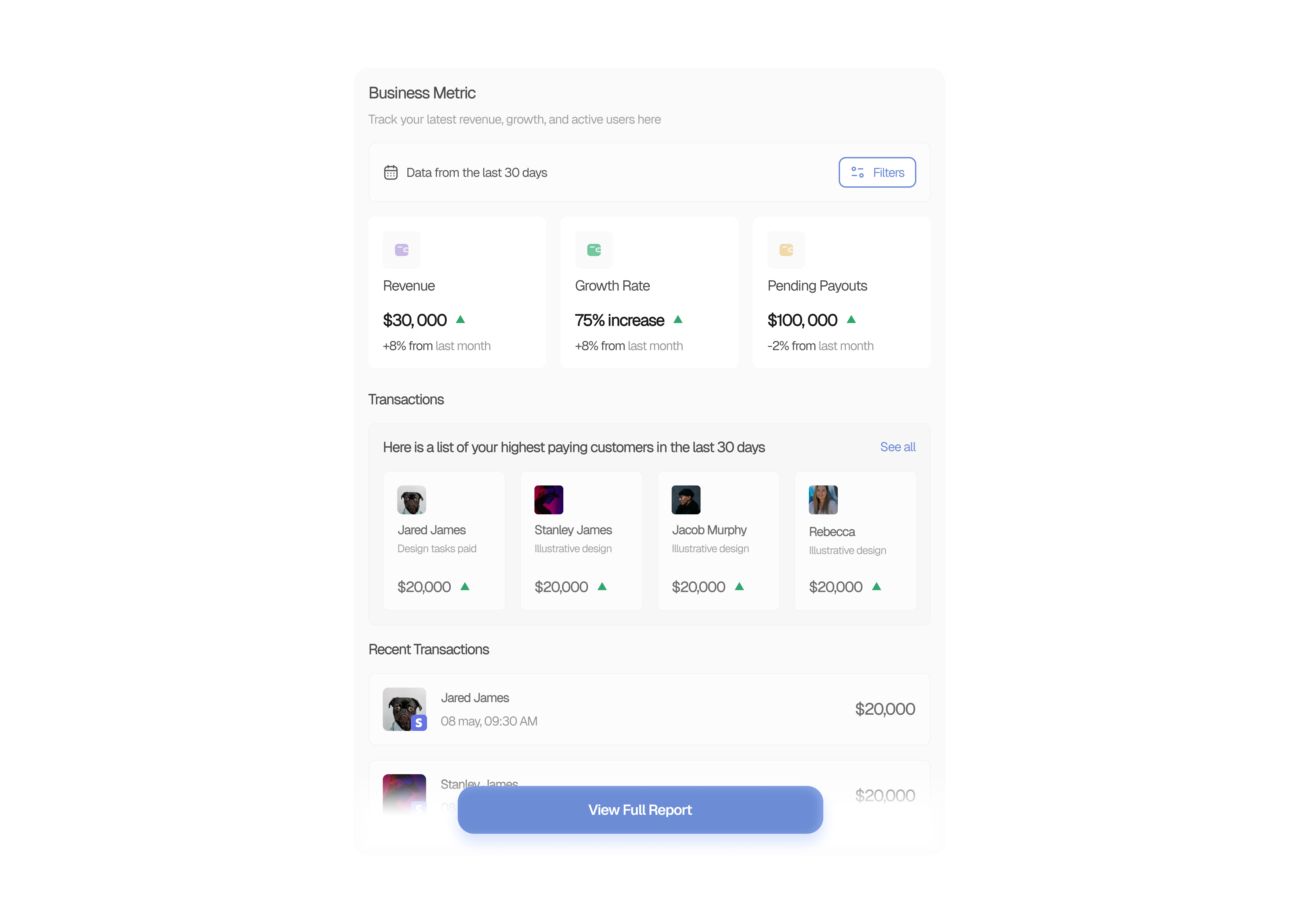
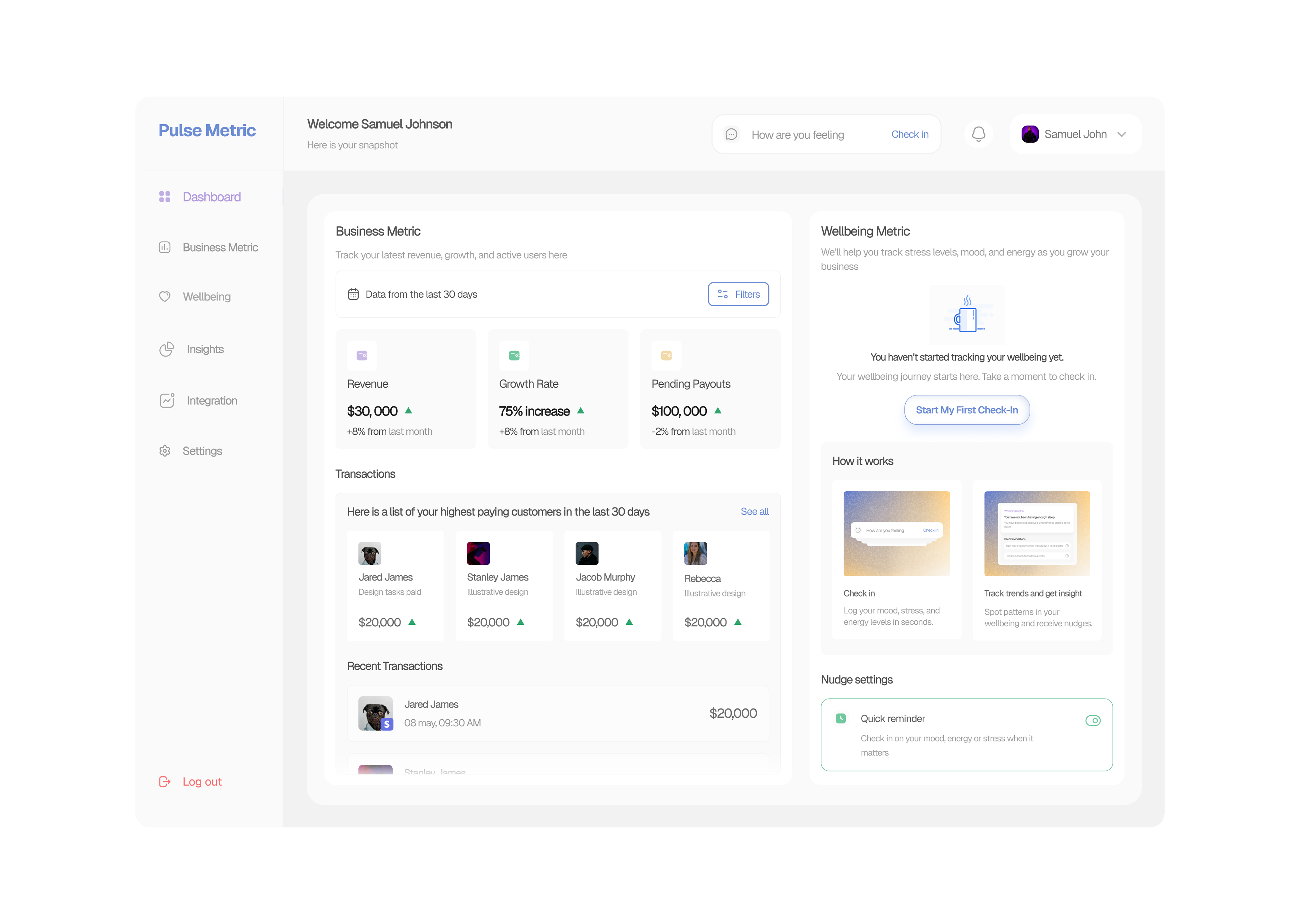
Here is how the final dashboard iteration looks.
Reviews
1 review

Well done, Willfred.
This is quite a thoughtful solution. The theme and color styles really do depict a balance between warmth and subtlety. Even the choice of font is really great.
However, there seems to be an underlying problem with visual hierarchy on the dashboard page design. A user may experience issues with knowing where to start or what to look at when they view the dashboard, and that can be overwhelming. There seems to be a lot of things to look at; because all the cards, for example, have the same visual weight.
Dashboard designs need to be directional. A good way to look at it would be: "What is the first thing I want the user to do (or look at) when they visit this page?" If the answer to this is not clear, then the goal of the design will not be met.
Also, you should always consider what the experience of a first-time user would look like when designing dashboards.
But in all, your work is solid!
You might also like

Smartwatch Design for Messenger App


Bridge: UI/UX Rebrand of a Blockchain SCM Product


Pulse Music App - Light/Dark Mode

Uxcel Halloween Icon Pack


Monetization Strategy


Designing A Better Co-Working Experience Through CJM

Popular Courses

Introduction to Figma


Core UI Components


Common UX/UI Design Patterns & Flows