Product Catalog Mobile design

E-commerce Catalog & Product Page: Design Rationale
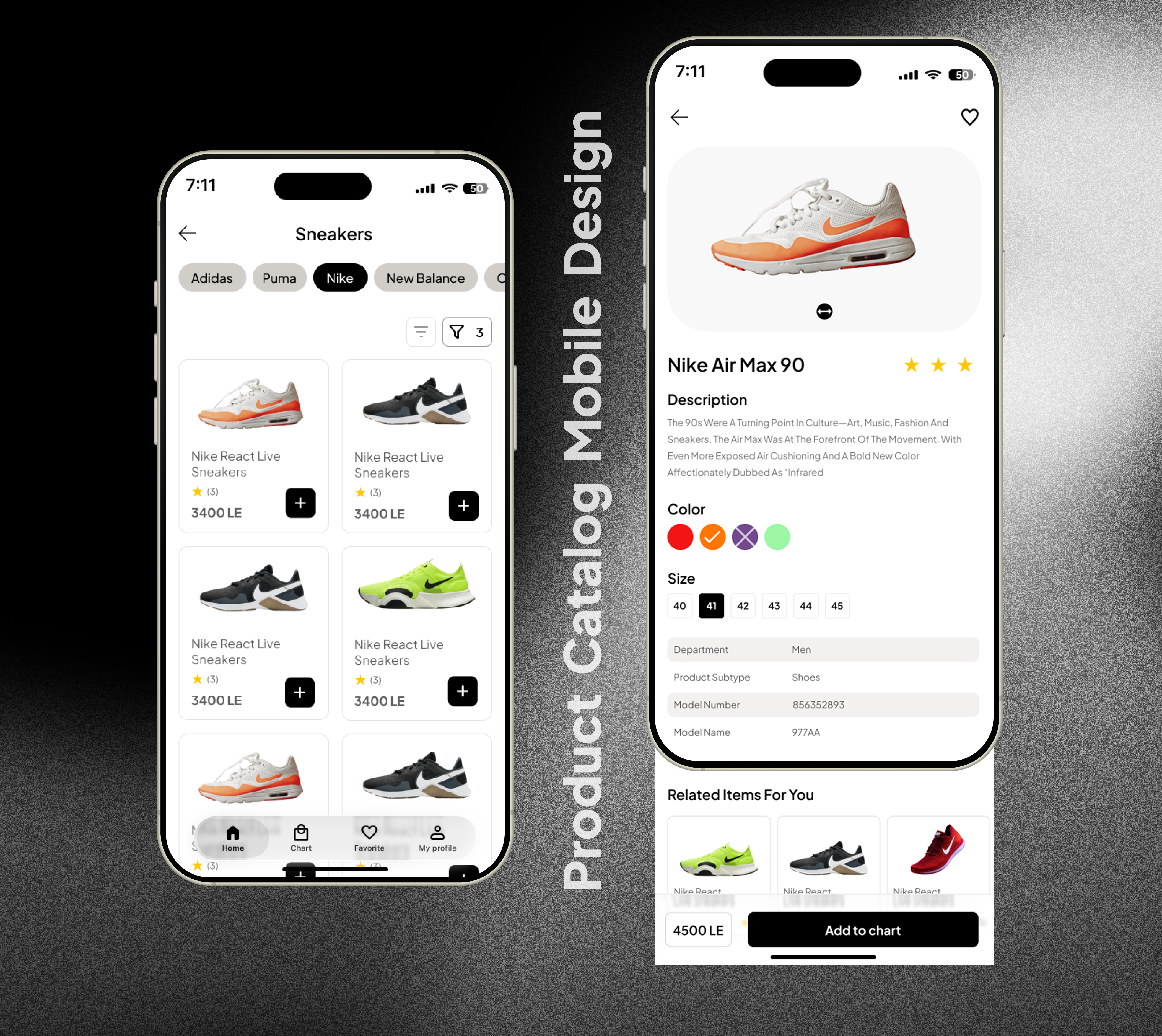
This mobile e-commerce design was driven by a core philosophy: maximize user efficiency and place the product at the center of the experience, especially in a visually-driven category like sneaker
1. Catalog View: Efficiency and Focus
My primary decision for the catalog page was maximizing scan speed and quick action:
- Focused Grid Layout: I opted for a clean, consistent grid that prioritizes the Product Image, Price, and Ratings at a glance. This layout is crucial for fast visual comparison, which is essential when browsing multiple similar products.
- Quick Conversion: The prominent Quick-Add Button (+) on the product card was included to enable instant adding to the cart, shortening the path to purchase and catering to repeat users who know what they want.
- Accessible Filtering: Key brand names (Nike, Puma, etc.) were deliberately placed as prominent horizontal filters at the top. This design choice removes the friction of opening a separate menu, making core navigation immediate and intuitive.
2. Product Details: Clarity and Trust
The detailed product page was structured to build trust and simplify the final decision:
- Visual Priority: The entire top section is dedicated to the product image and its core identifiers (Name and Star Rating), establishing clarity and credibility immediately.
- Structured Content: Product data (Description, Model info) and selection options (Size/Color) are placed within organized, scannable cards. This prevents information overload and ensures users can easily find specific details.
- Thumb-Friendly Controls: Size and color swatches/buttons were designed to be large and clearly selectable, optimized for mobile thumb interaction to reduce errors.
- Persistent CTA Bar: The "Add to Cart" button is placed in a fixed bottom bar, ensuring the final conversion step is always visible and readily accessible, regardless of how far the user has scrolled through the product description.
Tools used
From brief

Topics
Share
Reviews
3 reviews

Great job! The layout feels organized, and product cards are easy to scan. To make it more engaging:
- Show filters or sorting options to help users navigate.
- Highlight a standout product or deal to catch eyeballs.
- Drop in a quick mockup or interaction to show what happens when you tap a product.
Overall, clean work with good structure—just a little more flow and context will help it pop.

The product details are not properly aligned. ^^

Very clean interface, Radwa Elgindy!
I really like the simplicity and structure of your design.
You might want to think about consistency in two areas. First, take a look at how the pills are styled on the first screen and compare them with the rest of the elements. Could they be made more consistent?
Second, I noticed you used a liquid glass effect for the main navigation, while on the second screen you have a sticky bottom section with the price and CTA on a white background. Do you think consistency could also be applied there?
Overall, this looks great you did a really good job!

Hello Radwa, your design demonstrates a solid understanding of e-commerce fundamentals and shows clear intentionality in your approach. The way you've prioritized the product at the center of the experience is immediately apparent.
What really stands out is how you've tackled efficiency in the catalog view. The horizontal filter placement keeps browsing fluid, and that Quick-Add button directly on product cards shows you're thinking about reducing friction at every step. The product detail page feels trustworthy too—dedicating the top section to the product image and core identifiers gives users exactly what they need for confident decisions.
I'd encourage you to think about how users might discover and compare products across different categories. Your grid excels at browsing within a category, but consider how someone might jump between sneaker types or explore related items.
Overall, this is great work that shows you understand the balance between business goals and user needs.
You might also like

Smartwatch Design for Messenger App


Bridge: UI/UX Rebrand of a Blockchain SCM Product


Pulse Music App - Light/Dark Mode


Monetization Strategy


Designing A Better Co-Working Experience Through CJM


Design a Settings Page for Mobile
Visual Design Courses

UX Design Foundations


Introduction to Figma

Design Terminology
