Pricing Table
When designing this pricing page, my main focus was on clarity, usability, and conversion optimization. I wanted to create a structured and visually appealing layout that helps users quickly understand their options and make a decision with confidence.
1. Design & Layout Decisions
I chose a three-tier pricing model (Basic, Professional, and Enterprise) to accommodate different user needs. Each plan is displayed within a card-based structure, making it easy to compare features at a glance. To guide users toward the best value, I highlighted the Professional plan as "Popular," leveraging social proof and psychological nudging.
2. Color & Typography Strategy
- I used a consistent green theme to convey professionalism and trust while maintaining a clean, modern look.
- The dark green for the Professional plan and CTAs creates a focal point, subtly encouraging users to consider this option.
- The typography is simple and highly readable, ensuring effortless scanning and comprehension.
3. UX & Conversion Optimization
- Clear CTA Placement: The "Get Started" buttons are prominent, making it easy for users to take action.
- Billing Toggle: The “Monthly Billing / Annual Billing” toggle provides flexibility, catering to different purchasing behaviors.
- Feature Breakdown: Each plan clearly states its benefits, helping users make informed decisions without confusion.
4. Psychological Triggers & Pricing Strategy
- Anchoring Effect: Placing the Enterprise plan at $40 makes the $19 Professional plan feel more reasonable and attractive in comparison.
- Logical Pricing Structure: The progression from Basic to Enterprise follows standard SaaS pricing logic, making it feel familiar to users.
- Emphasizing Value Over Cost: Instead of just displaying prices, I structured the page to highlight the features and benefits users will get.
5. Accessibility & Responsiveness
- The design ensures a mobile-friendly experience, adapting seamlessly to different screen sizes.
- High contrast and clear CTA buttons improve readability and usability for all users.
- Minimal distractions keep the focus on decision-making, reducing friction in the signup process.
Tools used
From brief
Topics
Share
Reviews
2 reviews
The UI is well-structured and visually clear. The emphasis on the Professional plan through colour contrast and the "Popular" tag effectively guides users. However, the green scheme may limit accessibility for colour-blind users (deuteranopia), and the billing toggle could be more prominent - by adding subtle hover effects or micro-interactions could further enhance engagement.
Great design! Loved the concept—Professional plan builds on Basic, and Enterprise builds on Professional.
One suggestion: use black shades for body text for better readability. Also, instead of adding "Contact Support" in each card, consider placing a single button with a short description at the bottom.
You might also like
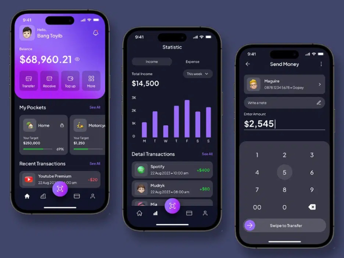
eWallet App Development Project
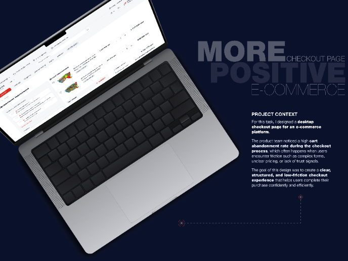
🖥 Desktop Checkout Flow Design
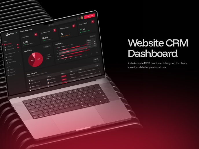
Website CRM Dashboard
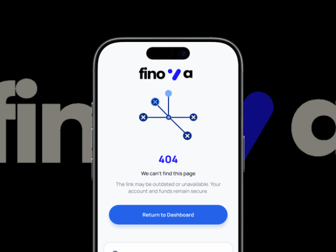
Helpful 404 Error Page for a Fintech Mobile App
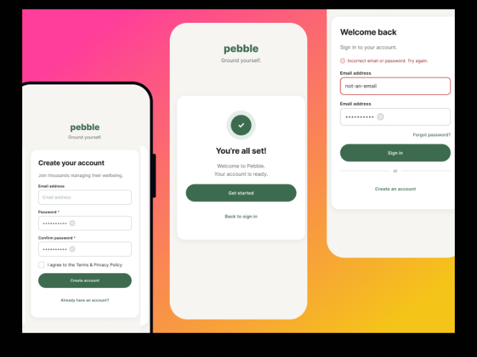
Pebble Accessible SAAS Signup Flow
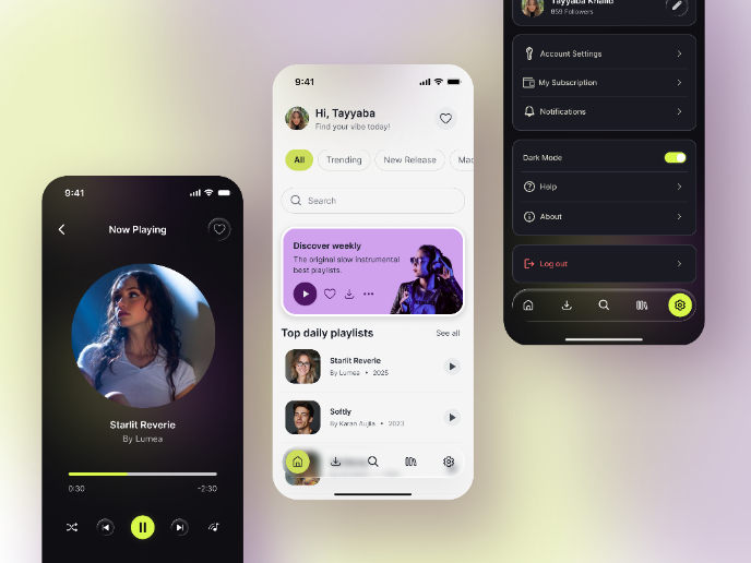
Music Player UI - Light & Dark Mode
Visual Design Courses

UX Design Foundations

Introduction to Figma


