Pricing Page

Color Scheme
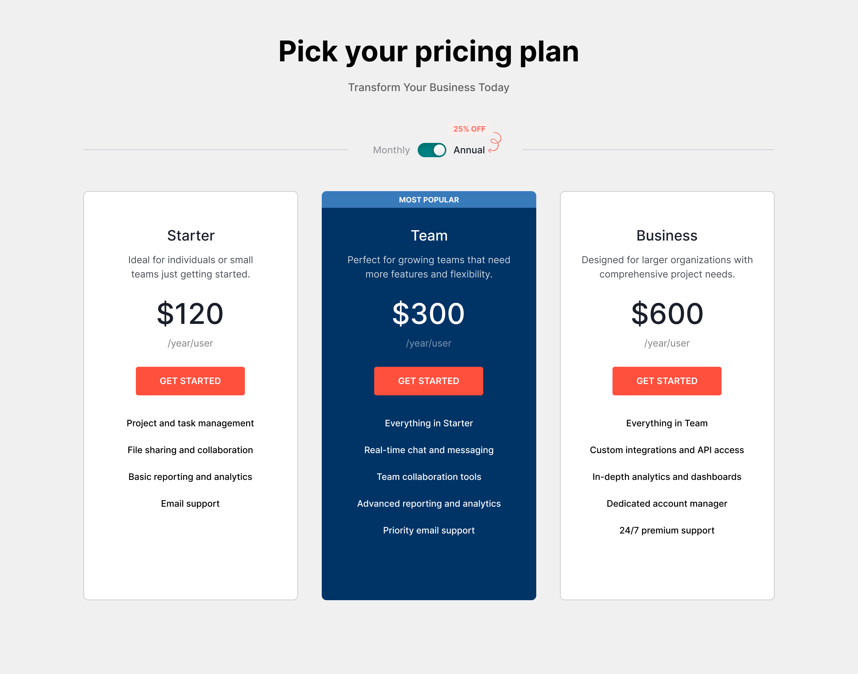
Primary Color: Deep Blue (#003366)
I chose a deep blue for the pricing cards to evoke trust and professionalism. This color is often associated with reliability, which is essential when users are considering a financial commitment. The blue also provides a strong contrast against the background, making the pricing options easily distinguishable.
Accent Color: Coral (#FF4F3D)
For the buttons, I opted for a vibrant coral. This color not only grabs attention but also creates a sense of urgency, encouraging users to take action. The warm tone of coral complements the deep blue, adding visual interest while maintaining a harmonious balance in the overall design.
Card Layout
Each pricing card features clear headings and concise descriptions to facilitate quick comparisons between plans. The use of card-based layouts helps to:
Organize Information: Users can easily scan through different pricing tiers without feeling overwhelmed.
Call-to-Action (CTA) Design
The CTAs are designed with the coral color, making them stand out. I ensured that the buttons are large and easy to click, adhering to accessibility best practices. The wording on the buttons is action-oriented, "GET STARTED" to encourage immediate engagement.
By thoughtfully combining color psychology, layout organization, and user feedback, I aimed to create a pricing page that not only looks appealing but also enhances the overall user experience, ultimately driving conversions for our SaaS product.
Reviews
2 reviews

Overall it's looking nice but you can take it to the next level.
"25% off" could be bigger since it's a benefit for the user. Same thing for "most popular" maybe to put it in a different color to get more contrast on the card.
The description on the cards looks like a block of text, you could try to align it to the left and create an unordered list with some "check" icons for example, since it's a list of features. This would make it to stand out and easier to scan.
The headings on the cards could be slightly bigger in size and font weight, maybe bold to create more contrast.

I liked reading about your choices for colour and you have made a good start with yoru designs! The 25% could be made bigger and highlighted more. At the moment the cards text just look look like a list. So using some icons to make each line stand out more would be a great way forward!
You might also like

Pulse — Music Streaming App with Accessible Light & Dark Mode


Islamic E-Learning Platfrom Dashboard

SiteScope - Progress Tracking App


Mobile Button System


FlexPay


CJM for Co-Working Space - WeWork

Popular Courses

UX Design Foundations


Introduction to Figma

Design Terminology
