PetShop
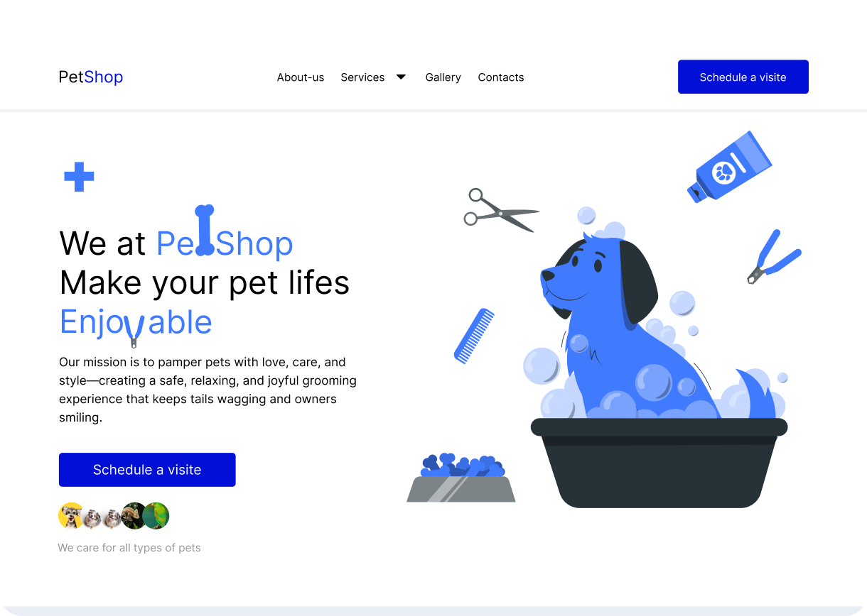
This is a clean and friendly design concept for a pet shop facility. All design decisions were made with the goal of creating a welcoming, neutral, and comfortable environment for both pets and their owners. The focus is on simplicity, playfulness, and functionality, ensuring that the space feels open, calm, and easy to navigate.
Tools used
From brief
Topics
Share
Reviews
1 review
🐾 Pawesome, Modibo!
Tiny suggestions to make it even more welcoming:
- Try bolder text for the buttons. The vibrant blue gives off strong energy, but it almost overpowers the most important element: the text itself, which serves as a wayfinding cue to distinguish between the CTA and the purchase button. These two are essential and should always stand out so users don’t miss them due to low legibility.
- To embrace inclusivity while keeping it fun, make sure all text remains readable by screen readers. For example, you can place the bone illustration behind the letter “t” so that when users highlight or have it read aloud, it still says “Petshop” not “Pe shop”. Technically, for the web, this could be done with CSS, something like: <p>Pe<span>t</span>shop</p> where the image is applied as a background to the <span>
- Be careful with black text on top of vibrant blue in the footer; sticking with lighter text colors will help maintain legibility.
Your feedback is really helpful — I’ll integrate these adjustments to make the design more effective.
10 Claps
Average 3.3 by 3 people
You might also like
Project
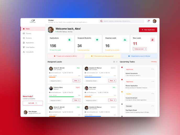
MalishaEdu Counselor Workspace
Context MalishaEdu is a student consultancy management platform used by counselors and branch teams to manage leads, applications, documents
Project
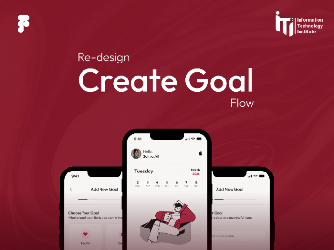
Goal Creation Flow
Project
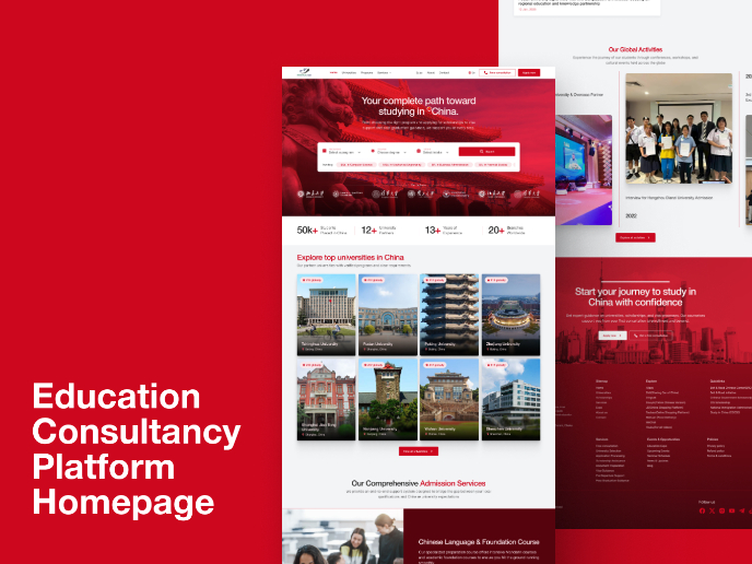
MalishaEdu - Website Design
MalishaEdu is an international education consultancy platform helping students study in China through end-to-end guidance, from program sele
Project
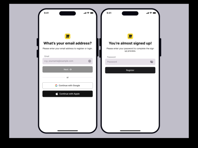
Sign-Up Page Activity - Miro
I designed this mobile login and sign-up flow following WCAG 2.1 AA accessibility principles, focusing on clarity, usability, and reduced co
Project
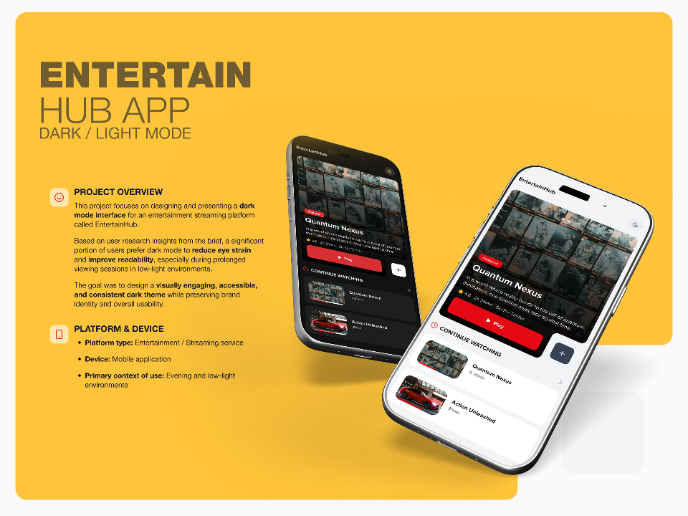
EntertainHub App (Dark / Light Mode)
Design ApproachI began by designing the main screens in light mode to establish: layout hierarchy spacing content structure After that, I tr
Project
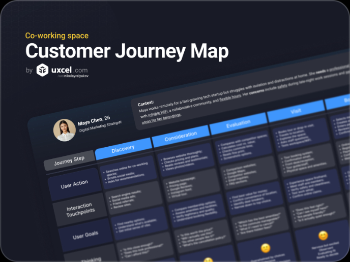
Co-working space | Customer Journey Map (AI-Augmented)
Brief DescriptionI chose to not select a specific company to create the CJM around, but rather the general idea set forth in the brief. I us
Visual Design Courses

Course
UX Design Foundations
Learn UX design fundamentals and principles that create better products. Build foundational knowledge in design concepts, visual fundamentals, and workflows.

Course
Introduction to Figma
Learn essential Figma tools like layers, styling, typography, and images. Master the basics to create clean, user-friendly designs

Course
Design Terminology
Learn UX terminology and key UX/UI terms that boost collaboration between designers, developers, and stakeholders for smoother, clearer communication.

