Pawy - Responsive Landing Page for Animal Care Service
"It's Pawy – A Responsive Landing Page for Pet Health Services 🐾"
Hey everyone! I designed this responsive landing page for It's Pawy, a pet health service that makes caring for furry friends easy and stress-free. The goal was to create a clean, user-friendly design with a smooth booking flow and a warm, welcoming vibe.
✨ What’s inside?
🔹 Mobile-friendly & responsive – Looks great on any device
🔹 Simple booking flow – No-fuss scheduling for pet owners
🔹 Soft, friendly visuals – Because pets deserve good design too!
🔹 Easy-to-read & accessible – Making pet care info clear for everyone
Check it out on Figma and let me know what you think! Would love to hear your feedback. 🚀🐶🐱
Tools used
From brief
Topics
Share
Reviews
6 reviews
Thank you for your sub, Quang!
I love your design here! Real clean and beautiful typography. What I think would add value to your project is changing the cropped hero image with the dog and cat.
here is a tutorial on youtube for that:
https://www.youtube.com/watch?v=ubN_L9ug58w
Another thing i would add, as I seen the figma file is try to organise your content into frames. This would help out the developers in building you site on containers and also help you for building up the mobile version a lot easier.
Keep up the good work!
You rock!
This is a design that creates a comfortable feeling, with clearly organized information that is valuable to users. You need to pay attention to the font, as improvements are needed in the proportions; the current sizes of the headings and paragraphs are not balanced, and the line spacing is not appropriate.
I really loved the color palette and layout—it’s visually appealing and well-structured. The responsive design across both desktop and mobile versions is impressive and seamless. I also appreciate how you named and organized the layers, which is a detail that many designers often overlook.
I have some friendly feedback that could help elevate your design process even further:
- Use Auto Layout: Applying auto layout for each section instead of relying on frames and groups would improve design consistency and efficiency. It would also make it easier for developers to implement the design.
- Componentize Buttons and Inputs: For elements like buttons and input fields that are used frequently across the web, creating components with different states (hover, focus, active, etc.) would streamline the design process and enhance reusability.
- Consider Additional Breakpoints: Adding breakpoints for tablet and larger desktop sizes would ensure even better responsiveness across a wider range of devices.
Overall, you’ve done a fantastic job—this design is not only aesthetically pleasing but also highly functional. Keep up the great work!
Very good work with a nice design! The responsiveness also works well for me!
Greate work! ^^
IS a well-designed and user-friendly interface that effectively communicates the brand’s purpose. The use of playful, pet-friendly visuals and a warm color palette creates an inviting and trustworthy atmosphere. The layout is clean and responsive, ensuring a seamless experience across devices. Key features like clear CTAs, service highlights, and testimonials are strategically placed to build credibility and encourage conversions. However, adding microinteractions or animations could make the page more engaging. Overall, it’s a thoughtful and professional design that caters perfectly to its target audience. Great work!
This design is beautiful, and the brand shines through with consistent use of the primary green. I assume your links will also be green. How do you differentiate a line of text that's a link to a line of text or an icon that is green but but not clickable? I also like the use of photography mixed with the color blocks is a good combination. I really like the use of white space and a structured, grid layout. Great job.
You might also like
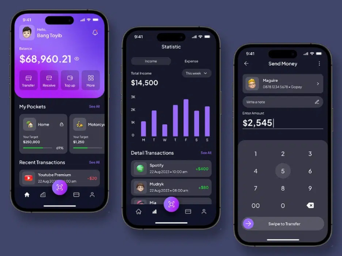
eWallet App Development Project
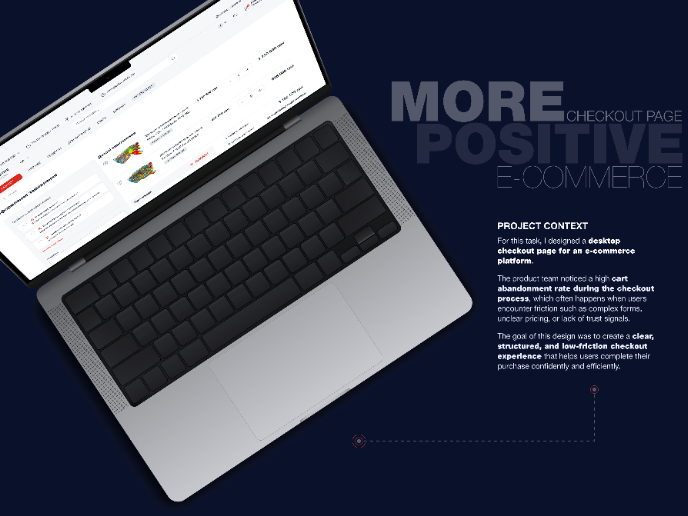
🖥 Desktop Checkout Flow Design

Website CRM Dashboard
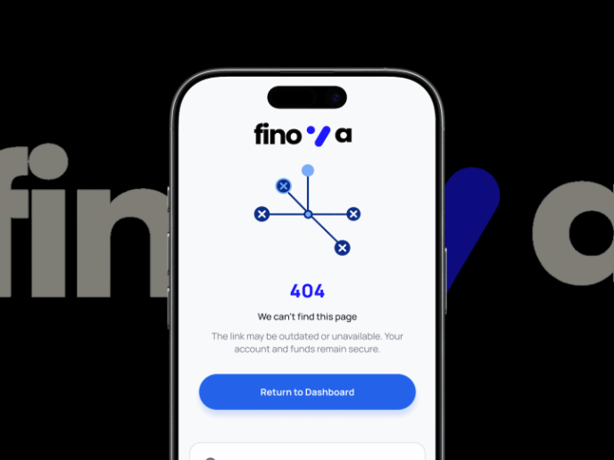
Helpful 404 Error Page for a Fintech Mobile App
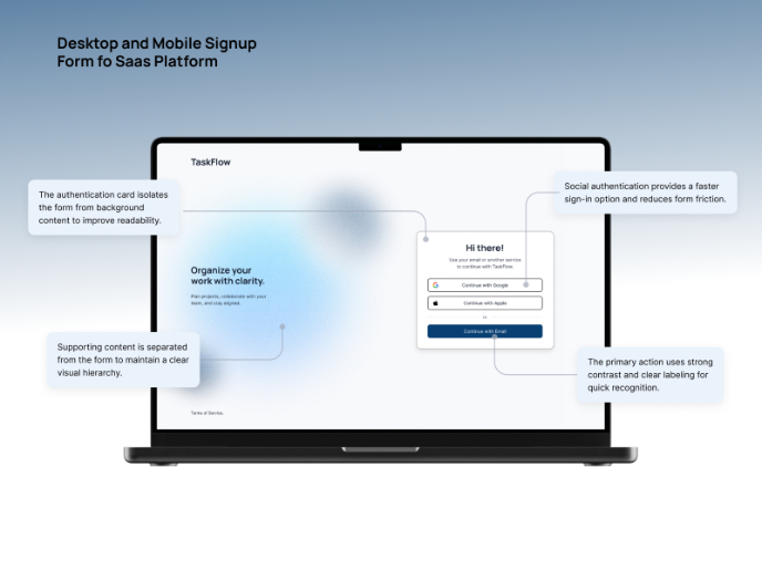
TaskFlow Authentication Flow
Pebble Accessible SAAS Signup Flow
Visual Design Courses

UX Design Foundations

Introduction to Figma


