
Reviews
2 reviews

Hey there,
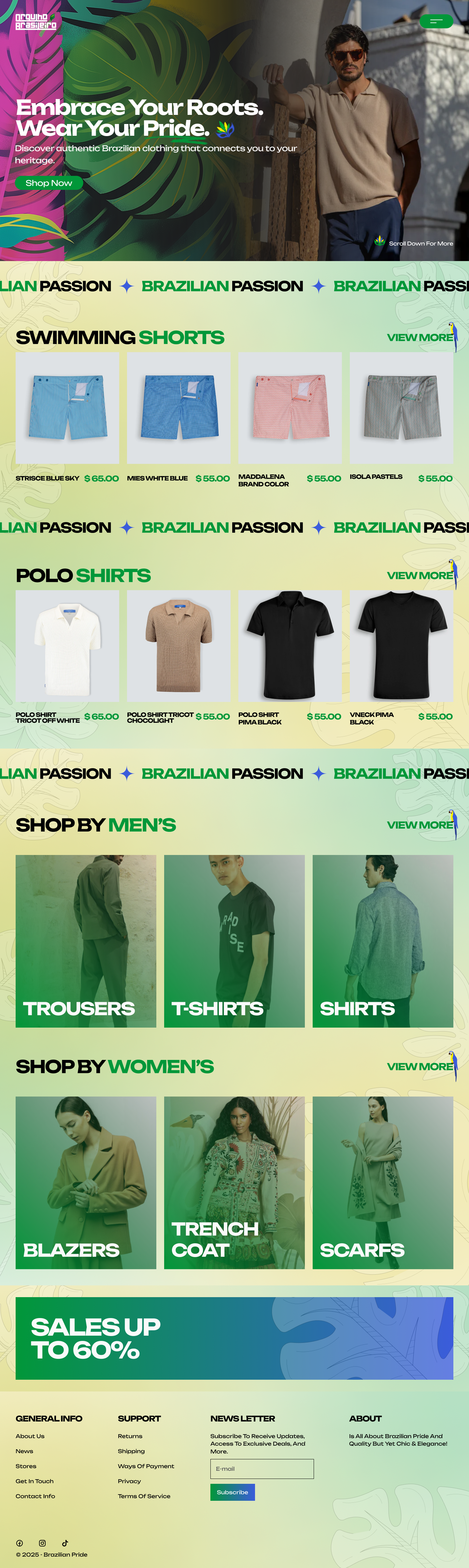
I like the bold headings and the color scheme. I could see someone using this for their site right away! Great job! A couple notes:
- You're using the green as an accent color as well as your primary color. This leads to some overlap for your headings and links. It would be worth differentiating these a little bit more. I think an easy improvement would be to add some extra styling to your link buttons (i.e. View More)
- the font you're using for your paragraphs is rather hard to track for a few reasons: the font itself, the weight, and the line height. My recommendation would be to choose another font for your body copy that allows better readability.
- I would consider moving your sales banner up to the top. Offers like that make sense to show early on to draw your users in and give them something to be excited about.
Overall, great work!

Solid grid work—love it!
5 Claps
Average 1.7 by 3 people
You might also like

Project
Accessible Signup Form

This project is an app which helps users to consume content based on their mood and it explores the design of an accessible, inclusive signu

Project
Auction

1. Clear visual hierarchySignup Screen: “Create a free account!”Login Screen: “Welcome back”Using clear H1 titles instantly orients the user

Project
Entrant - Analytical Dashboard

Entrant is a job-seeking platform built specifically for students and fresh graduates, helping them connect with internship and entry-level

Project
Transit Cairo — Digital Mobility Redefined

Transit Cairo is a mobile-first digital ticketing experience designed to reduce congestion and improve daily commuting across Cairo’s metro

Project
Babylon Balance - Designing Financial Clarity Through Constraint

OverviewBabylon Balance is a personal finance app designed to help users manage their income with clarity, discipline, and minimal cognitive

Project
Entrant Accessible Signup and Login Forms
Entrant was the internship-focused job-seeking app for college students and fresh graduates — built around lowering friction, making opportu
Popular Courses

Course
UX Design Foundations

Learn the essentials of UX design to build a strong foundation in core principles. Gain practical skills to support product development and create better user experiences.

Course
Introduction to Figma
Learn essential Figma tools like layers, styling, typography, and images. Master the basics to create clean, user-friendly designs

Course
Design Terminology

Learn UX terminology and key UX/UI terms that boost collaboration between designers, developers, and stakeholders for smoother, clearer communication.