Onboarding Screens for a Dairy Farming App

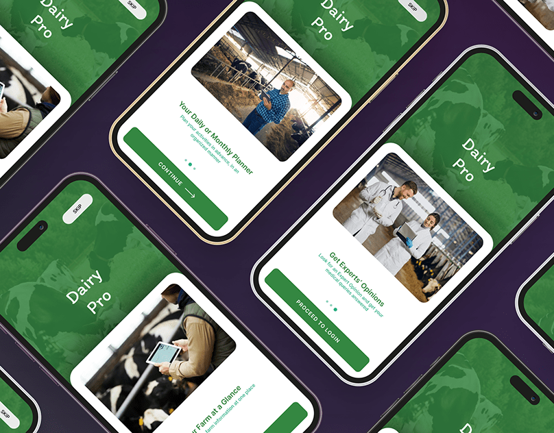
Designed a simple and friendly onboarding flow for a dairy farming app, focused on reducing cognitive load for first-time users. The screens guide farmers through core features using clear visuals, minimal copy, and step-by-step progression; making the app approachable even for non-tech-savvy users.
Reviews
3 reviews

Oh this one’s interesting 🐄🌾 I didn’t expect a dairy farming app, but I actually like the direction. It feels practical and grounded, which makes sense for the audience.
The onboarding looks clear and straightforward no unnecessary fluff. That’s smart, especially if the users might not be super tech-focused. The messaging seems focused on value and functionality, which fits the context 👌✨
If I’d suggest one upgrade, maybe add a bit more emotional hook like showing real impact (“track herd health easier,” “increase productivity”) to make it more motivating 🚜📈 But overall, solid and purpose-driven work.

Excellent work, Muaaz! Practical, friendly, domain-appropriate onboarding. Focusing on reducing cognitive load for non-tech-savvy farmers is exactly right. Here's my feedback:
Strengths:
- Domain awareness: Green branding, real farm imagery, practical messaging. Grounded in agriculture, not generic
- Cognitive load reduction: Minimal copy, clear visuals, step-by-step progression
- Authenticity: Real photography of farmers creates relatability and trust
- Friendly tone: "Your Farm at a Glance" messaging is approachable
- Visual hierarchy: Clear, modern design with strong contrast
- Recognition: Standing ovation from Insan
Critical Gaps:
- Shallow Case Study — Only onboarding screens shown. Where's the full app journey? What happens after onboarding?
- Missing Design Process — No user research. Did you interview farmers? What pain points drove decisions?
- No Problem Statement — Why does this app exist? What problem does it solve? Add emotional hooks ("track herd health easier")
- Limited Scope — Only 3 screens. What about error states? Offline mode? Account completion? Edge cases reveal maturity
- Minimal Behance Narrative — Add case study: problem, research, design decisions
- No Success Metrics — Measure onboarding success? Completion rate? Time to first action?
Key Questions:
- Target farmer segment (small/large farms, cooperatives)?
- How do farmers manage herds (pen/paper, spreadsheets, other apps)?
- Value proposition (health tracking, productivity, record-keeping)?
- What happens after onboarding?
Overall: Strong fundamentals and domain awareness. Onboarding is clean and friendly. Deepen the case study: add research, problem context, design decisions, and show the complete journey.
Next: Expand with research, problem statement, full journey, design decisions, metrics. You're at 60% of a compelling case study.

Hi Muaaz, I don’t think this works as a complete onboarding flow yet. While the UI elements like pagination, Continue, and Skip are present, the experience feels more like a feature introduction carousel rather than a structured onboarding process.
An onboarding flow should guide users through essential setup steps such as role selection, preferences, permissions, or collecting key information. Right now, it only presents features without helping users meaningfully get started. There’s no personalization, no account setup, and no clear transition into the actual product experience.
The full Skip option also weakens the purpose of onboarding. If certain information is crucial, those steps should be mandatory, with optional educational screens placed afterward.
From a UI perspective, there are inconsistencies in typography. The “Dairy Pro” title uses a different font style from the rest of the interface, which affects visual cohesion. The green color palette also feels slightly overpowering and could benefit from more tonal variation and supporting neutrals to create better hierarchy and balance.
At the moment, this feels more like a visual introduction rather than a fully thought-out onboarding concept. Strengthening the structure, clarifying required steps, and refining visual consistency would make the experience much more convincing and complete.
You might also like

Pulse — Music Streaming App with Accessible Light & Dark Mode

SiteScope - Progress Tracking App


Mobile Button System


Islamic E-Learning Platfrom Dashboard


FlexPay


CJM for Co-Working Space - WeWork

Popular Courses

Introduction to Figma


Design Terminology


Apple Human Interface Guidelines