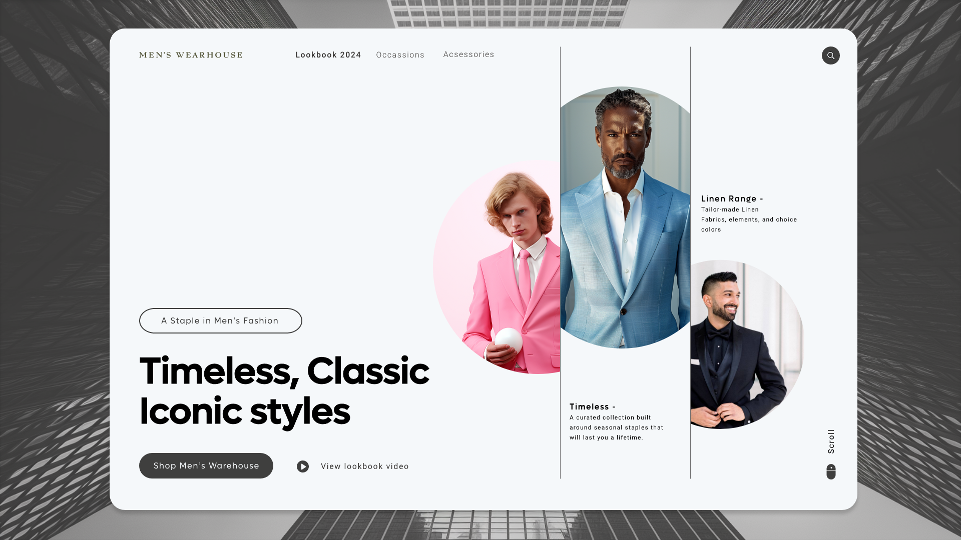
Men's Warehouse Landing Page

Hi Guys!
I’m very proud to share with you my revised exploration.
Men's Warehouse Landing Page Concept.
In this case, I tried to challenge myself to create a simple clean sleek & minimalist landing page.
Thought's most appreciated.
Reviews
2 reviews
At first glance, the page looks great—minimalistic and sleek. However, you haven't submitted any articulation of your design or provided additional screens showing the user flows. For example, is 'A Stable in Men's Fashion' an interactive element? Does it lead users somewhere? If so, the page appears overloaded with interactive elements, which can create confusion.
Secondly, if the main call-to-action encourages users to shop, there should be a visible cart icon. It would be helpful to see the catalogue, how the product pages look, the checkout process, FAQ pages, etc. The first impression is positive, but the project requires further development.

I really like what you did here, it's far from standard. I believe it would be great for a small fashion brand. Less for a warehouse. Or is 'warehouse' the name of the brand, and not an actual warehouse?
From Interactive perspective: the 'A stable in man's fashion' element looks like a button, but sounds like Eyebrow Text, if it's a button it doesn't signal its functionality. Change this, this is important.
From UX writing perspective:
Although the meanings of classic and iconic are separate, they somehow clash in my mind. Next to the search icon I would add a light grey text in uppercase "SEARCH".
"Shop Men's Warehouse" button also lacks clear signaling of its functionality, if the brand only sells suits, I would rename it to "Shop Suits".
You might also like

Mobile Onboarding: Casa di Pasta


Accessible Signup & Login Experience — Brainex


Accessible Signup Form


Auction


Entrant - Analytical Dashboard


Transit Cairo — Digital Mobility Redefined

Popular Courses

UX Design Foundations


Introduction to Figma

Design Terminology
