Reviews
1 review
You’ve put in solid work creating a lot of mobile screens, nice job showing scope and consistency. To make this case study more impactful for reviewers and hiring managers, try turning the screen gallery into a clear story about the problem, your users, your decisions, and the results.
What’s working
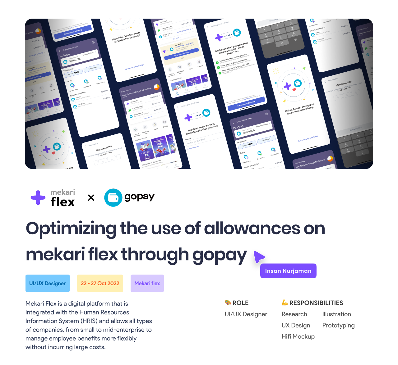
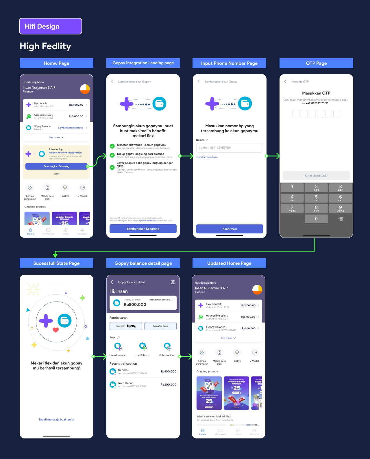
Plenty of artifacts: the breadth suggests you covered real flows, not just visuals.
Consistent tooling in Figma: implies systems thinking and repeatable components.
Mobile-first focus: good attention to real usage contexts.
What would make it stronger
Start with a short brief: who are the users, what problem are you solving, and what does success look like? Add your role, timeline, team, and constraints so people can judge decisions against goals.
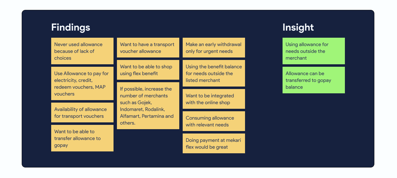
Show how you learned: summarize interviews, heuristics, analytics, and competitive analysis. Pull out 3–5 insights and connect each major UI change to a specific insight.
Reveal the flows: include a quick sitemap or user-flow diagram with entry points, decision nodes, and branches for empty/error/offline states. That’s how we see the “why,” not just the “what.”
Document edge cases: empty, loading, error, offline, permissions—these are where UX quality really shows.
Be explicit about accessibility: color contrast, semantic labels, screen-reader order, focus management, and touch targets. A simple before/after example with measured contrast goes a long way.
Close with outcomes: task success, time-to-complete, error rate, conversion. If you don’t have production data, include usability results or an A/B plan with expected impact.
Quick wins you can ship now
Add captions under each image explaining the user problem, the decision/trade-off, and what changed from the previous iteration.
Make primary actions clearly dominant and persistent where it helps; keep back behavior consistent and avoid deep modal nesting.
Improve forms with inline validation and plain-language error copy.
Include a small “metrics snapshot” (baseline vs. after): time-to-complete, error rate, conversion, even proxy numbers help tell the impact story.
Turning a screen gallery into an outcome-driven narrative will make your case study more memorable and credible. It shows not just that you can design interfaces, but that you make informed decisions that solve real user and business problems.
You might also like

Smartwatch Design for Messenger App

Bridge: UI/UX Rebrand of a Blockchain SCM Product

Pulse Music App - Light/Dark Mode

Monetization Strategy

Designing A Better Co-Working Experience Through CJM

Design a Settings Page for Mobile
Popular Courses

Introduction to Figma

Design Terminology


