Sign up form

A signup form is a web or app interface used to collect information from users who wish to register for a service, create an account, or subscribe to a newsletter. It typically includes fields for users to enter their name, email address, password, and any other relevant information. The form may also include checkboxes for users to agree to terms and conditions or to opt in to receive marketing communications. After completing the form, users usually click a submit button to send their information for processing.

Reviews
3 reviews
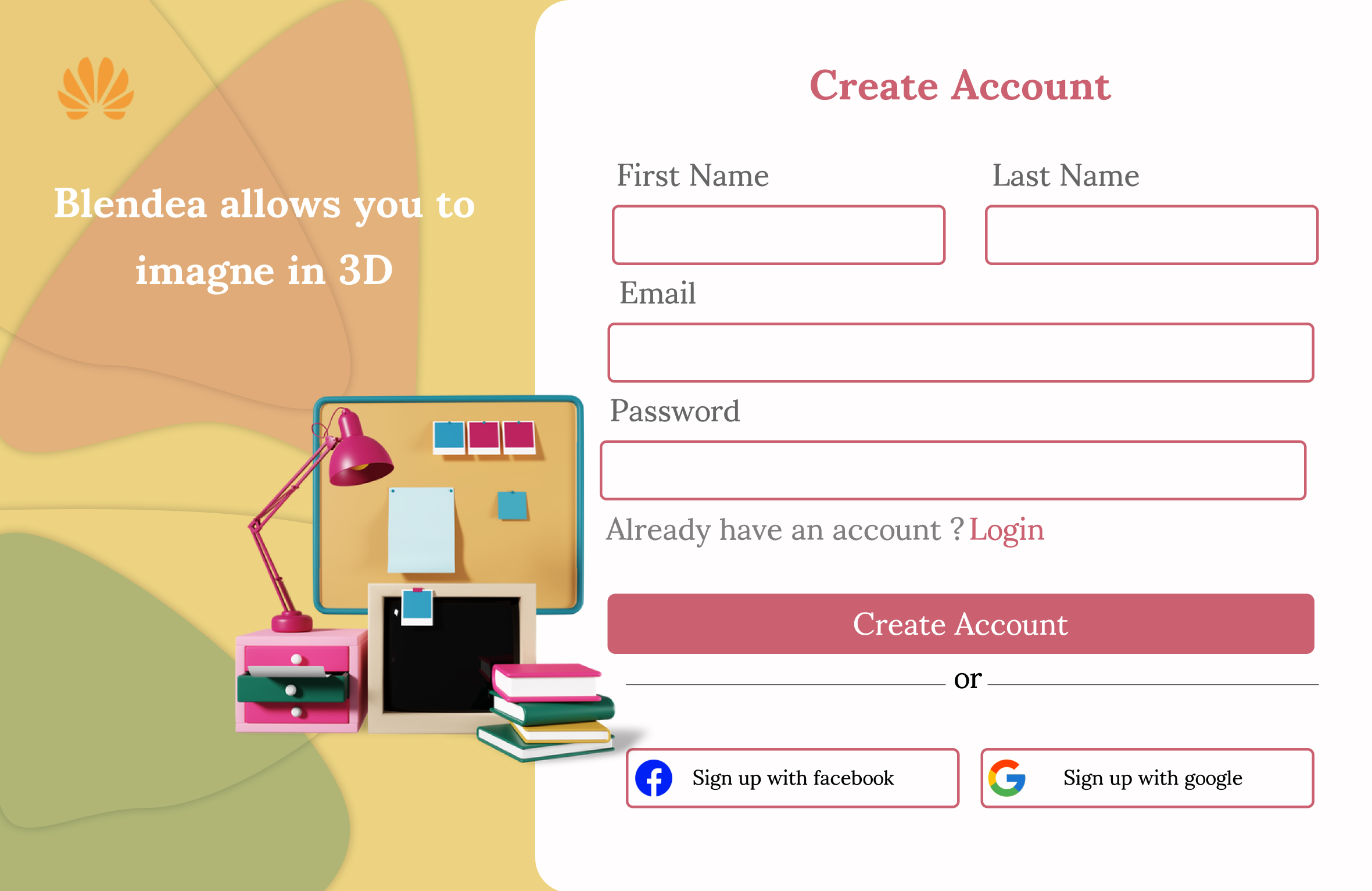
It's a good start on the signup page design. However, I agree with the previous review that more attention needs to be paid to the visual design.
Additionally, splitting first and last names into two fields seems unnecessary at this stage. This information, if needed for delivery or invoice, could be requested later when users are more committed.
There also needs to be more consideration given to the font sizes and element dimensions. Some buttons have insufficient touch target areas, and some text is so small it’s difficult to read.
Overall, the form could benefit from better spacing and alignment. Furthermore, the headline on the left contains spelling errors and lacks a clear value proposition, which could create mistrust among users.
Looking forward to seeing improvements!

Thanks for your work, but let me tell you that you need to improve your design knowledge and work cleaner.😊
In your work I see problems with element alignment, indentation between the semantic sides of elements, with padding in elements. The design is a bit chaotic and disorderly. Pay attention to the UX Foundations course (principles of design), I also recommend taking the lesson on form design.
Also, it's not a good decision to use dark pink for the stroke in fields, because it looks like all fields have an error.
A good solution is to suggest registering with Facebook or Google accounts.👌
Good luck and looking forward to more work! 🙌

The alignment & spacing between are horrible. The chosen illustration could be better
You might also like

Pulse — Music Streaming App with Accessible Light & Dark Mode


Islamic E-Learning Platfrom Dashboard

SiteScope - Progress Tracking App


Mobile Button System


FlexPay


CJM for Co-Working Space - WeWork

Visual Design Courses

UX Design Foundations


Introduction to Figma

Design Terminology
