iPermit Pro • UX/UI Challenge

This project involved redesigning iPermit Pro, a contractor portal, as part of a real-life design challenge. The objective was to streamline the user experience for requesting permits for various home construction projects, ensuring a more efficient and user-friendly process.
Reviews
1 review

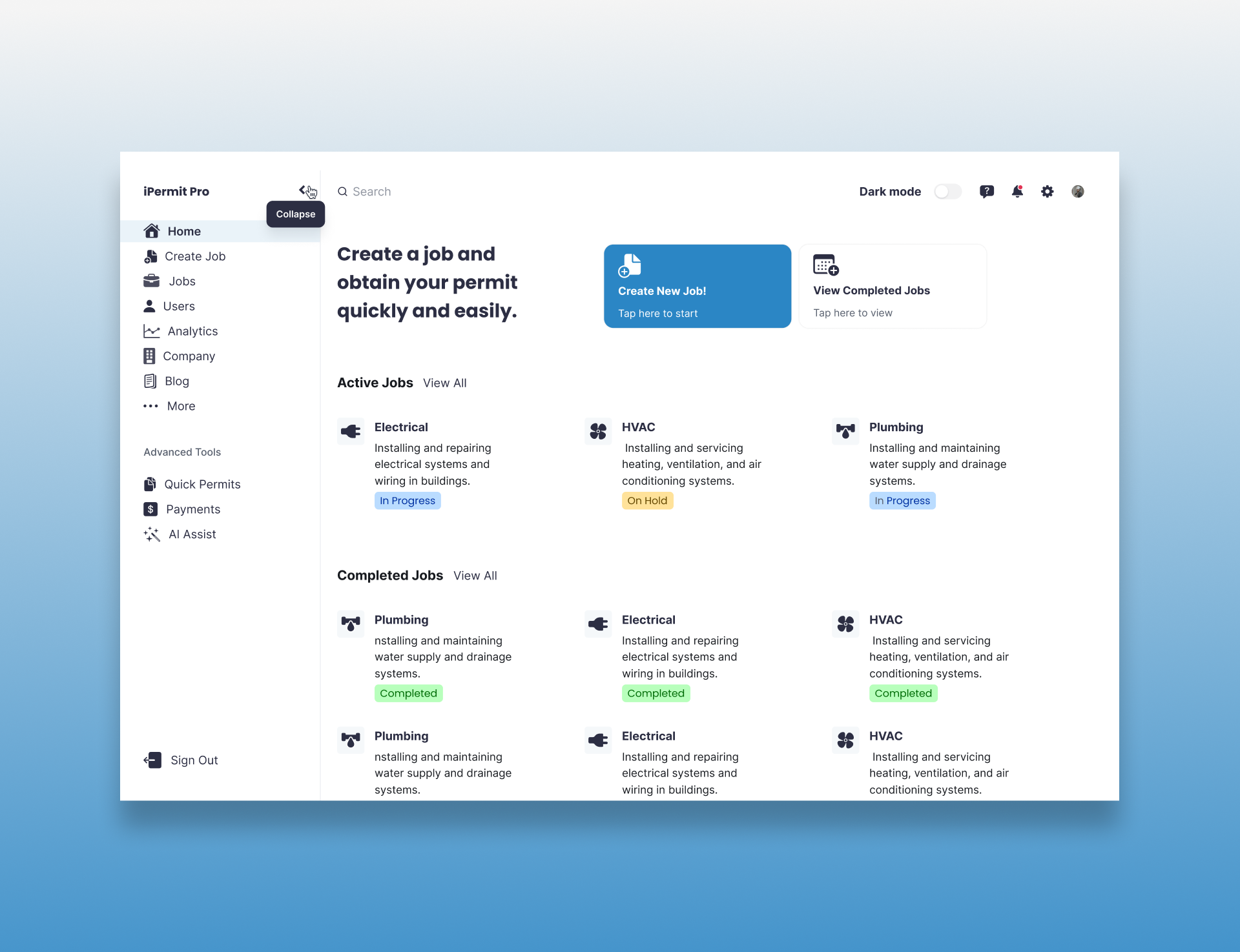
Paolo, your dashboard interface is clean, functional, and well-organized. The prominent cta buttons like "Create New Job" and "View Completed Jobs" offer clear navigation paths. The hierarchy is well-defined with active and completed job sections easily accessible. The sidebar navigation is intuitive with recognizable icons.
Improvements could focus on providing more visual distinction between job categories, improving the readability of smaller text elements, and adding tooltips for icons to enhance usability, especially for first-time users. Consistent spacing would improve legibility across sections.
You could also implement sorting by date completed, job type, or job priority to help users better manage their workload. or adding filters by job type (e.g., HVAC, plumbing, electrical), completion status (e.g., pending review, fully completed), or even assigned user would streamline navigation and make it easier to locate specific tasks in a large job list.
You might also like

Pulse — Music Streaming App with Accessible Light & Dark Mode


Islamic E-Learning Platfrom Dashboard

SiteScope - Progress Tracking App


Mobile Button System


FlexPay


CJM for Co-Working Space - WeWork

Popular Courses

UX Design Foundations


Introduction to Figma

Design Terminology
