Hero Section UX/UI Redesign
🔥 Before vs. After – Hero Section UX/UI Redesign! 🔥
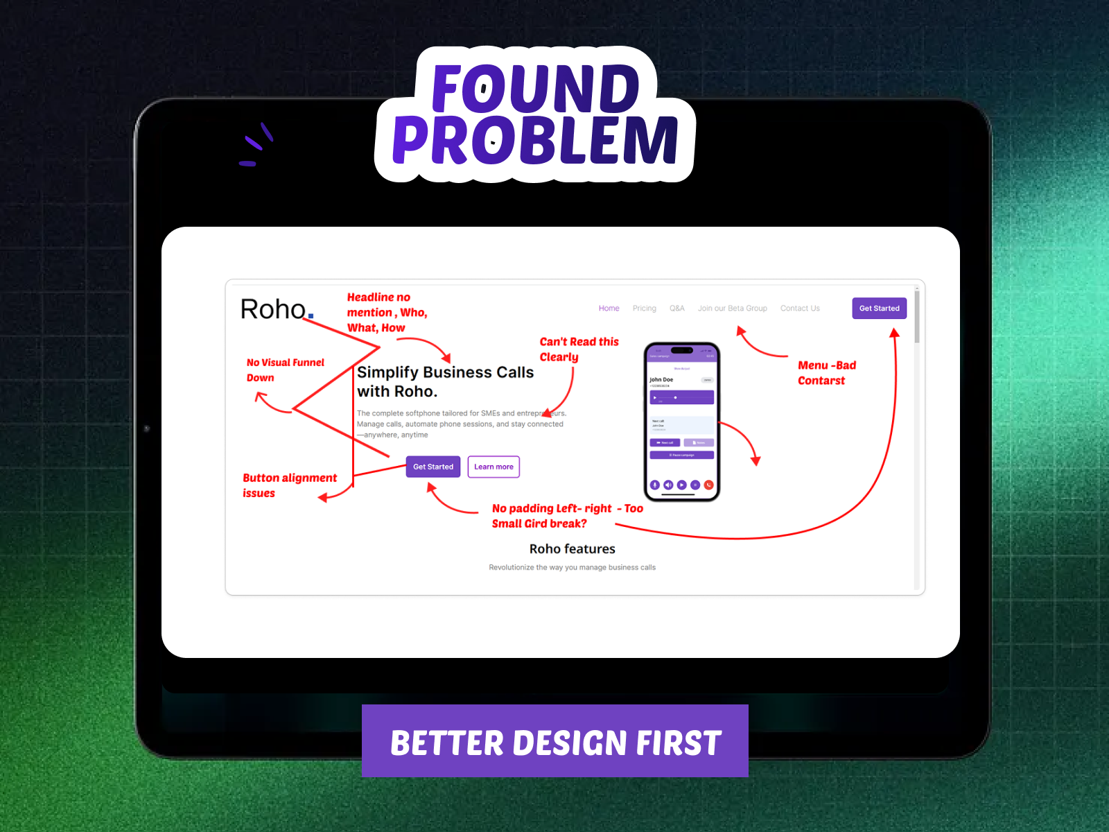
🚨 Initial Design Issues (Before Redesign)
The original hero section had UX/UI flaws impacting clarity, engagement, and conversions:
1️⃣ Unclear Headline & Messaging – No structured Who, What, How. Lacked a clear value proposition.
2️⃣ Weak CTA – Poor alignment and no directional guidance for user action.
3️⃣ Readability Issues – Low contrast in the menu, weak text hierarchy.
4️⃣ Lack of Trust Signals – No social proof or credibility elements, weak product preview.ts to build trust.
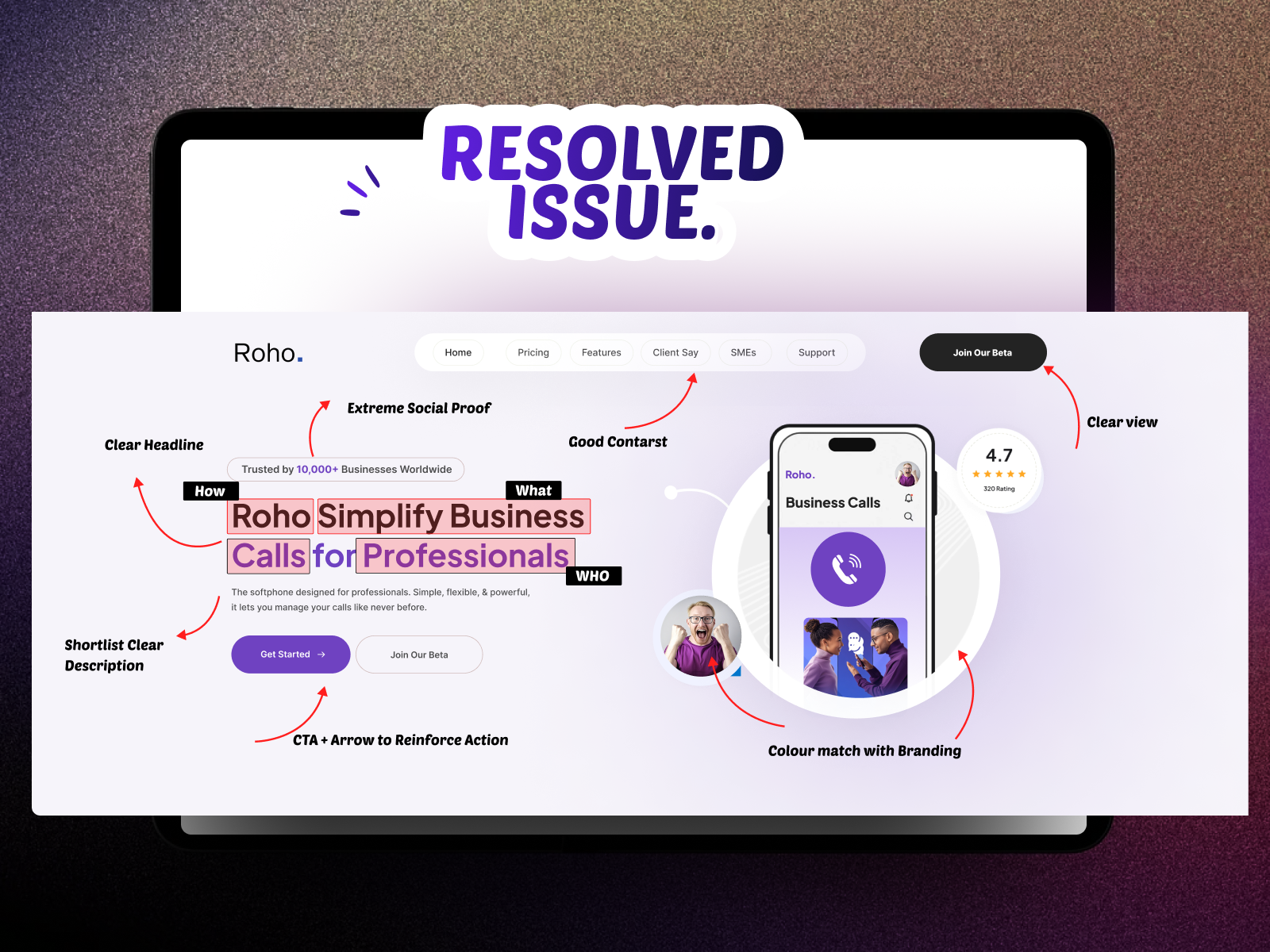
Final Outcome: A High-Converting, Engaging Hero Section
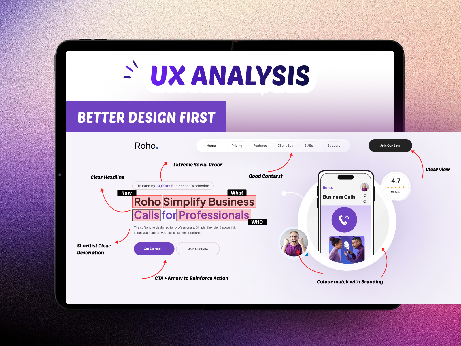
The redesigned hero section effectively improves clarity, usability, and trust, leading to better user engagement and conversions.
Design Principles Applied:
✅ Visual Hierarchy ✅ UX Copywriting
✅ Conversion Optimization ✅ Contrast & Readability
✅ Trust Signals & Social Proof
Reviews
1 review
Great job on the new design! The colour and contrast are a huge improvement, and the headline copy is well-crafted and effectively conveys the message. I like how you've used social proof to make the product more persuasive.
A couple of things you might want to look into:
- Beyond what you see - Accessibility: Making sure the design has proper semantic HTML, alt text for images, and keyboard navigation would make it more inclusive and reach a wider audience. It also benefits SEO.
- Internet consumers are more discerning: Exploring additional techniques, such as scarcity (e.g., limited-time offers), freemium model (e.g., provide free plan with limited features) or authority (e.g., expert endorsements), could further drive user engagement, build trust and encourage conversions.
You might also like

Pulse — Music Streaming App with Accessible Light & Dark Mode

Islamic E-Learning Platfrom Dashboard
SiteScope - Progress Tracking App

Mobile Button System

FlexPay

CJM for Co-Working Space - WeWork
Popular Courses

UX Design Foundations

Introduction to Figma


