Reviews
2 reviews
Hey Le,
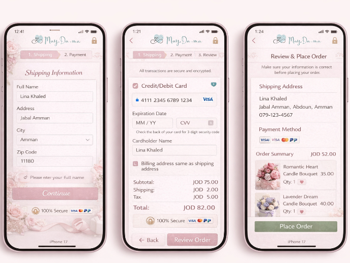
This redesign looks clean and easy to navigate — great job!
I especially liked the thoughtful touch of placing the subscribe component just below the logo in the footer. It’s a smart and engaging detail that adds value to the overall layout.
Your growth really shows!
5 Claps
Average 2.5 by 2 people
You might also like

Project
May.Da.Ma Candles & more

Project
Pulse — Music Streaming App with Accessible Light & Dark Mode
Platform & DeviceFor this project, I designed Pulse, a mobile music streaming application for iOS devices (using the provided mobile templat

Project
Islamic E-Learning Platfrom Dashboard
Visual Language & Color I wanted the interface to feel like a quiet room you'd actually want to sit in and study. The warm neutrals - off-wh
Project
SiteScope - Progress Tracking App
🧩 Project OverviewThis project showcases the design of a mobile login and sign up experience for a construction progress tracking app. The

Project
Mobile Button System
As my first ever ux design attempt, I tried to go with a simplified approach with only a few button types and states. I kept the color palle

Project
FlexPay
The onboarding was designed to reduce financial anxiety, create a sense of instant reward, and encourage early action. Instead of overwhelmi
Popular Courses

Course
UX Writing
Learn to write microcopy that communicates clearly and concisely to improve user experience, build trust, and boost conversions across digital products.

Course
Ethical & Responsible Product Design
Learn to build products that respect users, society, and the planet while driving sustainable business growth

Course
Government Design Foundations
Learn best practices and core principles for government design to create impactful, user-centered digital services that improve accessibility and efficiency.


