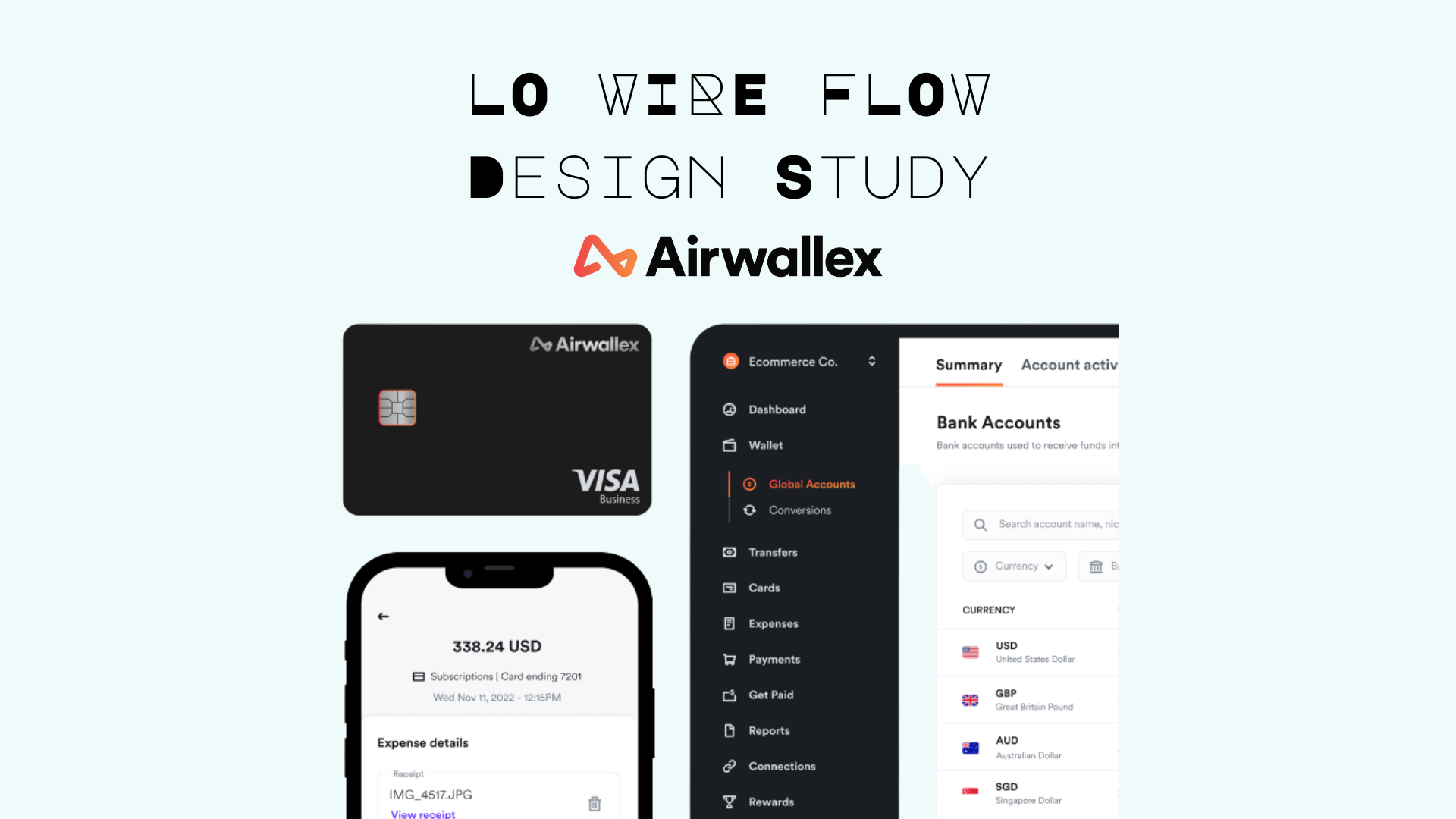
From Napkin Sketches to Market Dominance

THE CHALLENGE
Airwallex needed to validate their transfer flow concept quickly without investing in design. The goal will be to test if the flow works before the building stage.
THE SOLUTION: LOW FIDELITY SKETCHES
Why This Approach?
- Speed — Sketches take minutes
- Flexibility — Easy to change
- Focus — Logic only. No visual distraction.
- Testing — Users see flow, not aesthetics
THE SKETCHES
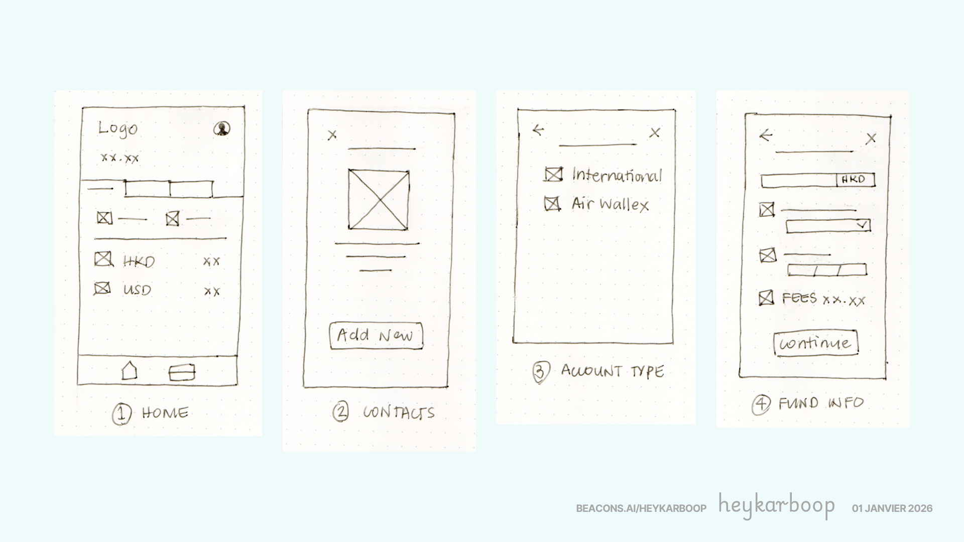
Home screen shows balance, account tabs, and quick actions (Transfer, Add Funds). Recipient screen captures account details with minimal required fields. Account Type offers a binary choice (International or AirWallex). Fund Details display the sending amount, currency, and live exchange rate.
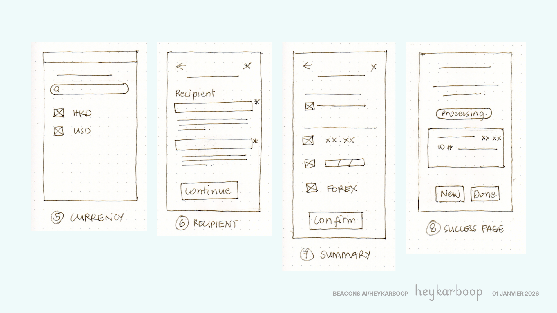
Summary page shows the complete breakdown—what you send, the rate applied, and what the recipient gets—before final confirmation.
Each screen serves one purpose: guide users from decision to confirmation with zero confusion.
WHY THIS WORKS
Minimal text keeps users focused on the flow rather than reading instructions. Simple layouts make it easy to change, test, and iterate quickly based on feedback. Without visual decoration, the core question becomes clear:
Does the path work? Can users find what they need?
This stripped-down approach reveals exactly what matters - the logic of the experience, not the aesthetics.
KEY FINDINGS FROM SKETCHES
Sketches revealed four critical insights that simplified the flow:
- Currency Selection Needs Priority - Users needed quick access to currencies and not buried in menus.
- Two Decisions, Not Five - Early branching confused users so they've used simplified to binary choices
- Amounts Matter - Users wanted transparency in fees and exchange rates, committed by the bank before user acceptance.
- Confirmation Page is Essential - A summary screen that builts trust before the money moves.
TIMELINE
Day 1: Review of Airwallex screenshots and initial drawings with iterations
Day 2: Redrawing of a second version with less noise and clutter and final alterations before going to screen
Day 3: Proceed to developing mid fidelity wireframes in Figma
KEY TAKEAWAY
This case study illustrates the value of low-fidelity wireframing in product design validation. By prioritizing rapid iteration over visual polish, Airwallex's team was able to identify critical user needs early in the design process. The minimal, sketch-based approach facilitated faster feedback cycles and reduced rework, ultimately accelerating time-to-market without compromising user experience quality.
Reviews
2 reviews

Excellent work on this low-fidelity wireflow design study for Airwallex! The presentation is clean and professional, making it easy to follow the user journey through the bank account management system.
Strengths:
- Clear visual hierarchy with well-organized screens
- The wireflow effectively demonstrates the account summary and transaction flow
- Good use of typography to establish information architecture
- The mobile-first approach shows strong UX thinking
Suggestions for improvement:
- Consider adding annotations to explain key decision points in the flow
- It would be valuable to see more context about user pain points this design solves
- Adding interaction states (hover, active, disabled) would make this even more comprehensive
Overall, this is a solid foundation for a fintech product. The attention to detail in the account structure is impressive. Great job!

Hi Karen!
The title alone signals ambition and that’s a good thing. “From napkin sketches to market dominance” suggests a journey from ideation to impact, which is exactly the arc strong case studies should follow. It frames design as a strategic driver, not just execution.
What I find compelling in projects like this is the evolution story. If you’ve shown how early assumptions were validated, refined, or challenged along the way, that demonstrates growth and product thinking. The ability to translate rough ideas into structured, scalable solutions is a core senior-level skill.
To elevate it further, I’d ensure the “market dominance” claim is backed by measurable outcomes. Concrete results growth metrics, user adoption, revenue impact would strengthen the credibility of the narrative. Overall, this feels like a confident, outcome-oriented story with strong positioning.
You might also like

Smartwatch Design for Messenger App


Bridge: UI/UX Rebrand of a Blockchain SCM Product


Pulse Music App - Light/Dark Mode


Monetization Strategy


Designing A Better Co-Working Experience Through CJM


Design a Settings Page for Mobile
Popular Courses

Introduction to Figma


The Product Development Lifecycle & Methodologies


Product Management for Designers