Filtreach Variation Design

Reviews
1 review

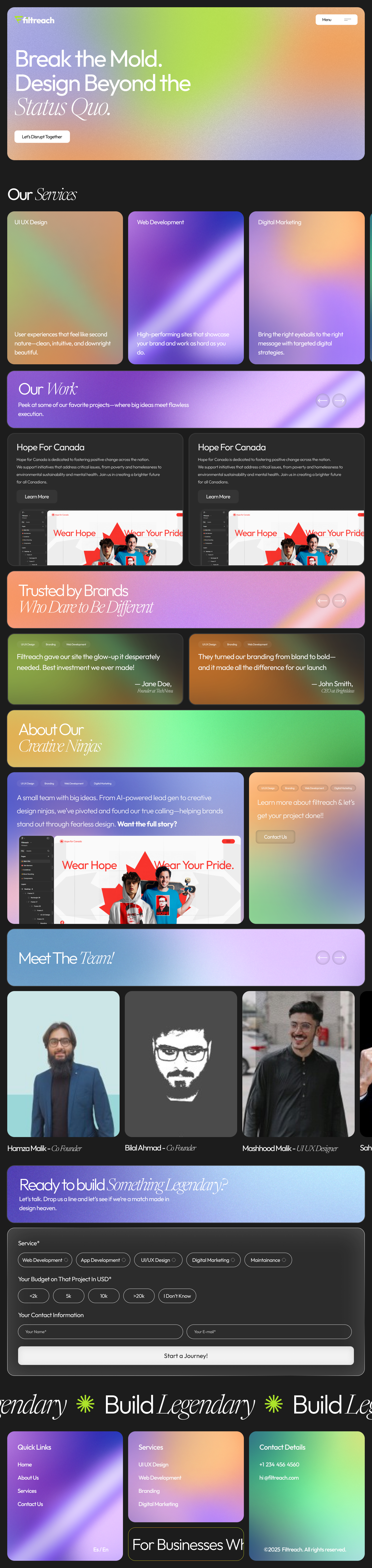
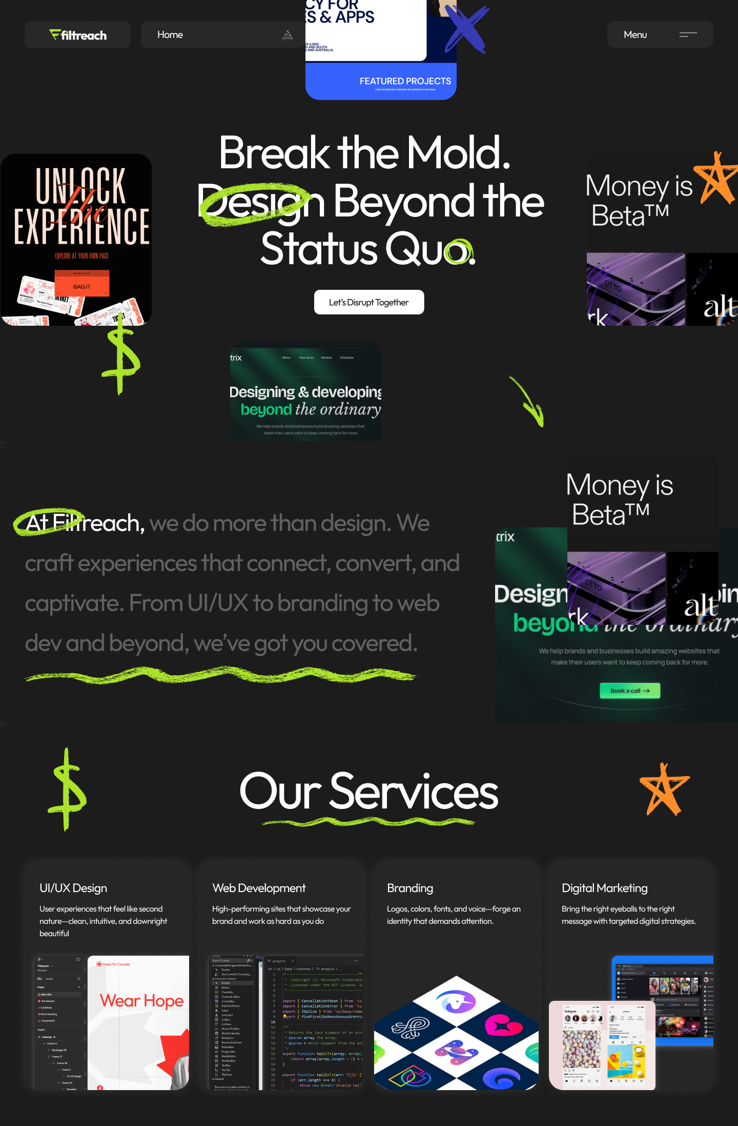
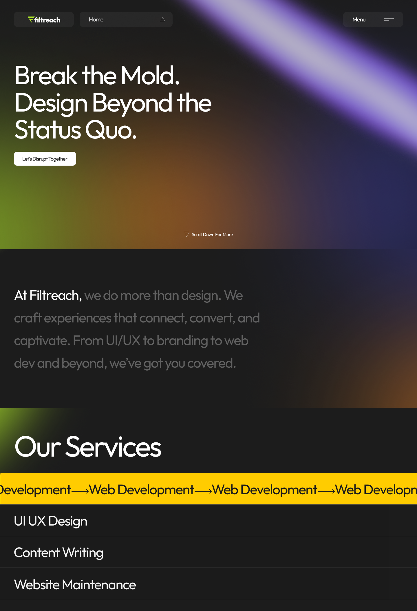
Hi Mashhood! Thanks for posting this- I love the vibrancy of the product, type combinations, and overall layout of your landing page. I would love to see this brought to life with some motion design on a live site.
Two thoughts I had- visual clutter and color contrast. The content on these pages is tightly knit with a range of bright and strong colors. Numerous large elements are repeated throughout the page. The design is evocative, but I wonder if the balance between aesthetics and functionality needs to be tweaked. Additionally, if client-facing work is your goal, I might look into making colors more accessible. From a quick review, I believe many of the white text areas on the gradients here don't meet WCAG standards.
Overall, I really love this direction, and everything in design has a level of subjectivity to it! Food for thought.
You might also like

Accessible Signup Form


Auction


Entrant - Analytical Dashboard


Transit Cairo — Digital Mobility Redefined


Babylon Balance - Designing Financial Clarity Through Constraint


Entrant Accessible Signup and Login Forms
Popular Courses

UX Design Foundations


Introduction to Figma

Design Terminology
