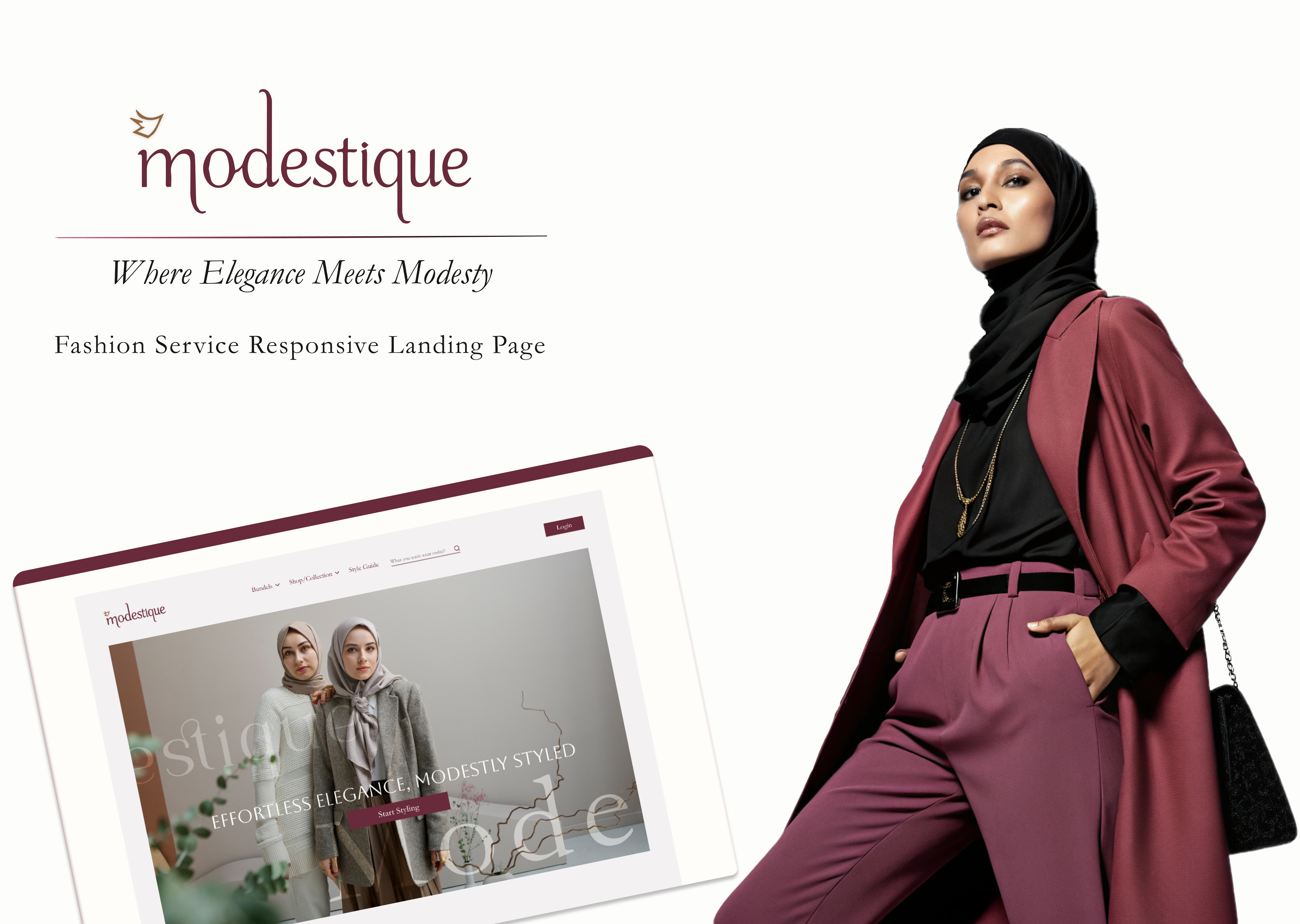
Fashion Landing Page – Personalized Styling for Modest Wear
🔍 Project Overview
This project is a landing page design for a fashion service that offers personalized styling for Islamic outfits (skirts, dresses, hijabs, bags, and formal outfits). The goal was to create an elegant, modern, and user-friendly experience for customers looking for curated modest fashion styles.
🚀 Problem Statement
Many online fashion platforms lack a personalized approach to modest styling, making it difficult for users to find curated looks that align with their preferences. The challenge was to design a visually appealing, easy-to-navigate landing page that reflects the brand’s identity and enhances the shopping experience.
🔬 Research & Competitive Analysis
To ensure the design aligned with industry standards, I analyzed six global and Middle Eastern competitors that offer a "Create Collection" functionality. The competitor research focused on:
✅ UI Design & Aesthetic Trends
✅ User Flow & Ease of Navigation
✅ Personalization Features & Engagement
Findings showed that a minimalist approach, combined with bold typography and high-quality imagery, enhances the user experience while keeping the focus on products.
Key UI Decisions
1️⃣ Hero Section: Features a large hero image showcasing stylish outfits, immediately capturing attention.
2️⃣ Clear CTAs: Encourages users to explore curated collections effortlessly.
3️⃣ Typography Hierarchy: Ensures information is easily digestible and visually appealing.
4️⃣ Mobile-First Approach: Optimized for seamless responsiveness across all devices.
📲 Final UI & Prototype
The final design blends aesthetic appeal with functionality, creating an immersive user experience.
✨ Check out the Responsive prototype here: (https://www.figma.com/proto/3vGfcN5Xnf2OXaZJXRhwKh/Landing-Page-for-Fashion-Service?page-id=0%3A1&node-id=187-282&p=f&viewport=1286%2C1244%2C0.11&t=e1XewIiNPqBVCu8k-1&scaling=contain&content-scaling=fixed&starting-point-node-id=187%3A282&show-proto-sidebar=1)
Tools used
From brief
Topics
Share
Reviews
1 review
Hello Mariam Adel Abdelrazek,
Your research is detailed and comprehensive—well done! The designs also look minimalistic and clean, perfectly aligned with your research. I have a few feedback points that can help enhance the design even further. Since we are focusing on mobile-first, my feedback will be for the mobile version:
1- Typography Hierarchy: Since the font is serif, reducing its weight and color intensity makes it stand out more compared to other fonts. In some areas, the contrast appears low, which can be easily noticed. Increasing the color intensity slightly and making the text a bit bolder will greatly improve readability. For text placed over images, adding a semi-transparent black overlay on the images will help enhance legibility.
2- Filter Section: The filter section appears out of the grid, disrupting both the visual hierarchy and systematic structure. Keeping it inside the grid will provide a more structured and clean look. Instead of traditional filters, you might consider using “chips” for category selection, which would be a more seamless and user-friendly alternative.
3- Product Image Size on Mobile: The clothing images appear too large, forcing users to scroll twice just to see the product—and even then, they can’t fully view it. To improve this, you can display 2 or more products per scroll, following best mobile UX practices. This will not only enhance the user experience but also positively impact sales.
With these adjustments, your already strong design will become even more refined. Great job! Keep up the amazing work! 🚀
You might also like
🖥 Desktop Checkout Flow Design
Website CRM Dashboard
Helpful 404 Error Page for a Fintech Mobile App
Pebble Accessible SAAS Signup Flow
Music Player UI - Light & Dark Mode
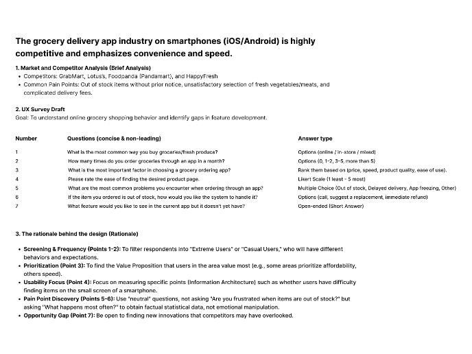
Create a UX Research Survey
Content Strategy Courses

UX Writing

Common UX/UI Design Patterns & Flows


