Empty State Design For Educational App

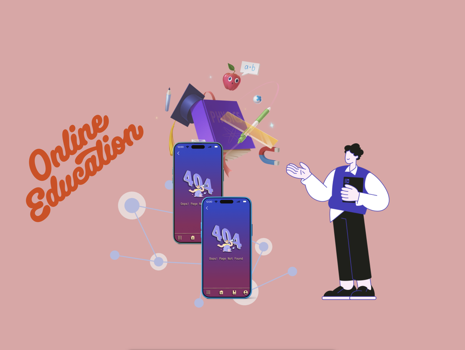
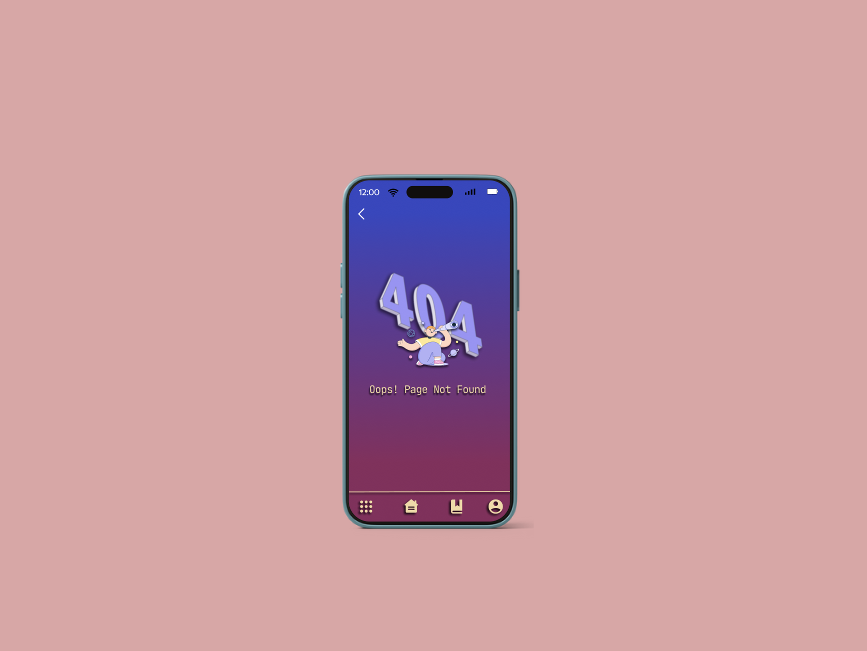
The design choice for this empty state page in an educational application leverages a combination of visual appeal and thematic relevance to create a positive user experience.
* Visual appeal: The cartoon character and the use of colour make the page engaging and inviting, especially for younger users.
* Thematic relevance: The telescope directly relates to the concept of discovery and learning, which aligns with the purpose of an educational application.
This design aims to inform users about the empty state in a way that is both informative and lighthearted.
* Character: Consider incorporating a friendly and relatable mascot or character that embodies the spirit of learning and exploration.
* Colour: Utilise a vibrant colour scheme that reflects the app's brand identity while fostering a positive and energetic atmosphere.
Thematic relevance:
* Imagery: Select an image that directly ties in with the concept of education and knowledge acquisition.
* Messaging: Craft clear and concise text that informs users about the empty state and guides them towards taking the desired action.
By combining these elements, you can create an empty state page that effectively communicates its purpose while remaining engaging and aligned with the app's overall theme.
In conclusion, this empty state page design effectively utilizes visual appeal and thematic relevance to create a positive user experience in an educational application. It sets the tone for learning and exploration, while remaining informative and user-friendly.
Tools used
From brief

Topics
Share
Reviews
1 review
Thank you for your effort. The illustration is relevant for the 404 error page, although from the visual side, shadows are a bit too heavy, making the screen appear a bit visually overloaded. However, the main point of the 404 page is the error message - the copy. and although you've written "Messaging: Craft clear and concise text that informs users about the empty state and guides them towards taking the desired action," your copy doesn't explain much nor guides users toward some exit. I recommend exploring the 11 Best Practices for Designing 404 Pages lesson to gain an understanding of a good and informative 404 page.
You might also like

Pulse — Music Streaming App with Accessible Light & Dark Mode


Islamic E-Learning Platfrom Dashboard

SiteScope - Progress Tracking App


Mobile Button System


FlexPay


CJM for Co-Working Space - WeWork

Content Strategy Courses

UX Writing


Common UX/UI Design Patterns & Flows


Building Content Design Systems
