EchoWave — Accessible Light & Dark Mode Music App

Project Summary
EchoWave is a conceptual music streaming mobile app designed to explore accessible light and dark mode implementation.
The project focuses on applying dark mode best practices, WCAG color contrast guidelines, and color testing methods to create a comfortable and readable listening experience across different lighting conditions.
Context & Problem
Music streaming apps are often used for extended periods, especially at night or in low-light environments. While dark mode is increasingly expected, poorly designed dark themes can reduce readability, strain the eyes, and fail accessibility standards.
The challenge was to design a product that supports both light and dark modes while maintaining strong hierarchy, brand consistency, and WCAG-compliant color contrast.
Applying the 13 Principles of Dark Mode Design
Principles Applied
Avoided direct color inversion
Light mode colors were not simply inverted. Instead, a dedicated dark palette was created using modified contrast and adjusted luminance values.
Avoided pure black
Pure black (#000000) was avoided in favor of a near-black background to improve readability and reduce eye strain.
Used desaturated colors
Brand and accent colors were slightly desaturated in dark mode to improve comfort and contrast against dark surfaces.
Maintained brand identity
The primary brand color was preserved across themes, with increased luminance in dark mode to meet accessibility requirements.
Provided user control
Users can manually switch between Light, Dark, and System themes from the Settings screen.
Color Accessibility (WCAG Compliance)
All text, icons, and interactive elements were designed to meet WCAG 2.2 Level AA contrast requirements.
Normal text maintains a minimum contrast ratio of 4.5:1, while icons and UI components meet or exceed the 3:1 requirements.
Key Accessibility Decisions
- Primary actions in dark mode were brightened to pass contrast checks
- Secondary text uses reduced contrast without falling below WCAG limits
- Color is never used as the sole indicator of state (icons and labels reinforce meaning)
Contrast was validated using online contrast checkers during the design process.
Testing Color Combinations
Color combinations were tested iteratively during design to ensure readability, comfort, and clarity.
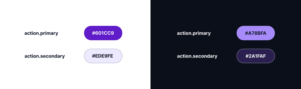
Multiple variations of primary action colors were evaluated against dark backgrounds until a color that met WCAG requirements for small text, large text, and UI components was selected.
I initially chose action.primary #6D28D9 for both light and dark modes. However, upon reviewing an online contrast checker, I found that action.primary does not meet the necessary contrast standards against bg.default #0B0F19. While it's important to maintain consistency in primary color across modes, prioritizing accessibility is essential.
The color #6D28D9 may seem saturated at first glance, but it's important to understand that saturation does not equal luminance. According to the Web Content Accessibility Guidelines (WCAG), contrast ratios are determined by relative luminance, and purple ranks poorly for contrast in dark mode for several reasons:
- It is positioned in the mid-spectrum.
- It inherently lacks brightness.
- Simply increasing saturation fails to boost contrast significantly.
Recognizing that increasing saturation wouldn't yield the desired results, I explored several lighter shades of purple. The findings were clear:
- #8B5CF6 delivered an impressive contrast ratio of 7.04:1, which is rated as "Very Good."
- #A78BFA achieved a contrast ratio of 4.52:1, deemed "Good."
Thus, #8B5CF6 stands out as the optimal choice. Moving forward, the primary actions will maintain our brand hue across modes and adjust luminance in dark mode to fully meet WCAG contrast requirements. This approach ensures a seamless and accessible user experience.
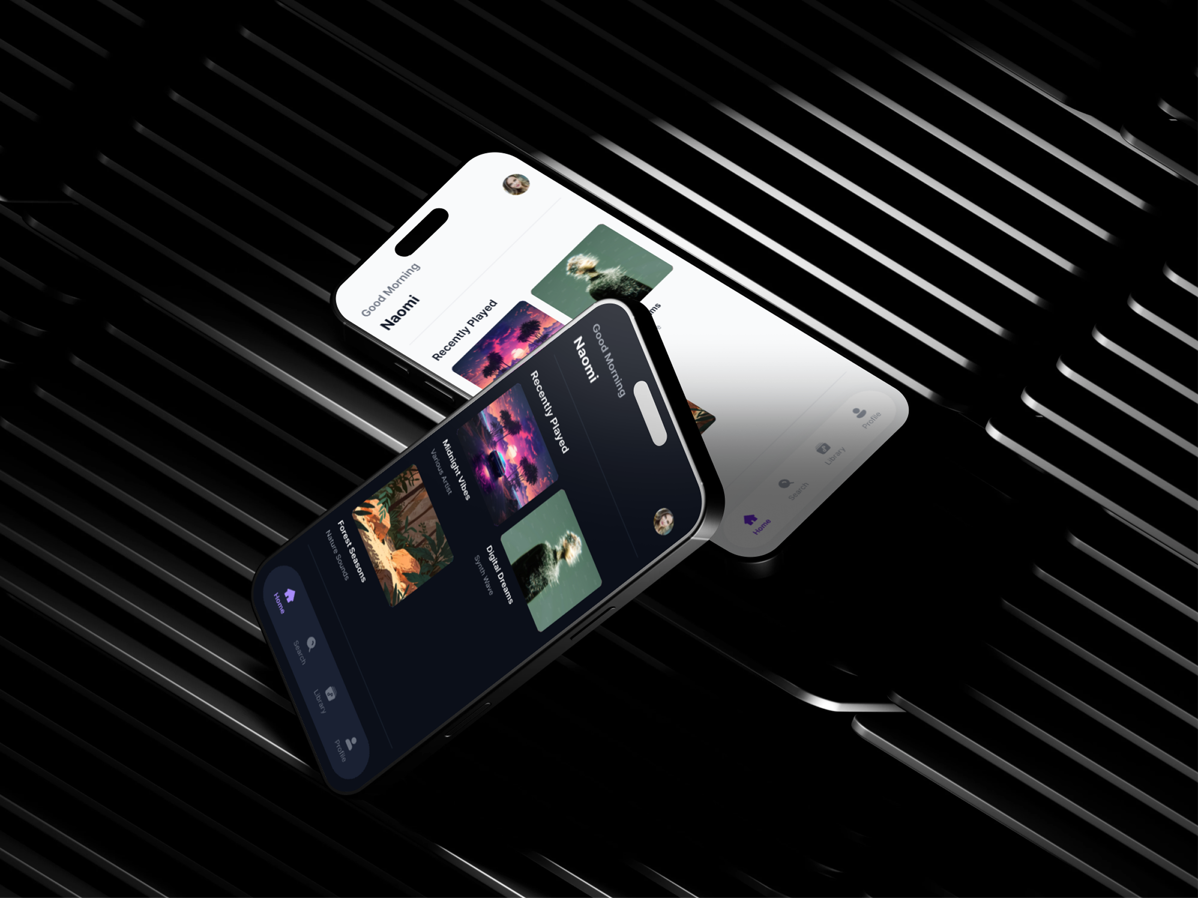
Design Solution (Screens Overview)
Keep this short.
The final design includes the core music app flow:
- Home (content discovery)
- Search (exploration)
- Library (saved content)
- Playlist detail (content focus)
- Now Playing (immersive playback)
- Settings (account, playback, appearance)
Bottom navigation is used only on top-level destinations, while focused screens remove it to reduce distraction.
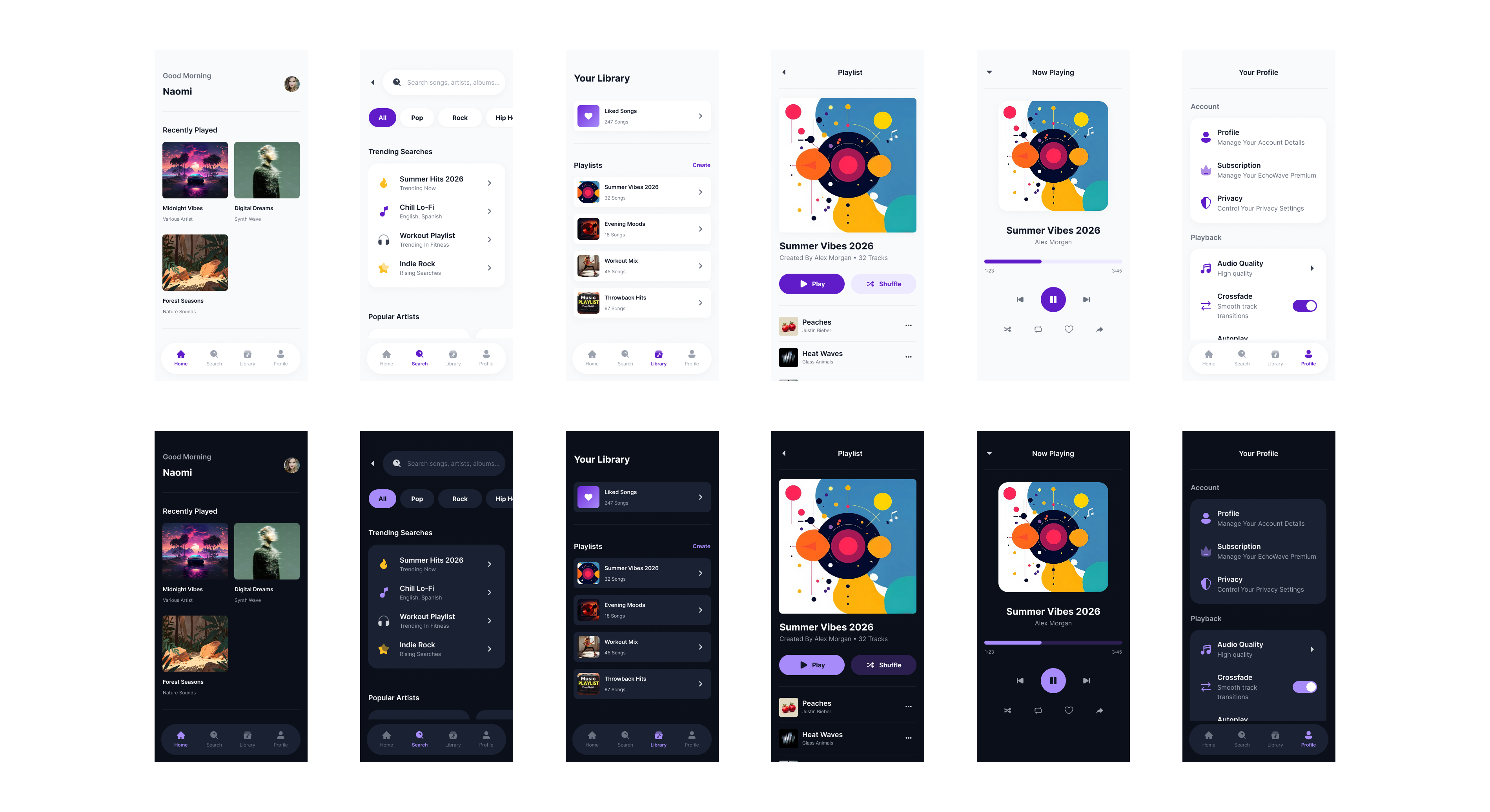
Scannability was prioritized through strong visual hierarchy, clear sectioning, and consistent spacing. Key actions are visually emphasized, while secondary information is intentionally de-emphasized to reduce cognitive load.
- Home: Recently Played → Recommended → Featured
- Playlist: Play as primary action, Shuffle as secondary
- Library: Liked Songs surfaced first
The visual design uses a neutral, modern color palette to support long listening sessions without visual fatigue. Accent colors are used sparingly to highlight primary actions, while typography and imagery work together to maintain clarity and emotional engagement.
- Neutral backgrounds + near-black text
- Desaturated colors in dark mode
- Album artwork as emotional anchors
- Consistent typography scale
Reflection & Learnings
This project reinforced the importance of intentional dark mode design rather than simple color inversion.
I gained a deeper understanding of how contrast, saturation, and hierarchy behave differently in dark environments, and how accessibility decisions directly impact usability for a wide range of users.
Behance Case Study: https://www.behance.net/gallery/243578103/EchoWave-Music-Streaming-App-%28Light-Dark-Mode-UXUI%29
Tools used
From brief

Topics
Share
Reviews
2 reviews

Exceptional work, David! Your color theory, contrast analysis, and intentional dark mode design shows mastery. Here's my feedback:
Strengths:
- Accessibility expertise: You explain why (saturation ≠ luminance), not just apply WCAG. Deep understanding, not checkbox compliance
- Color documentation: Journey from #6D28D9 to #8B5CF6 with contrast analysis (7.04:1) is exemplary
- Dark mode principles: Applied all 13 principles comprehensively—no inversion, no pure black, desaturated colors, brand consistency, user control
- Intentional hierarchy: Strong visual hierarchy, clear sectioning, consistent spacing. Scannability prioritized
- Reflection: You articulate learnings—maturity separates junior from senior
- Complete flow: Home → Search → Library → Playlist → Now Playing → Settings
- Interactive prototype: Clickable prototype provided
Areas for Refinement:
- Motion & Micro-interactions — Show playback states, transitions, and loading states. Music apps are inherently dynamic. Static screens miss this
- Real-Use Scenarios — Show app in different lighting (bright sunlight, dim room, night). Validates accessibility claims in context
- Edge Cases — Long playlist names? Offline mode? Network errors? These reveal design maturity
- Accessibility Testing — Did you test with actual users (colorblind, low-vision, screen reader)? Document this
- Performance — Music apps need fast load times and smooth scrolling. Did you consider performance?
Key Questions:
- How does this compare to Spotify, Apple Music, and YouTube Music?
Overall: Exceptional work. You've demonstrated mastery of accessibility, color theory, and intentional design. You're thinking like a senior designer.
Next: Add motion/transitions, show real-use scenarios, test with actual users, and address edge cases. You're at 90% of an excellent case study.

Hi David!
This one feels really polished 🎵✨ The light and dark modes actually feel intentionally designed, not just color-swapped versions of each other. That shows real attention to detail.
I especially like the accessibility focus. Music apps get used in so many environments, and the readability and contrast here seem thoughtfully handled. It feels immersive but still practical 👌🌙
If I’d take it a step further, maybe show more real-use scenarios like playback states or motion during transitions. That would make the experience feel even more alive. Overall though, clean, intentional, and well executed.
You might also like

Smartwatch Design for Messenger App


Bridge: UI/UX Rebrand of a Blockchain SCM Product


Pulse Music App - Light/Dark Mode


Monetization Strategy


Designing A Better Co-Working Experience Through CJM


Design a Settings Page for Mobile
Visual Design Courses

UX Design Foundations


Introduction to Figma

Design Terminology
