Dropbox Sign/Signup Page

The primary goal of the project was to design a user-friendly, accessible, and secure signup/signin page for Dropbox, catering to a wide range of users, including those with varying levels of tech-savviness and different accessibility needs. The focus was on ensuring ease of use, quick access, and compliance with WCAG (Web Content Accessibility Guidelines) standards.
Defining Requirements
Usability: The signup/signin page needed to be intuitive and easy to navigate, minimizing the number of steps required to complete the process.
Accessibility: Compliance with WCAG 2.1 guidelines was a priority to ensure the page was accessible to users with disabilities, such as those who rely on screen readers or keyboard navigation.
Security: Given the sensitive nature of the information stored on Dropbox, security features like multi-factor authentication (MFA) and password strength indicators were essential.
Design Rationale
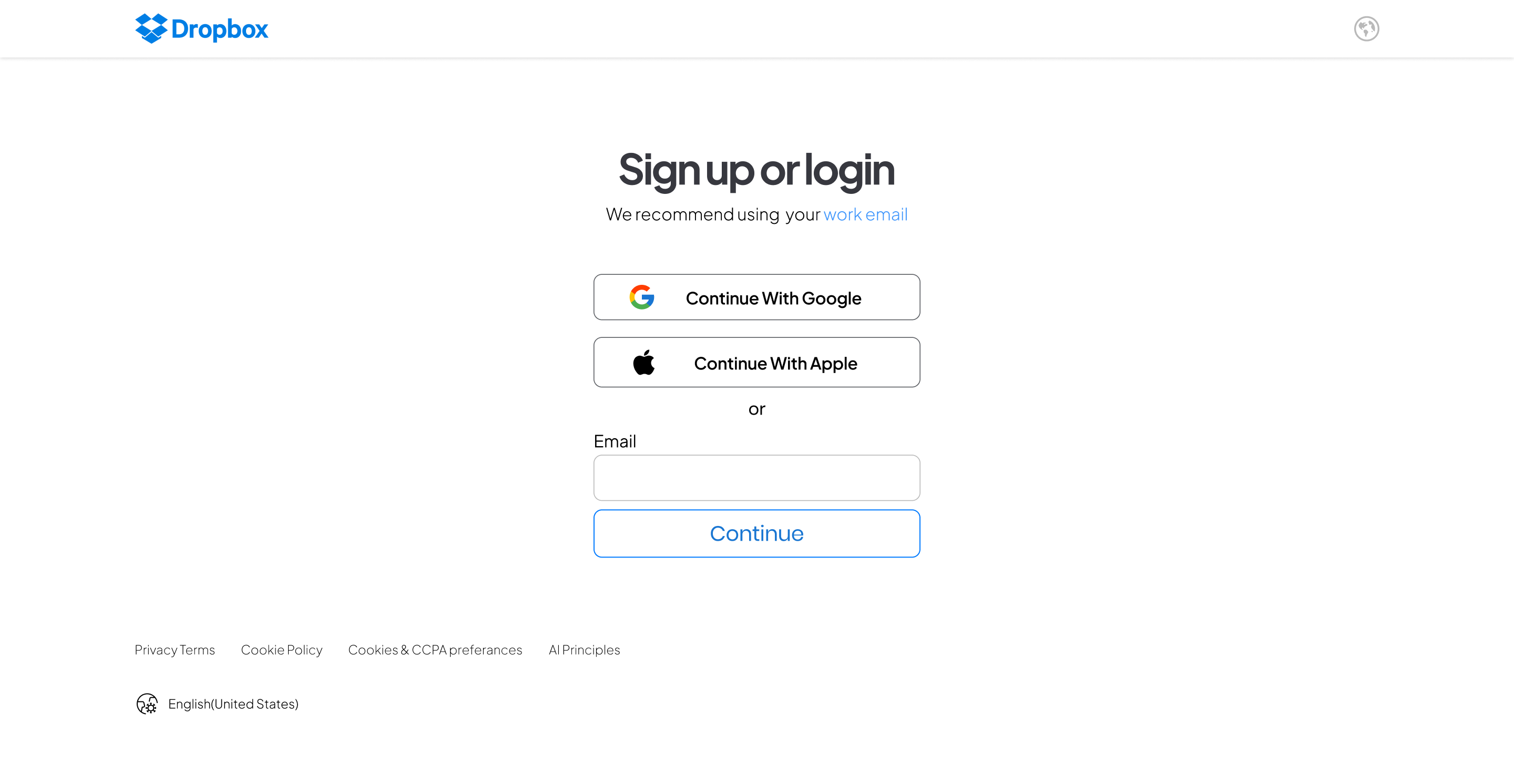
- Minimalist Interface: A clean, minimalist design was chosen to reduce cognitive load and prevent users from feeling overwhelmed. The interface was kept simple, with a clear focus on the primary actions: signing up or signing in.
- Progressive Disclosure: Only essential fields were displayed initially, with additional options (like "Sign in with Google" or "Forgot Password") revealed progressively. This approach helped maintain a streamlined look while still offering flexibility.
- Visual Hierarchy: A strong visual hierarchy was established to guide users through the process. For example, the "Sign In" button was prominently displayed, while secondary actions like "Create an Account" were placed nearby but in a slightly less prominent position.
- Color Contrast: High-contrast colors were used for text and interactive elements to ensure readability, especially for users with visual impairments. The design also considered color blindness by avoiding reliance on color alone to convey information.
- Error Handling: Inline validation was implemented to provide immediate feedback when users entered incorrect information, reducing frustration and improving the overall user experience. Error messages were clear and instructive, guiding users on how to correct the issues.
Tools used
From brief

Topics
Share
Reviews
1 review

Sreejith, the presentation is solid, and you’ve effectively highlighted the importance of WCAG and how you’ve implemented it on your page. However, some of your color choices don’t meet the guidelines. For instance, the label text with color #AFAFB2 doesn’t pass the contrast checker—it only achieves a 2.18:1 ratio, which is below the minimum 3:1 requirement. I recommend reviewing your color choices and, if necessary, running the accessibility plugin again to fix the contrast issues where needed.
You might also like

Pulse — Music Streaming App with Accessible Light & Dark Mode


Islamic E-Learning Platfrom Dashboard

SiteScope - Progress Tracking App


Mobile Button System


FlexPay


CJM for Co-Working Space - WeWork

Visual Design Courses

UX Design Foundations


Introduction to Figma

Design Terminology
