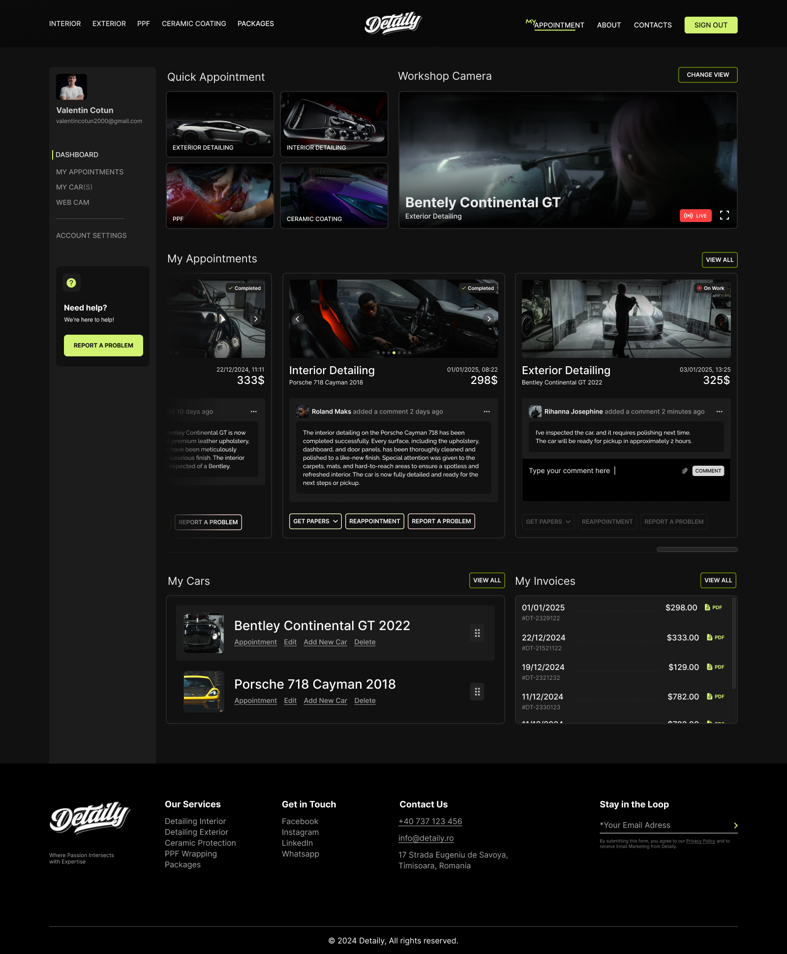
Detaily - Car Detailing Website
Background
In this case study, I’ll share how I designed Detaily's website—a platform for a premium car detailing studio dedicated to meticulous vehicle care. I’ll take you through the process of creating a user-focused experience that improves engagement and drives online performance. From shaping the visual identity to enhancing functionality, this project reflects my approach to delivering impactful design solutions.
The Challenge
Car owners often struggle to find reliable, high-quality car detailing services online. Many face challenges navigating websites, understanding pricing, and booking services, which leads to frustration and confusion. Through my research, I found that while customers recognize the value of these services, the lack of a clear, intuitive website design makes it harder for them to trust and engage with the business. Something is missing.
Solution
I’m creating a user-focused online solution for car detailing that prioritizes ease and transparency. Features include 24/7 live cam tracking of cars in the garage, real-time service monitoring, seamless online booking, and dynamic pricing for clear service details. Users will also have a personal cabinet to track everything about their vehicle while it's being worked on. These intuitive features ensure a smooth, engaging experience for every customer.
Tools used
Topics
Share
Reviews
1 review
This seems like a very big and well-thought-out project Valentin. I like the documentation of the process and the whole idea of the project. It would be nice to see this in a bit deeper form. Two things I could bring as my comment here.
- It would be nice if we could zoom in on some pages and graphs on your portfolio page. I believe for people like us it is important that we get the wider picture of what is happening there. Maybe it is just me, but unfortunately at the moment I can't click and zoom on any of your images.
- Regarding the designs that I could see from far away, I would say there is only one thing that can be improved and that is visual hierarchy. It's always good to give certain components and elements some room to breathe. You could easily achieve this with minimum effort by just rearranging a couple of stuff.
Other than this. I believe this is a strong and well thought output. Well done!
You might also like

Pulse — Music Streaming App with Accessible Light & Dark Mode

Islamic E-Learning Platfrom Dashboard
SiteScope - Progress Tracking App

Mobile Button System

FlexPay

CJM for Co-Working Space - WeWork
Popular Courses

UX Design Foundations

Introduction to Figma


