Design Rationale: B2B ERP Customer Portal Checkout

Design Rationale: B2B ERP Customer Portal Checkout.
Problem Context
Cart abandonment in B2B e-commerce stems from different friction points than B2C: complex approval processes, price verification needs, bulk ordering requirements, and multi-stakeholder decision-making. Traditional checkout flows fail because they assume single-session, single-user purchases.
Solution Approach
Design a checkout system that embraces B2B complexity rather than fighting it—treating baskets as workspaces, not just shopping carts.
Key Design Decisions
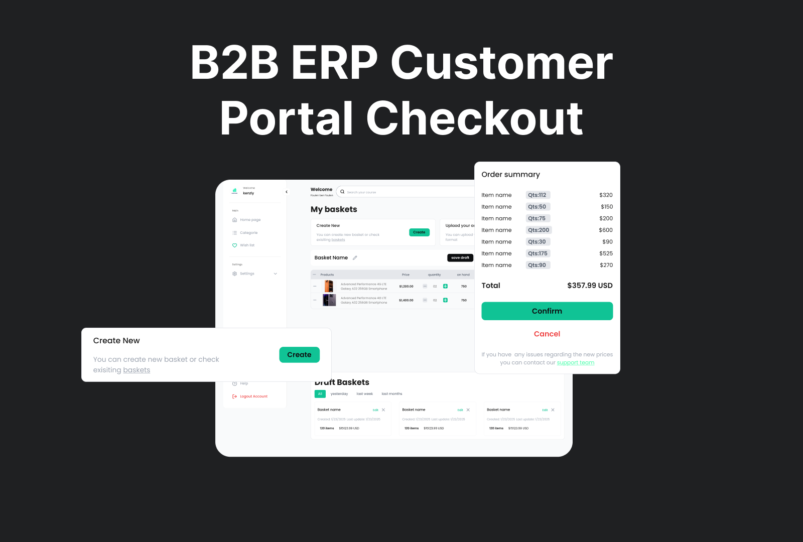
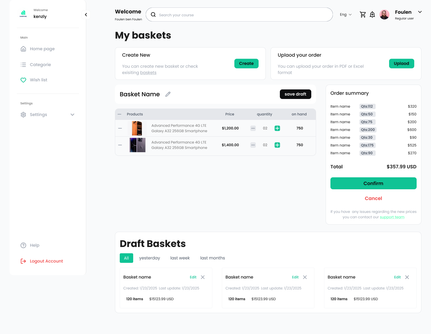
1. Multiple Baskets with Draft Saving
Rationale: B2B users rarely complete purchases in one session. They need to:
- Compare different order configurations
- Get internal approval before finalizing
- Pause and resume across days or weeks
How it reduces abandonment: Users don't lose progress when they leave. The draft basket system removes time pressure and allows collaborative decision-making without forcing premature checkout.
Design implementation:
- Prominent "Save draft" button (always visible, not hidden)
- Draft baskets section with timestamps and quick access
- Filter by timeframe (yesterday, last week, last month) for easy retrieval
2. Excel/File Upload Capability
Rationale: B2B purchasing often involves:
- Reordering from previous invoices
- Bulk orders from inventory spreadsheets
- Orders based on templates or approved product lists
How it reduces abandonment: Eliminates tedious manual entry of 50+ line items. A task that would take 30 minutes becomes 30 seconds.
Design implementation:
- Clear "Upload your order" section with accepted formats (PDF, Excel)
- Placed prominently alongside "Create New" for equal discoverability
3. Transparent Price Update Messaging
Rationale: ERP systems often have:
- Contract-specific pricing
- Volume discounts that calculate server-side
- Real-time inventory that affects availability
How it reduces abandonment: Surprises cause abandonment. The loading state with clear messaging ("The prices are being updated / This will take a few moments, thank you for your patience") sets expectations and maintains trust during backend processing.
Design implementation:
- Gentle mint green background (non-alarming, calm)
- Dollar sign icon (clearly communicates this is about pricing)
- Two-tier messaging: what's happening + why it's worth waiting
- Replaces order summary panel (not a modal) so context remains visible
4. Flexible Quantity Management
Rationale: B2B orders require frequent adjustments:
- Changing quantities based on budget constraints
- Matching available warehouse space
- Splitting orders across delivery dates
How it reduces abandonment: Real-time order summary updates eliminate guesswork. Users see immediate impact of quantity changes on total cost without navigating away.
Design implementation:
- Inline +/- controls with current quantity visible
- "On hand" column shows inventory availability (prevents ordering unavailable stock)
- Live-updating order summary panel (no page refresh needed)
- Remove item option (easy error correction)
5. Editable Basket Names
Rationale: B2B users manage multiple baskets simultaneously:
- "Q1 Office Supplies" vs "Emergency Restock"
- "Budget Option" vs "Premium Option" for comparison
- Client-specific orders for resellers
How it reduces abandonment: Clear labeling prevents confusion and accidental ordering of the wrong basket. Users confidently navigate multiple saved drafts.
Design implementation:
- Pencil icon next to "Basket Name" (universal edit affordance)
- Inline editing (no modal interruption)
6. Integrated Support Access
Rationale: Complex B2B purchases often hit roadblocks:
- Unclear pricing for custom configurations
- Questions about lead times or minimums
- Technical questions about product compatibility
How it reduces abandonment: Instead of leaving the platform to email/call support (and never returning), users get immediate help without losing context.
Design implementation:
- Support team link in confirmation message footer
- Contextual: appears when pricing issues might arise
- Teal color matching primary CTA (signals it's a helpful action, not a warning)
Visual Design Decisions
Left-Aligned Pricing
Rationale: Numbers aligned left maintain consistent reading flow and prevent eye strain when scanning multiple line items. Right-alignment is a legacy print convention that doesn't serve digital interfaces where consistent left-to-right reading is expected.
Research backing: Contradicts common practice but improves usability in data-heavy tables where users scan vertically down columns.
Uncluttered Layout
Rationale: B2B interfaces often become database dumps. Every field gets shown "just in case."
How it reduces abandonment: Cognitive load is the silent killer. Clean hierarchy lets users focus on their task: reviewing and confirming their order.
Design implementation:
- Strategic whitespace between sections
- Grouped related information (customer details together, line items together)
- Progressive disclosure (draft baskets collapsed until needed)

Confirmation Screen Information Architecture
Rationale: Combines reassurance with practical details:
- Customer ID, billing, contact, shipment (proves system has correct information)
- Line item breakdown (final verification before commitment)
- "Order confirmed" badge with checkmark (immediate positive feedback)
How it reduces abandonment: Reduces post-purchase anxiety by clearly showing what was ordered and where it's going.
Measurable Impact on Cart Abandonment
This design addresses the top 5 B2B abandonment causes:
- Complex approval processes → Draft saving allows multi-session workflows
- Pricing uncertainty → Transparent price updates and support access
- Bulk ordering difficulty → Excel upload eliminates manual entry
- Decision paralysis → Multiple baskets enable comparison without commitment
- Lost progress → Persistent drafts with clear timestamps and filtering

Reviews
2 reviews

Hey Mohamed!
Since I couldn't access your work as it's only available by request (you should try to open access to your file in the future, to help future reviews), I'll give my feedback based on what you shared.
From the lack of any flow on your submission, it looks to me like you took the task and ran to draw some screens directly. Which probably accounts for the usability, information architecture, and visual design issues.
For example, on your first screen a user is facing:
- A sidebar without any hint on where you are
- A welcome message and huge search interface
- CTAs to create a new basket and import an order
- The details of a basket, separate from the details of an order
- A list of draft baskets
That is way too many things toghether, with really unclear relationships. I would not know what I am supposed to do here as a user.
If you want to improve your submission, I would go back 2 steps and focus your efforts on outlining a clear flow first. For example, you could identify one one core flow like:
- Logging in
- Be welcomed with any baskets on draft
- The user decides to upload a file to generate a new one
- The file is treated (does the user need to do anything?)
- The user is redirected to a page with the draft basket, where they can make any adjustments
- The user shares through a link the draft with another user that needs to review
And then work on your screens. Say you want to focus on the page where the draft basket is edited: From your design I would get as many things out of the way let the page really be focused on the main job to do on it. You could remove the welcome message (why should the user be welcomed on all screens?), move the creation of basket and uploading of a file to either the header (shrinking the search bar) or to the sidebar, move the drafts to the sidebar.
Keep it up! Practice makes the craft 🙂
And thanks for sharing!

Hi Beldi
From a strategic standpoint, a B2B ERP customer portal checkout is a complex space to operate in and the fact that you framed it around design rationale is a strong signal. In enterprise contexts, clarity of reasoning often matters as much as the UI itself.
What I find valuable in projects like this is when the rationale connects directly to operational realities: bulk orders, account-based pricing, approval flows, compliance constraints. If your design decisions address those layers rather than treating it like a typical B2C checkout, that demonstrates mature systems thinking.
To elevate it further, I’d ensure the trade-offs are explicit. Enterprise design is rarely about “cleaner UI” it’s about balancing power and usability. Highlighting constraints, stakeholder needs, and measurable business impact would make the rationale even more compelling. Overall, this feels strategically positioned and grounded in real-world complexity.
You might also like

Smartwatch Design for Messenger App


Bridge: UI/UX Rebrand of a Blockchain SCM Product


Pulse Music App - Light/Dark Mode


Monetization Strategy


Designing A Better Co-Working Experience Through CJM


Design a Settings Page for Mobile
Interaction Design Courses

UX Design Foundations


Introduction to Figma

Design Terminology
