Redesigning The Square Hospitals App

Tools used
Topics
Share
Reviews
3 reviews

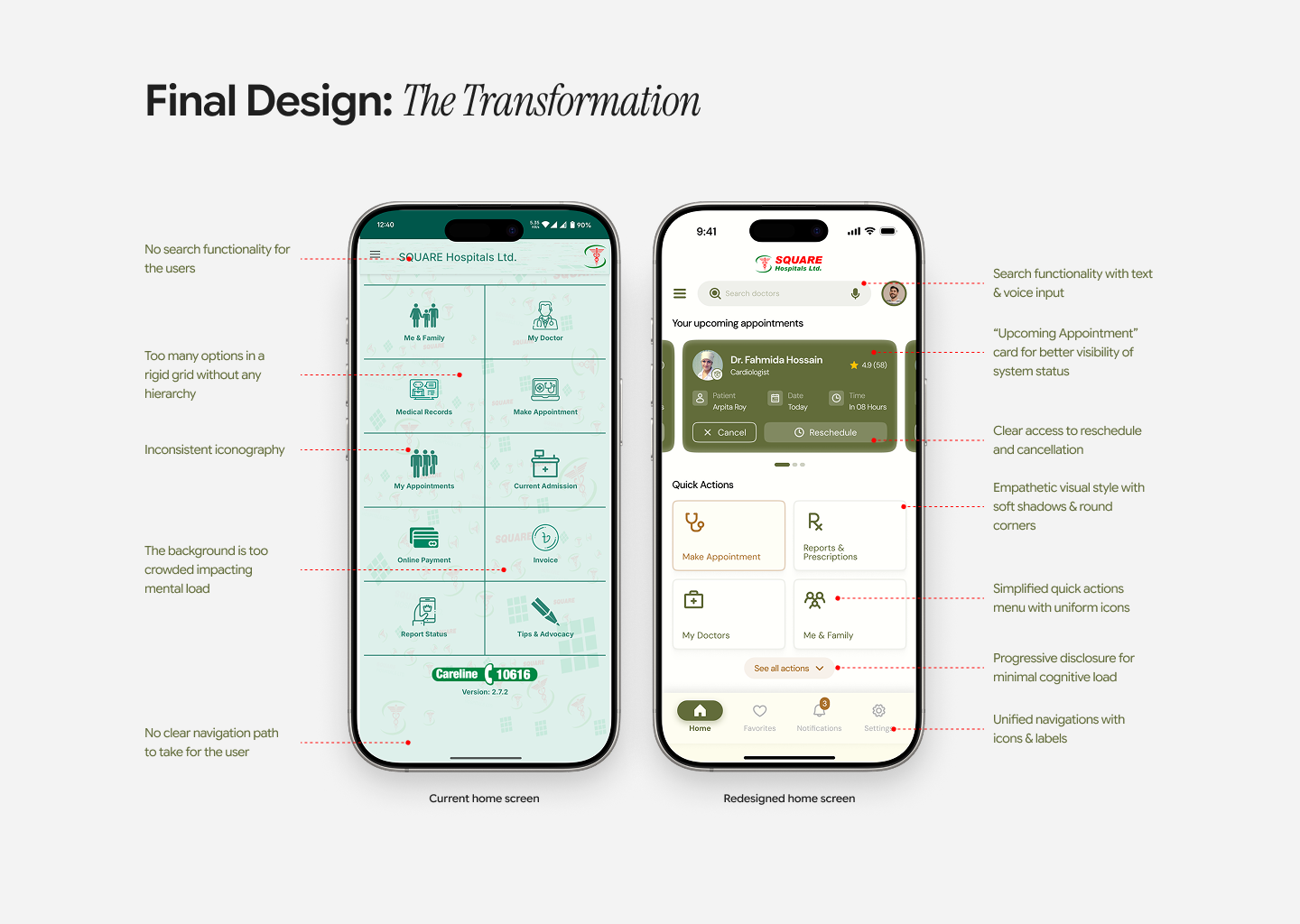
Overall, this is a strong, well-structured case study with clear UX thinking. The research is thoughtfully synthesized, and the redesign meaningfully improves hierarchy, reduces cognitive overload, and introduces better visibility of system status (like the Upcoming Appointment card). The final UI feels calmer, more cohesive, and more patient-friendly.
To elevate it further, consider showing more interaction depth like error states, loading states, validation, edge cases, and accessibility indicators. Also, strengthen the connection between research insights and specific UI decisions to make the strategic thinking more explicit.
Overall, solid UX work with good system-level thinking and strong portfolio potential.

Amazing works. Your skill proved can improve complex UI to very intuitive experience for user. Great job. Waiting for your next project

Excellent work, Roy! Your tagline—"making hospital experiences feel less clinical and more human"—captures the human-centered approach. Here's my feedback:
Strengths:
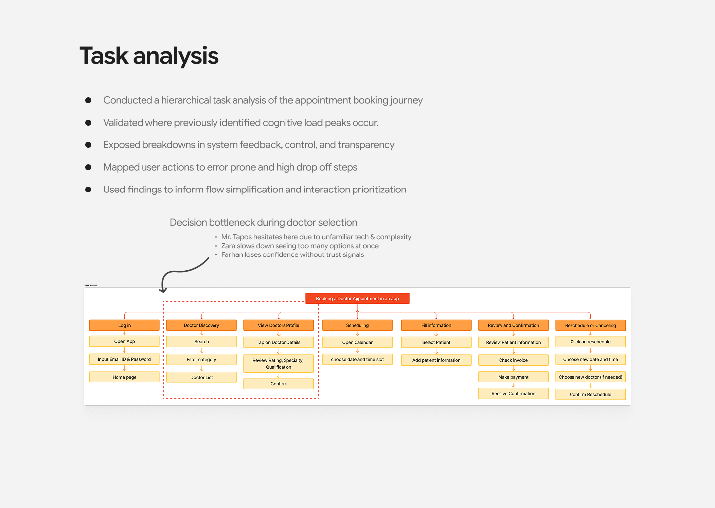
- Research-led design: User research identified pain points (finding doctors, understanding info, navigating flows)
- Clear narrative: Problem and solution well-explained
- Accessibility awareness: Tagged Accessibility, HIG, Heuristic Evaluation
- Trust-building focus: Healthcare apps need confidence; your clarity emphasis is strategic
- Professional presentation: Well-structured with clear visuals
Critical Gaps:
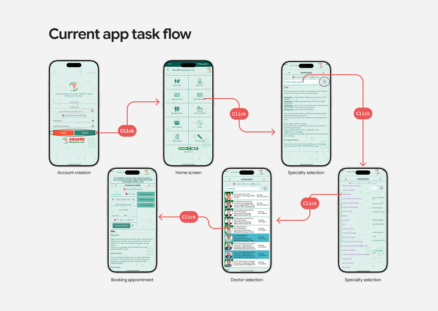
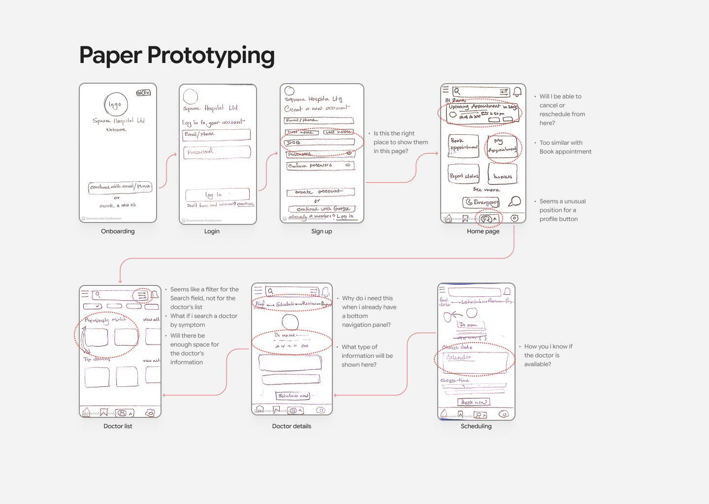
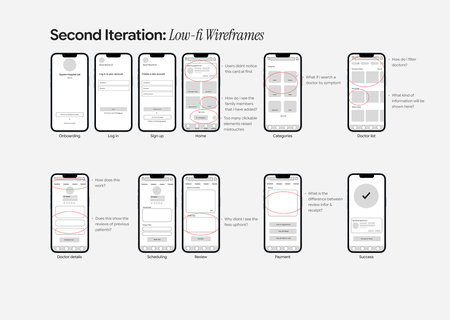
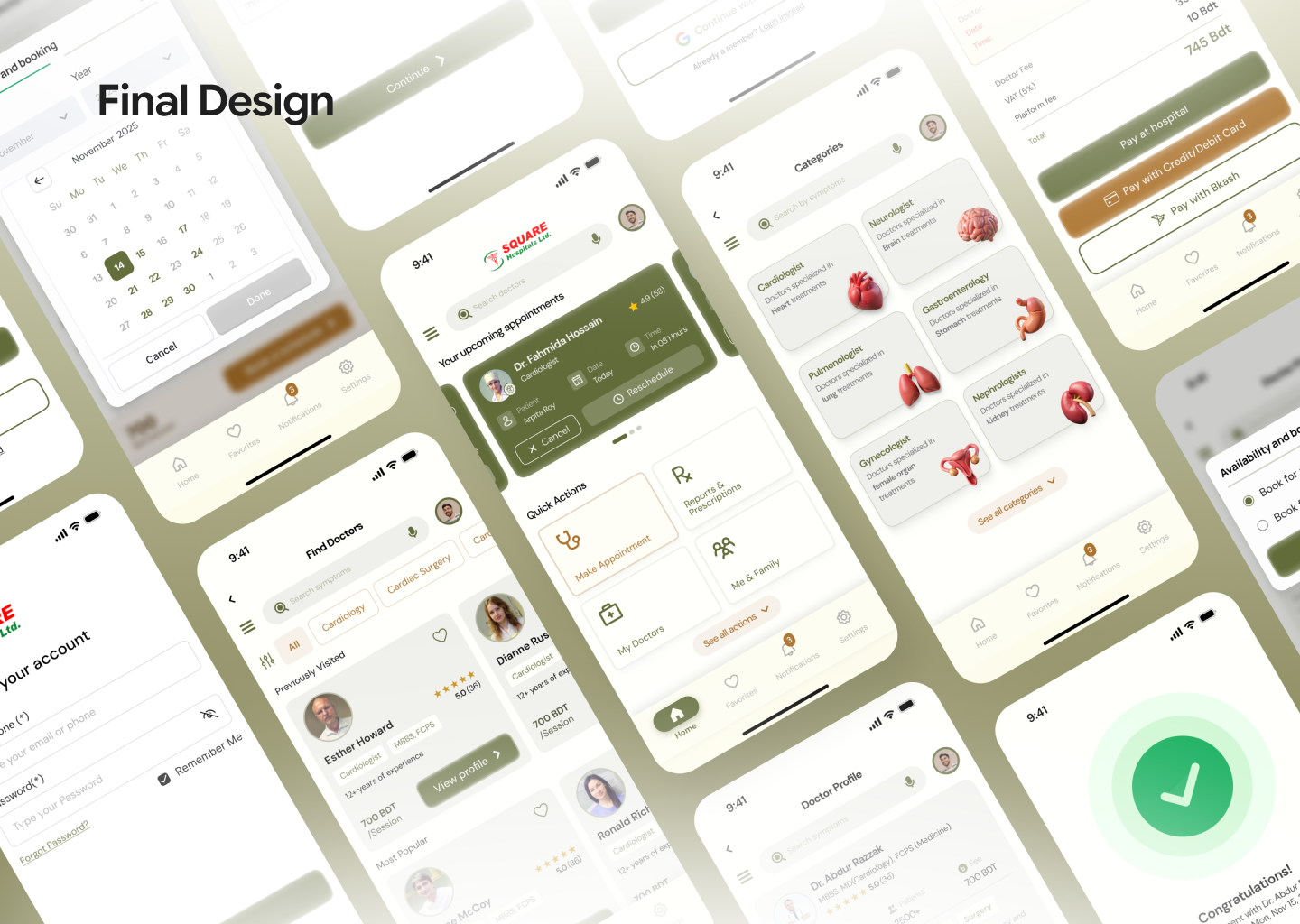
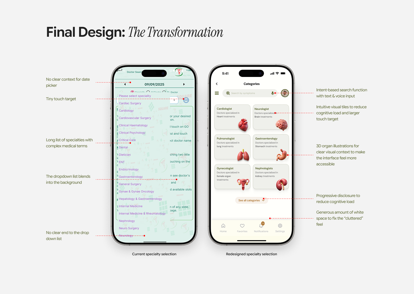
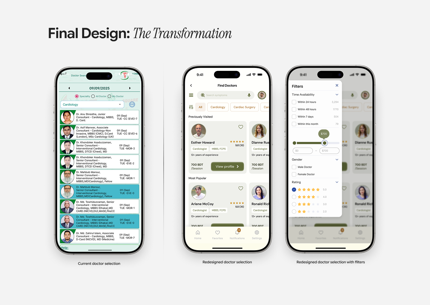
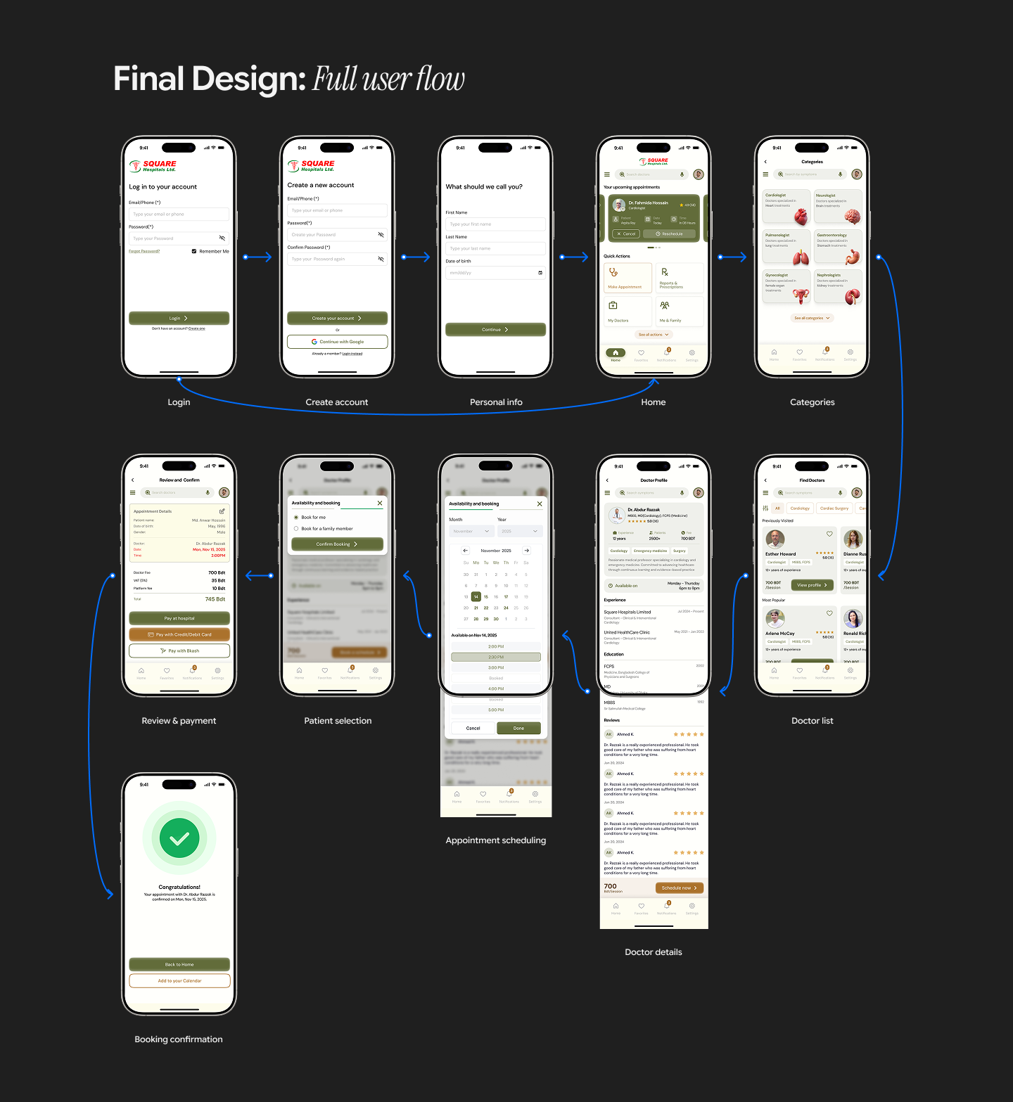
- Incomplete Journey — 3 screens shown, but the full journey is missing. Where's before/after? Show the old app's pain points. Show complete flow from entry to appointment booking.
- Missing Validation — Did you test with patients or healthcare workers? User testing results are essential. Show metrics, task completion rates, and feedback.
- Accessibility Unproven — You tagged it, but did you validate? Show color contrast, keyboard navigation, and screen reader testing. Healthcare apps must be accessible.
- Design System Missing — Show component consistency, typography, spacing. Healthcare apps need robust systems.
- No Impact Metrics — What was the outcome? Did bookings increase? Patient confidence improved?
Key Questions:
- How does this compare to competitor apps?
- Onboarding flow for new patients?
- Edge cases (complex medical history)?
Overall: Strong research thinking and human-centered vision. Solid foundation. Complete the case study: show before/after, validate with users, prove accessibility, demonstrate impact.
Next: Expand journey, add user testing, validate accessibility, and show design system. You're at 60% of a compelling case study.
You might also like

Improving Dating App Onboarding: A/B Test Design

FORM Checkout Flow - Mobile


A/B Test for Hinge's Onboarding Flow


Accessibility Asse


The Fitness Growth Engine


The Relational Workspace

Popular Courses

UX Design Foundations


Design Terminology


UX Writing