Daycare App Design

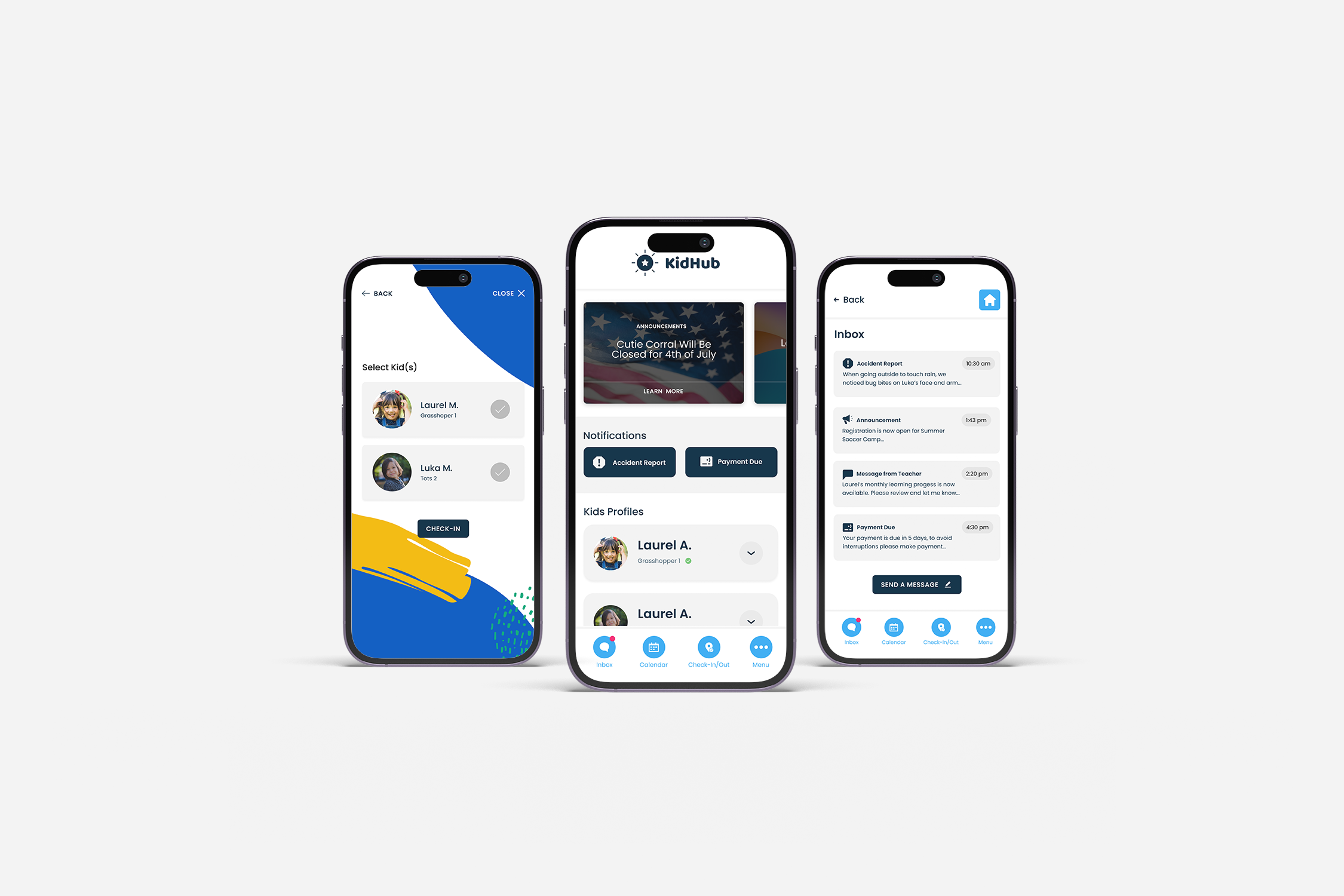
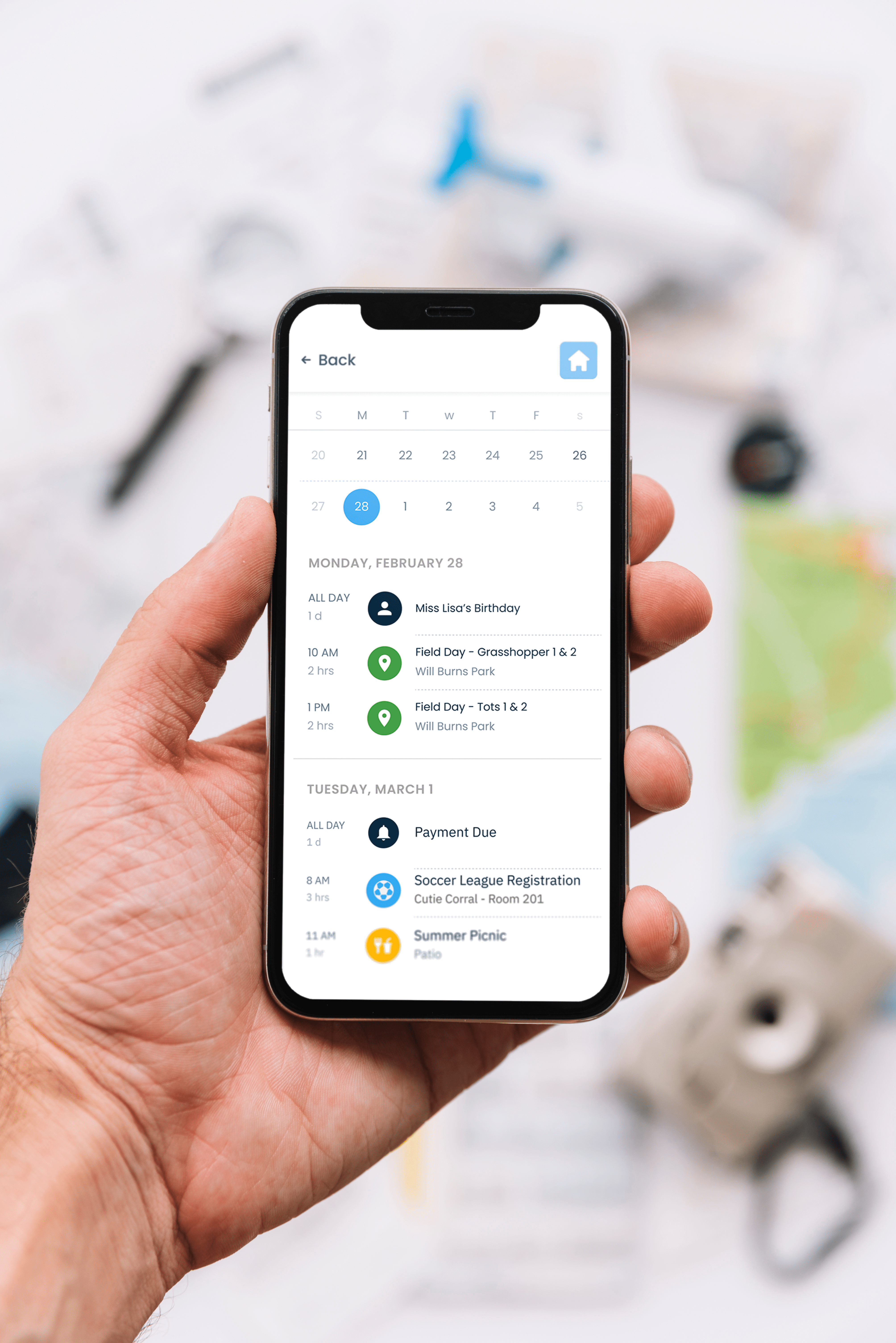
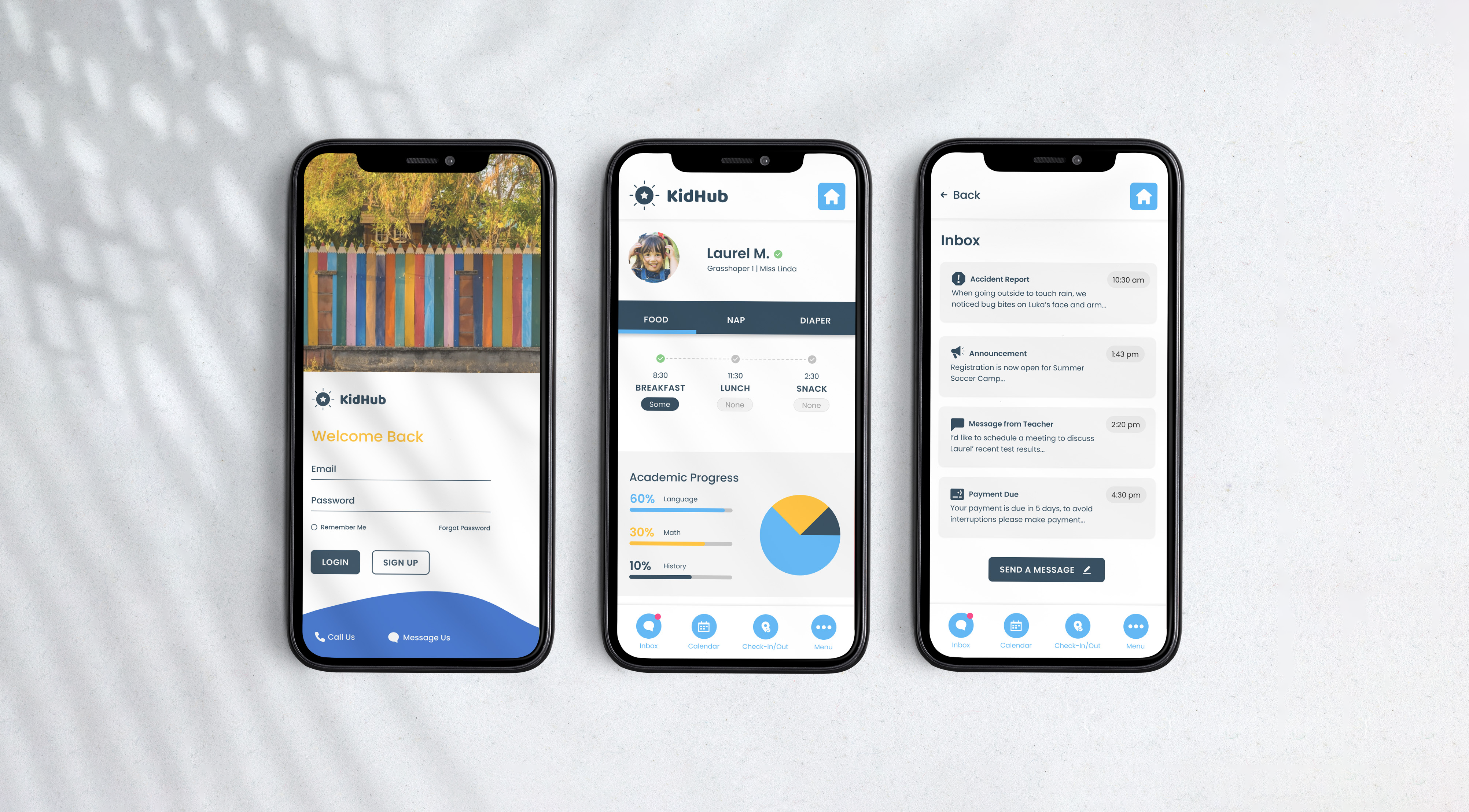
App for urban daycares and busy parents to overcome scheduling challenges and enhance child development tracking. Created during Google UX design course.https://poventud.com/app-design
Tools used
Topics
Share
Reviews
1 review

Kudos to you, Josefina, on a well-structured and thoughtfully presented case study! 👏🏻 The topic you’ve chosen is incredibly important, and as a parent myself, I can relate to the challenges users face in managing a daycare routine.
Your design process is well-documented and follows a strong narrative, making it easy to follow. That said, there’s still room for improvement in a few areas:
- Visual Style – The text formatting could be refined to enhance readability and create a more polished look. Right now, it feels a bit "sketchy."
- User Research Summary – Your findings are valuable, but summarizing them more effectively—perhaps using bullet points—could make them more digestible. If you conducted usability testing, quantifying key insights (e.g., "80% of users found X confusing") would strengthen your case.
- Problem Statement Clarity – The current statement is a bit broad. Refining it to something more specific, like “Existing tools are fragmented, leading to missed updates, difficulty tracking progress, and lack of direct engagement with teachers” would make it more impactful.
- Showcasing Design Changes – Adding short callouts that highlight key improvements (e.g., “Increased readability,” “Simplified navigation”) would better demonstrate the impact of your iterations.
- Information Architecture (Optional but Valuable) – Including a brief section on how you structured the information architecture would provide additional context on your design decisions.
- Final Thoughts & Next Steps – Wrapping up with a “Lessons Learned” or “Next Steps” section would reinforce the depth of your process and demonstrate forward-thinking.
Overall, this is a strong UX case study with great visuals and a well-documented process. A few refinements in clarity, research synthesis, and storytelling would make it even stronger. Keep up the great work! 😊
You might also like

Customer Journey Map for a Co-Working Space


Reimagining Asana's Color System

Responsive Main Screen


Latios - Free Portfolio Template for UX/UI Designers

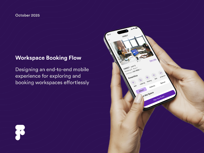
Workspace Booking Flow - UI/UX Design

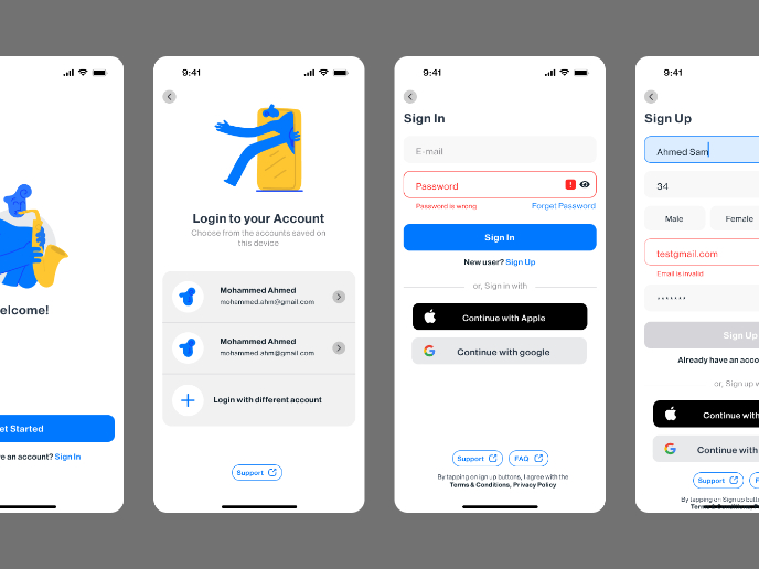
Login/Sign up Form

Popular Courses

Apple Human Interface Guidelines


UX Design Foundations

Introduction to Figma