Day #1 Mobile App Screen UI

Date: 3/1/2025
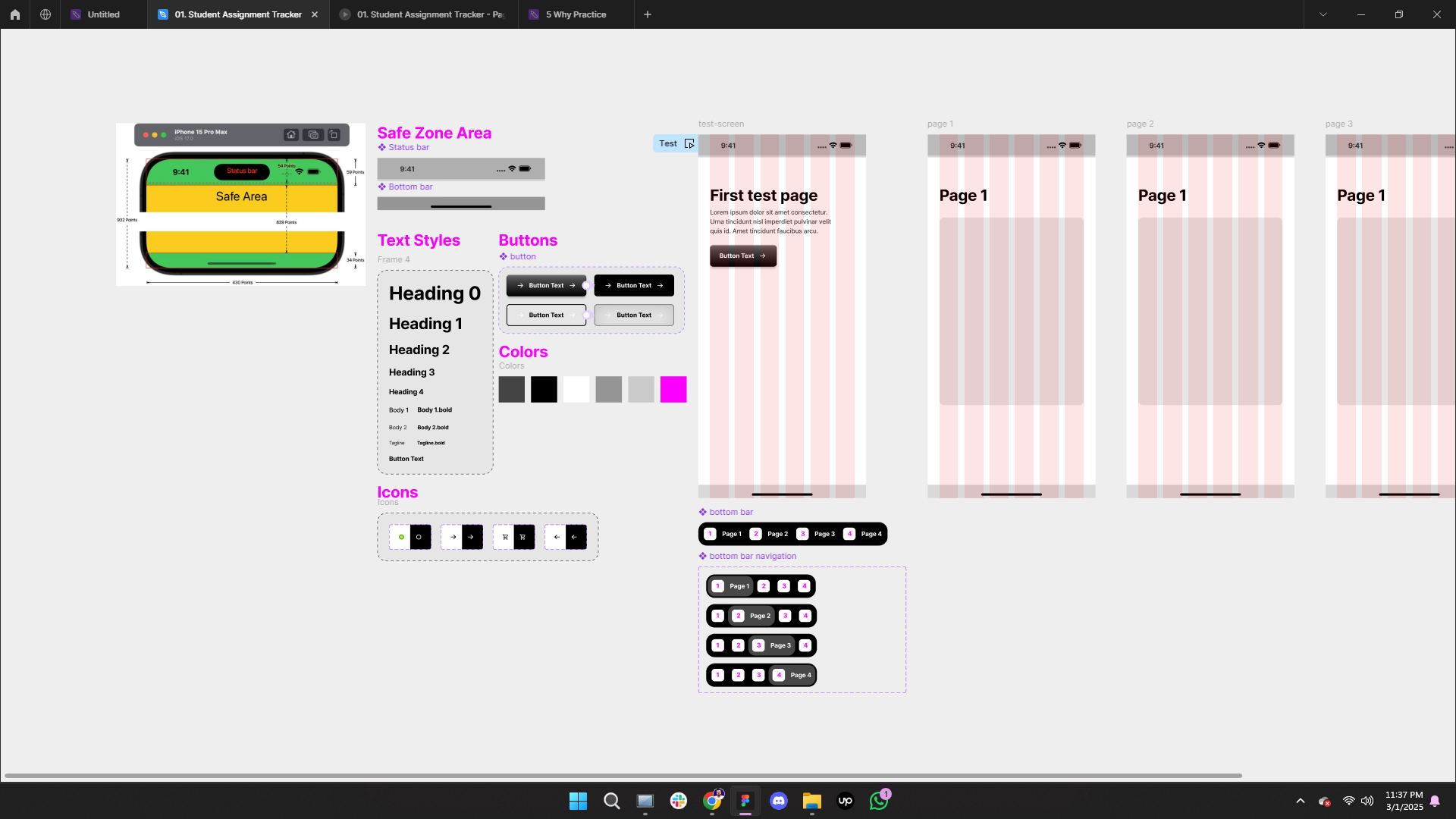
Today, I focused on refining font and color styles, designing the iPhone 15 Pro Max status bar, and creating a bottom bar component for consistency across the app.
What I Learned:
1️⃣ Properties & Variants Usage/Creation
Defined multiple states: Primary, Secondary, Primary_Pressed, Secondary_Pressed.
Created a toggle property for icons (Left/Right) with true/false values.
Designed multi-variation icons (White/Black) within a single component for efficiency.
2️⃣ Safe Zone Area for iPhone 15 Pro Max
Top Status Bar: 59pt / 54pt Safe Area sizing.
Bottom Safe Area: 34pt allocated for the bottom bar.
3️⃣ Icon Creation
Designed essential icons from scratch: Battery, WiFi, Signal, and even the Dynamic Island.
4️⃣ Interactive Button Styling
Developed four button states: Primary, Secondary, Primary_Pressed, and Secondary_Pressed.
Experimented with Drop Shadow, Inner Shadow, Linear Gradient, and Opacity to achieve a realistic plastic button effect.
Created a pressed-state illusion to enhance user experience.
5️⃣ Interactive Button Prototyping
Set up a prototype:
While Pressing Button → Change to State 2 (Pressed UI)
Smart Animate: Ease Out | 120ms
This was a fundamental yet valuable practice session—full of learning and hands-on experimentation. The best part? I truly enjoyed the process.
Thanks for reading this post! I’d love to hear your feedback or any suggestions on this practice project. 😊
Reviews
2 reviews

Thats clear and great keep it up
nice work
You might also like

Pulse — Music Streaming App with Accessible Light & Dark Mode


Islamic E-Learning Platfrom Dashboard

SiteScope - Progress Tracking App


Mobile Button System


FlexPay


CJM for Co-Working Space - WeWork

Popular Courses

Introduction to Figma


Design Terminology


Introduction to Design Systems