Credit Card Checkout

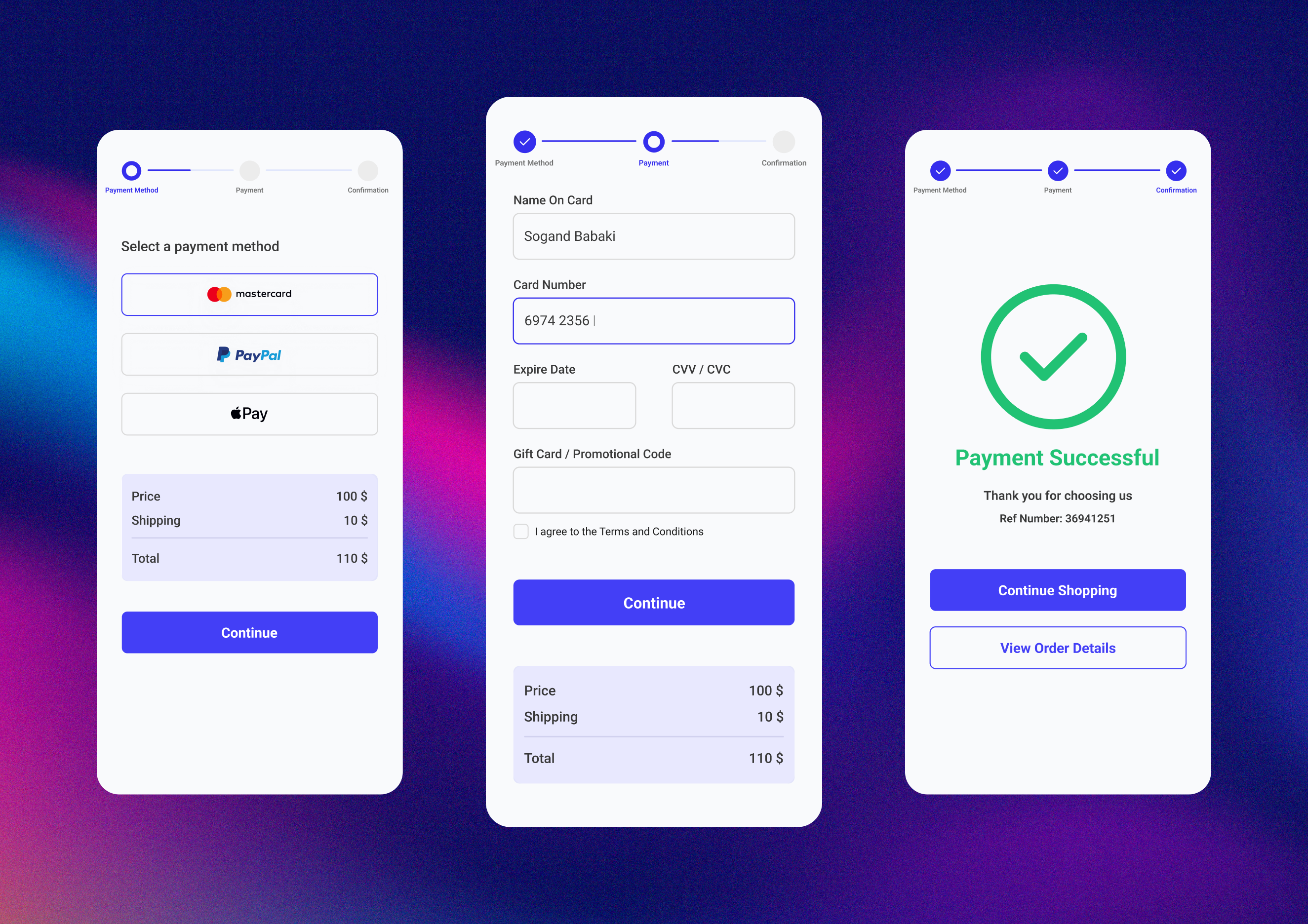
Excited to share my latest design: a smooth and modern Credit Card Checkout interface. Focused on simplicity, clarity, and a seamless user experience.
I’d love to hear your thoughts and feedback! 💳✨
Reviews
5 reviews

Great work!
If there were some elements, which I would advise you to consider next time, that would be:
- Typically the shipping & payment are in the same flow. Even if it is a digital product, a billing address must be provided (or if already provided on the account, verified and edited If necessary) - this is required for online card payments for the transaction to go through. I would make this the first step out of four.
- Please note that the minimum font size (on any device) should be 12 px. The captions underneath the step flow steps seem to be too small and thus unreadable to many users.
- I would considerably emphasize the total amount - this can be done via a larger, heavier font, or other method - it should be more visible to the secondary "price" and "shipping" above it.
- The CTA should not be too high up and it should typically be the last element on the page in such a flow. Hence I'd add a small reminder of the final price above the CTA on the second frame. The total price can be a small collapsed infobox secondary in nature to the other information.
- On the second frame, I would change the CTA copy - it should typically say something like "complete payment" instead of continue. The user should be aware that this is the last and final step. Additionally, it would be nice to have a final "review" step so that the user can see a summary of the product name, size, and type, along with their billing address and payment before submitting the order for finalization.
- Lastly, a small visual hint - I'd consider making the checkmark icon on the last frame a bit smaller. It's size is a bit overpowering for the page.
I hope my feedback helps you and allows you to look at your designs from a new perspective. Other than what I have mentioned, you did a great job. Bravo :)


Thanks for your sub, Sogand!
The design looks great and clean. What I would really appreciate to see is that you go extra miles from here :
- think about the flows - error messages?
- rethink about the typography - minumum is 12px, you might not have enough size for the steppers
- use a color palette - for instance, you have two different blue colors there.
great vibes only!

The credit card checkout design looks clean and straightforward. The layout is simple, making the process feel quick and easy for users.
The use of white space keeps it uncluttered, and the clear typography enhances readability.
Small touches, like well-placed input fields and visual hierarchy, guide users seamlessly through the steps.
Overall, it’s a smooth and modern interface that focuses on simplicity and a great user experience.

I can see a few little optimisations which might make it more accessible:
- On screen one if this item is to be shipped it would be great to have an address to confirm where to, if not then the email address/user details somewhere to confirm where the digital credits are going.
- On the first screen have a "review order" section to show what is being purchased one final time before handing over your cash.
- Hint for the format expiry date
- Hint for the 3 digits needed for the CVC
- A link for the T's and C's on the text of Terms and Conditions with an underline.
- The last button on the second screen instead of "Continue" it would be more descriptive to say "Confirm and Pay"

Yohan
Really nice work! I really like the clean and simple design.
There are two elements that I think could be tweaked. The order summary on the payment screen is underneath the CTA. Depending on the screen ratio and resolution, it might not be visible. Keeping it above the CTA in a compact form (ex. accordion only displaying the total) could solve the issue of still having the information and freeing up space for your input fields.
The input fields could have placeholders. Fields like the date, if destined for an international audience, would provide a very good hint at the date format, for example :)
You might also like

edX Sign-Up Page Redesign


Beautify Login page WCAG principles


Design Prioritization Workshop


Notion Login Page Accessibility Optimization


Sanyahawa - Landing page Design


Healthy Dashboard

Popular Courses

UX Design Foundations


Introduction to Figma

Design Terminology
