CorpXAware — Mobile Cybersecurity Training App
Reviews
1 review
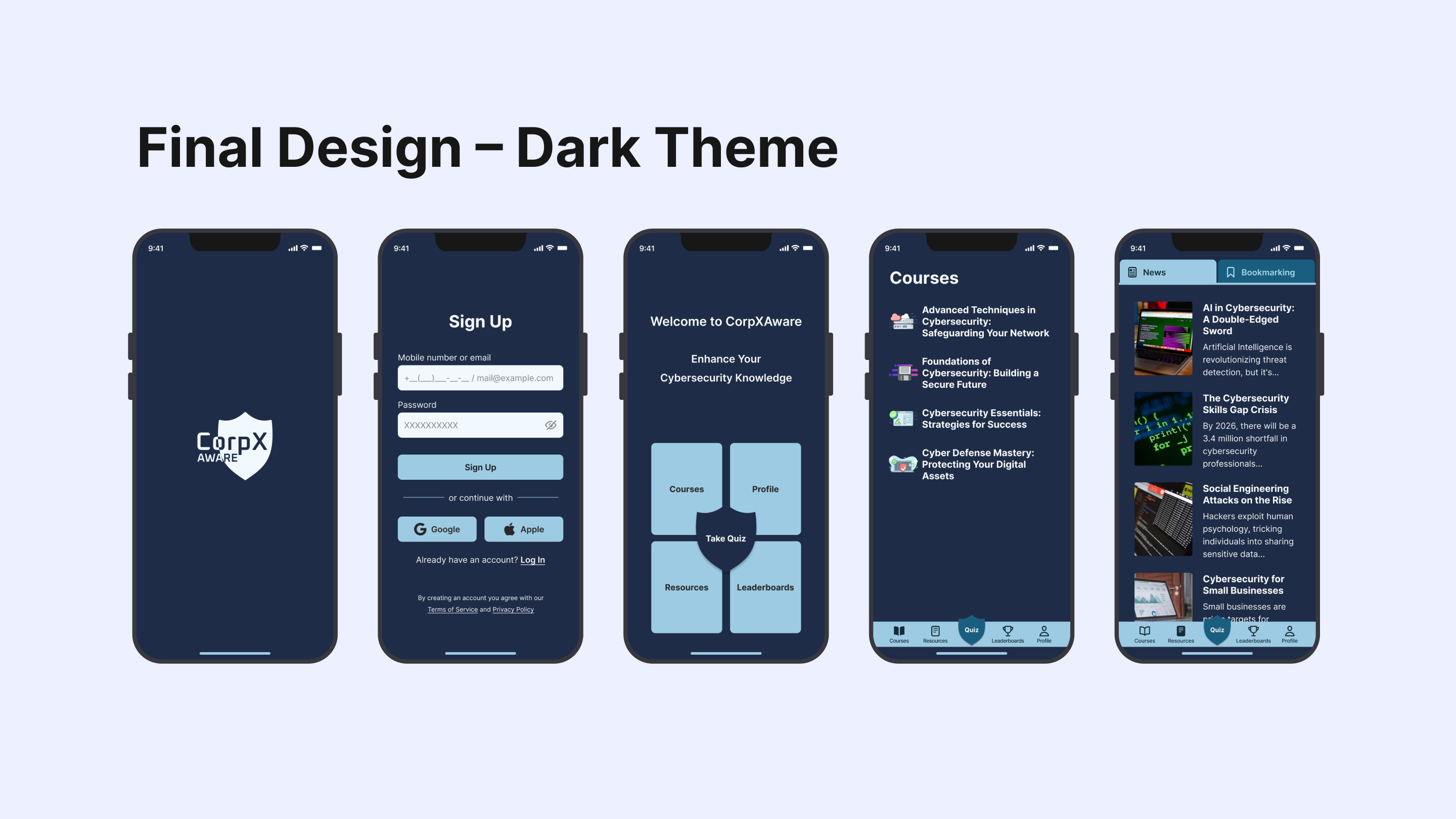
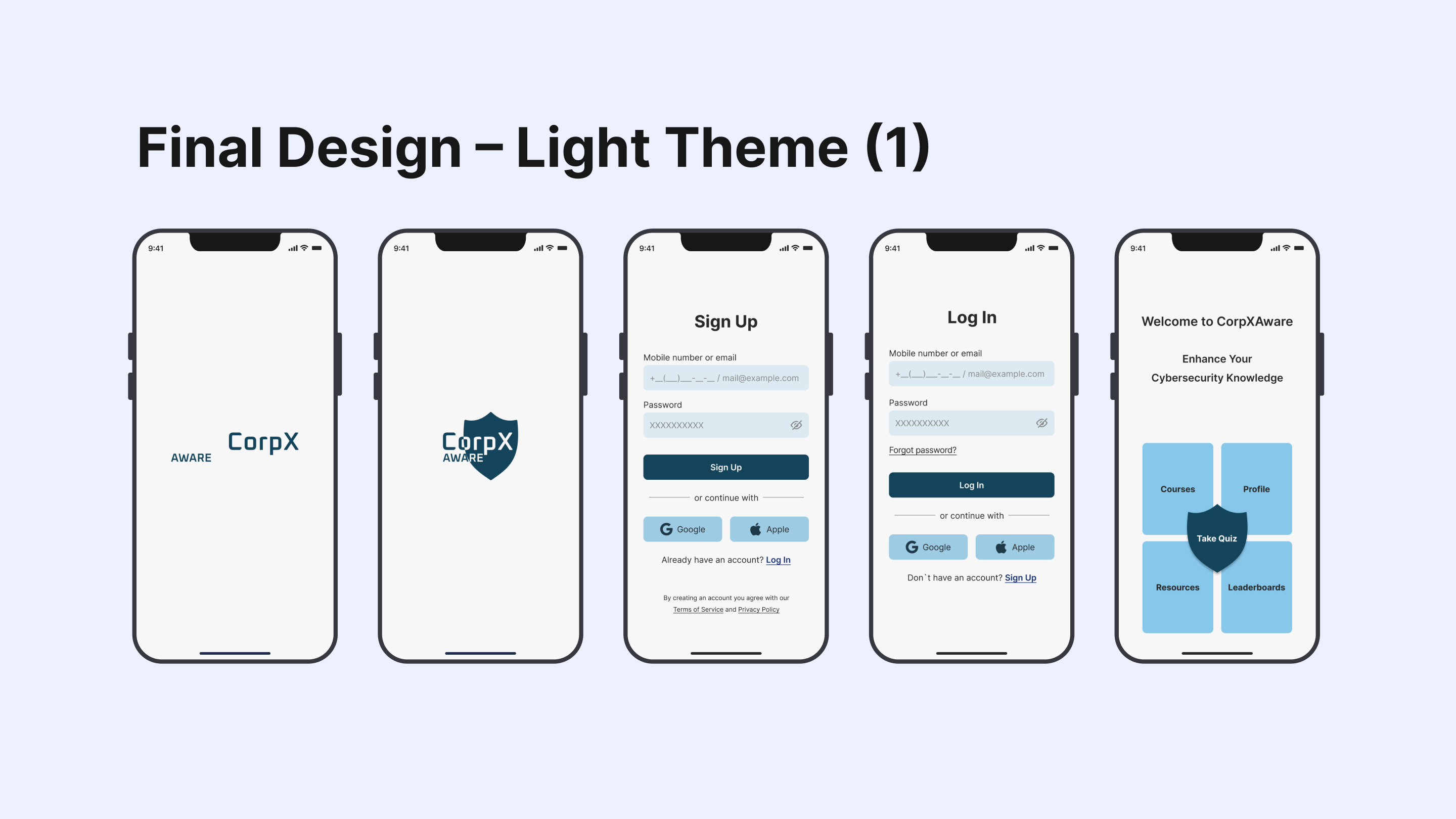
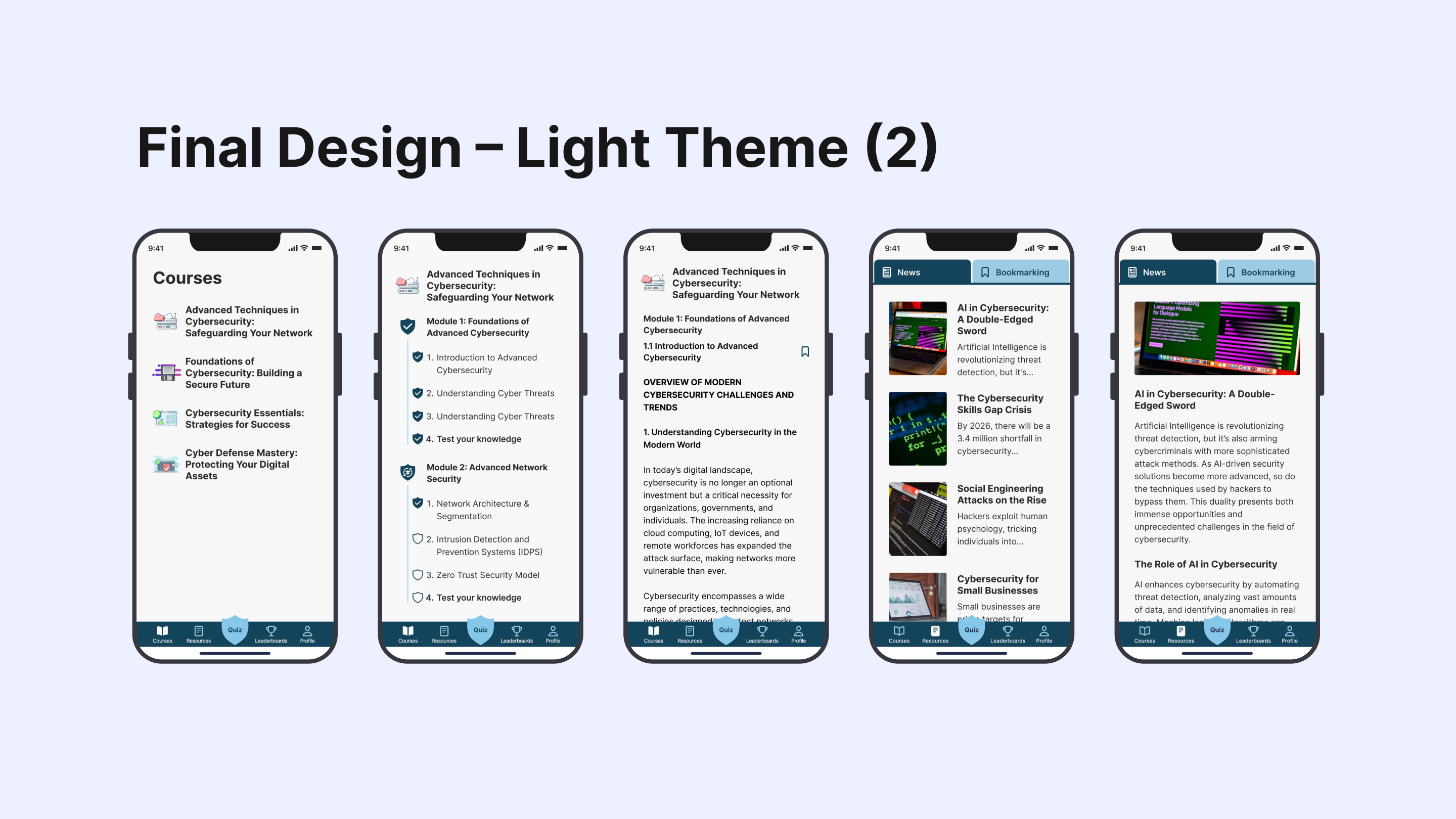
Good job, Iryina, from UI perspective, while the overall look is clean, some screens could benefit from a bit more contrast or visual emphasis on the most important actions. For example, primary CTAs and progress indicators could stand out more to guide users quickly, especially on busy or content-heavy screens. I'd also check course headings and its contrast.
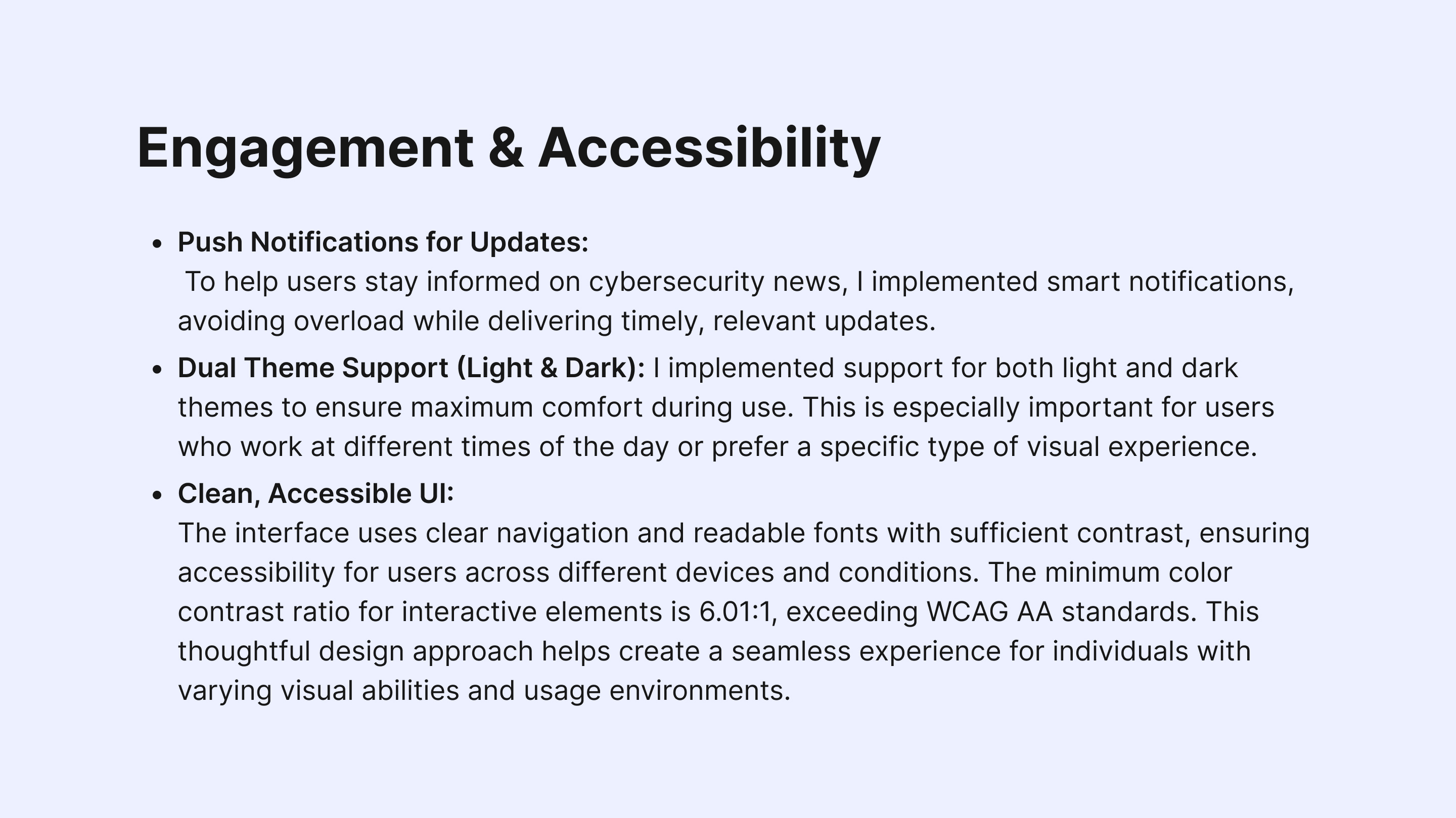
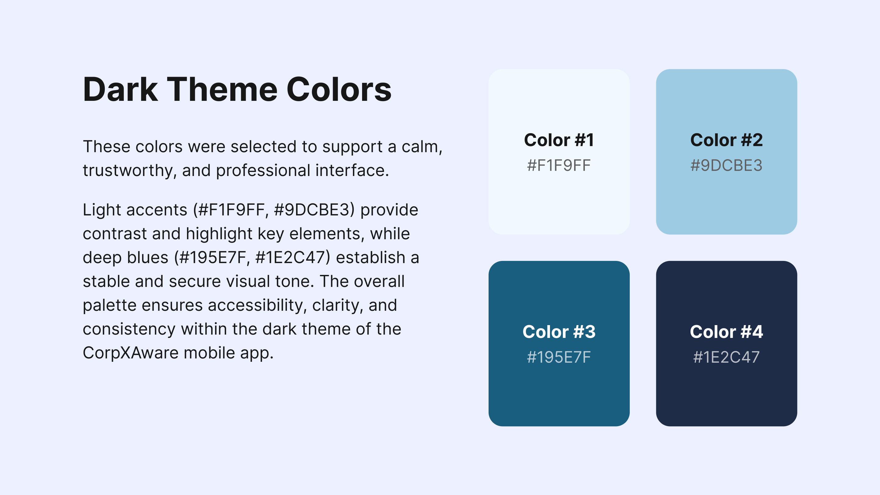
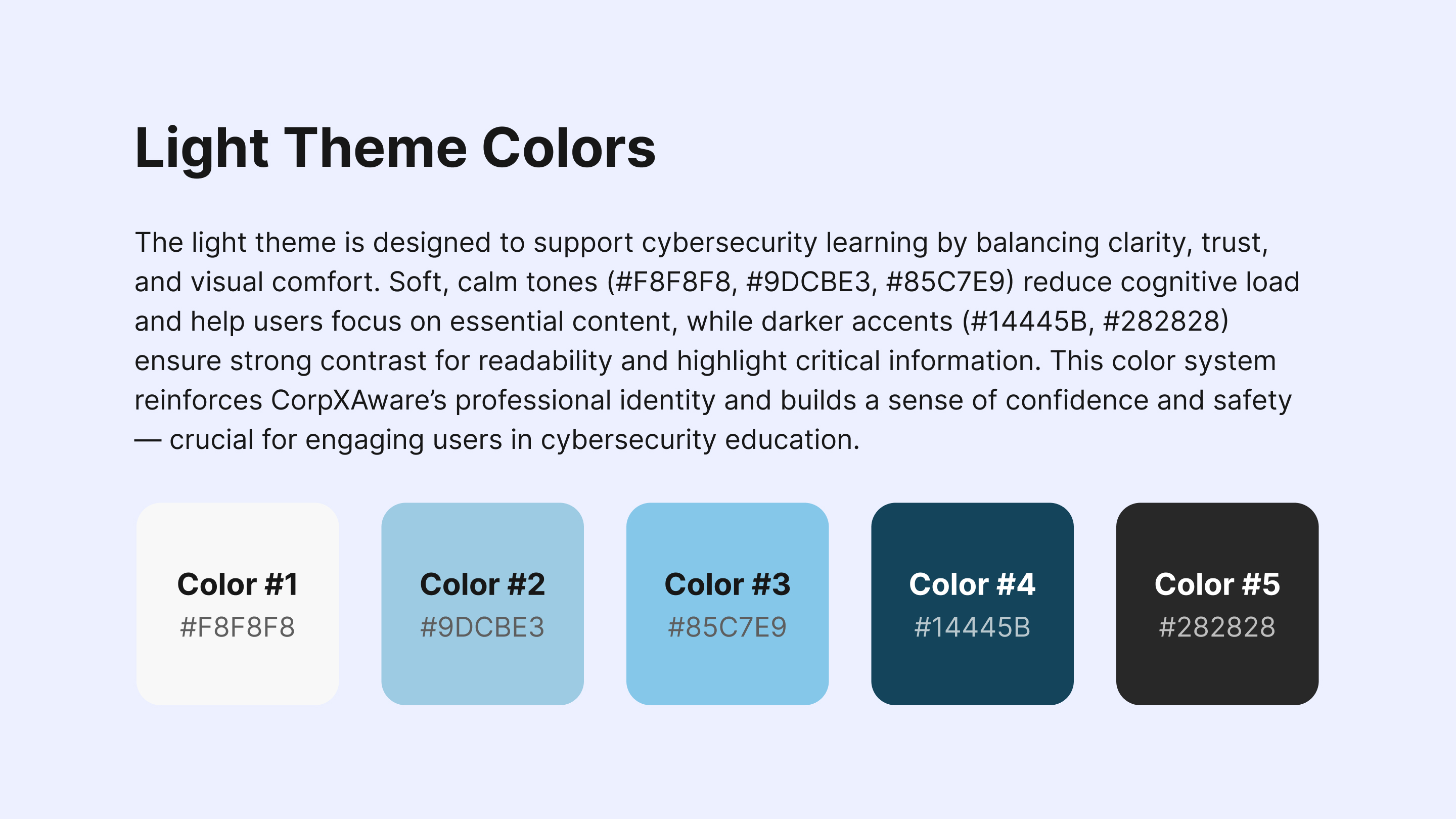
Hi Elene, thanks for your feedback. Regarding contrast — in this project, the minimum contrast ratio for elements is 6.01:1, and in most cases, it’s even higher. I follow WCAG guidelines closely, but to avoid any doubt, I’ll include these values directly on the slide.
As for your comment about “primary CTAs and progress indicators,” I’d appreciate a bit more clarification — I wasn’t entirely sure which specific screens or elements you were referring to. It would help me understand what exactly could be improved. Thanks in advance for your insight!
4 Claps
Average 4.0 by 1 person
You might also like

Project
Improving Dating App Onboarding: A/B Test Design
This project explores how improving the onboarding experience of a dating app can increase profile completion and early user engagement. I d

Project
FORM Checkout Flow - Mobile
Try out the prototype here. Design Rationale Why mobile? Mobile accounts for the majority of e-commerce browsing, and premium furniture pur

Project
A/B Test for Hinge's Onboarding Flow
This project focuses on improving the onboarding experience of a dating app - Hinge, by addressing low profile completion rates. Since profi

Project
Accessibility Asse
For this project, the LearnLink website was selected, and the goal was to redesign the login and sign-up pages specifically, adapting them t

Project
The Fitness Growth Engine
This slide shows how user behavior translates into business success by connecting activation, habit formation, retention, and monetization i
Editors’ Choice
Project
Uxcel Halloween Icon Pack
🎃 Introducing the Uxcel Halloween Icon Pack! 🎃 This custom Halloween-themed icon set was created to enhance the seasonal user experience o
Popular Courses

Course
Introduction to Figma
Learn essential Figma tools like layers, styling, typography, and images. Master the basics to create clean, user-friendly designs

Course
Design Terminology
Learn UX terminology and key UX/UI terms that boost collaboration between designers, developers, and stakeholders for smoother, clearer communication.

Course
Core UI Components
Learn how to design buttons, forms, cards, and other core UI components, and understand the reasoning and best practices behind their usage in every project


