ColorLine

Dye factories were stuck in Excel hell — every team modeling emissions, water use, and recipes in different, fragile spreadsheets.
The result? No trust, zero alignment, and stalled innovation.
We built ColorLine, a real-time simulation platform that unified data, modelled environmental impact per recipe stage, and helped global factories make greener, cheaper, smarter decisions, along with saving them money.
🔧 Key Features
The system introduces a suite of powerful tools designed to improve simulation accuracy, user efficiency, and adoption across teams.
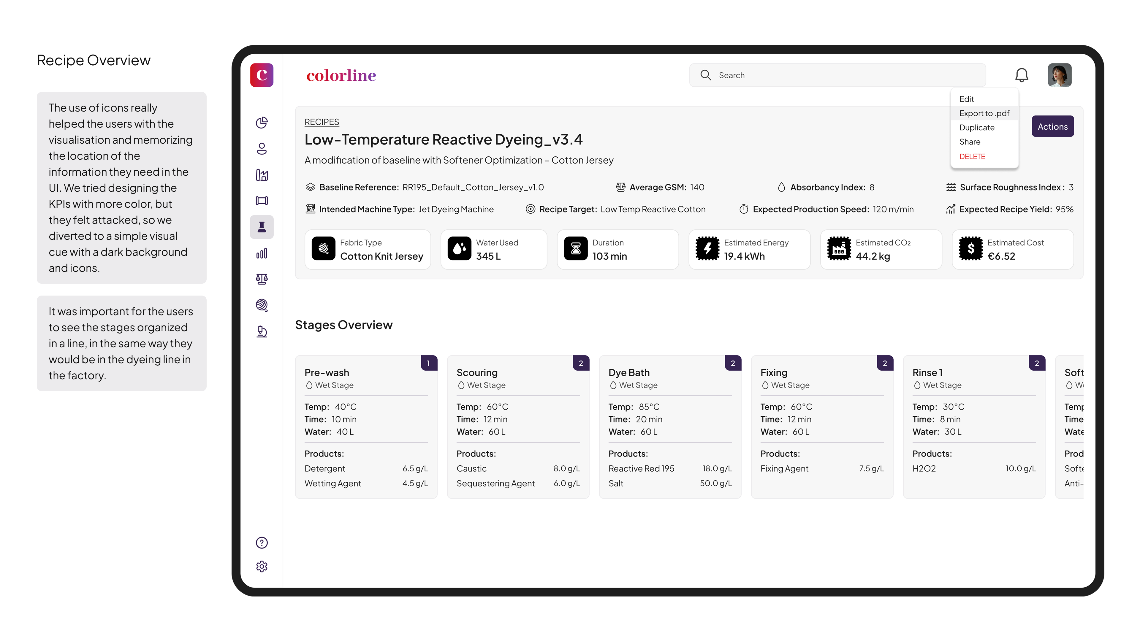
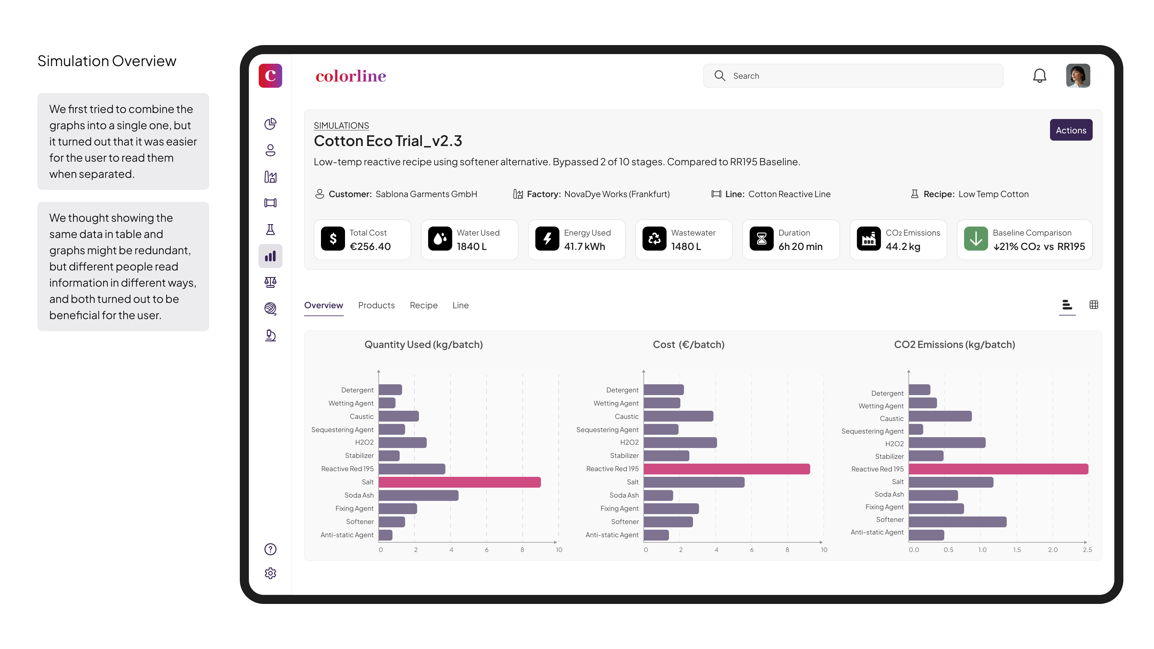
● Dashboard
- Displays KPI cards for CO₂, water usage, and cost over time
- Includes alerts for anomalies in emissions or incomplete simulations
- Offers AI-powered suggestions (e.g., “Try Enzyme X instead of Soda Ash”)
● Transition Tools
- Enables importing of existing Excel workflows to support smoother onboarding
- Features role-based permissions and access controls
- Includes inline validation to help prevent user errors before submission
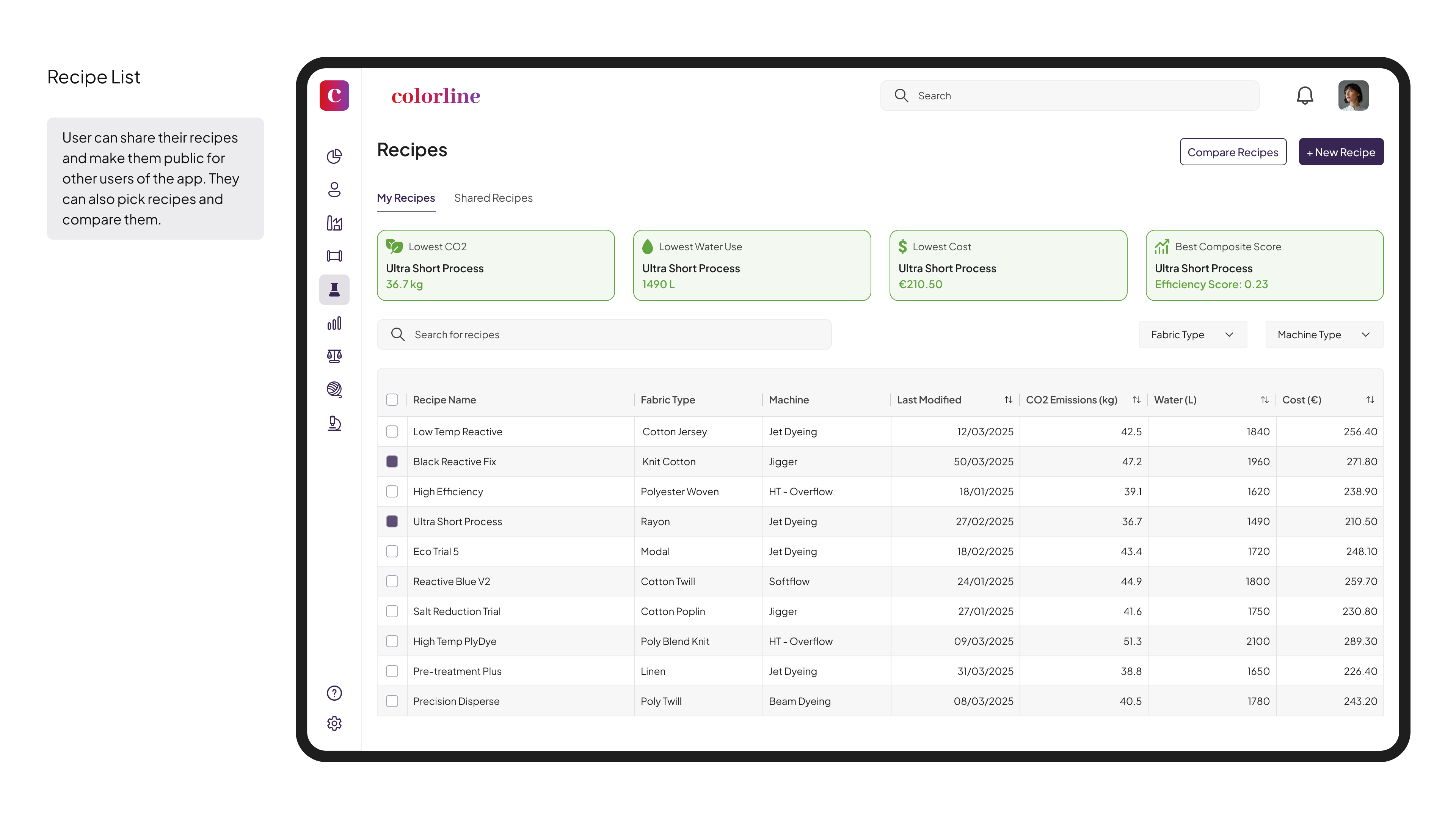
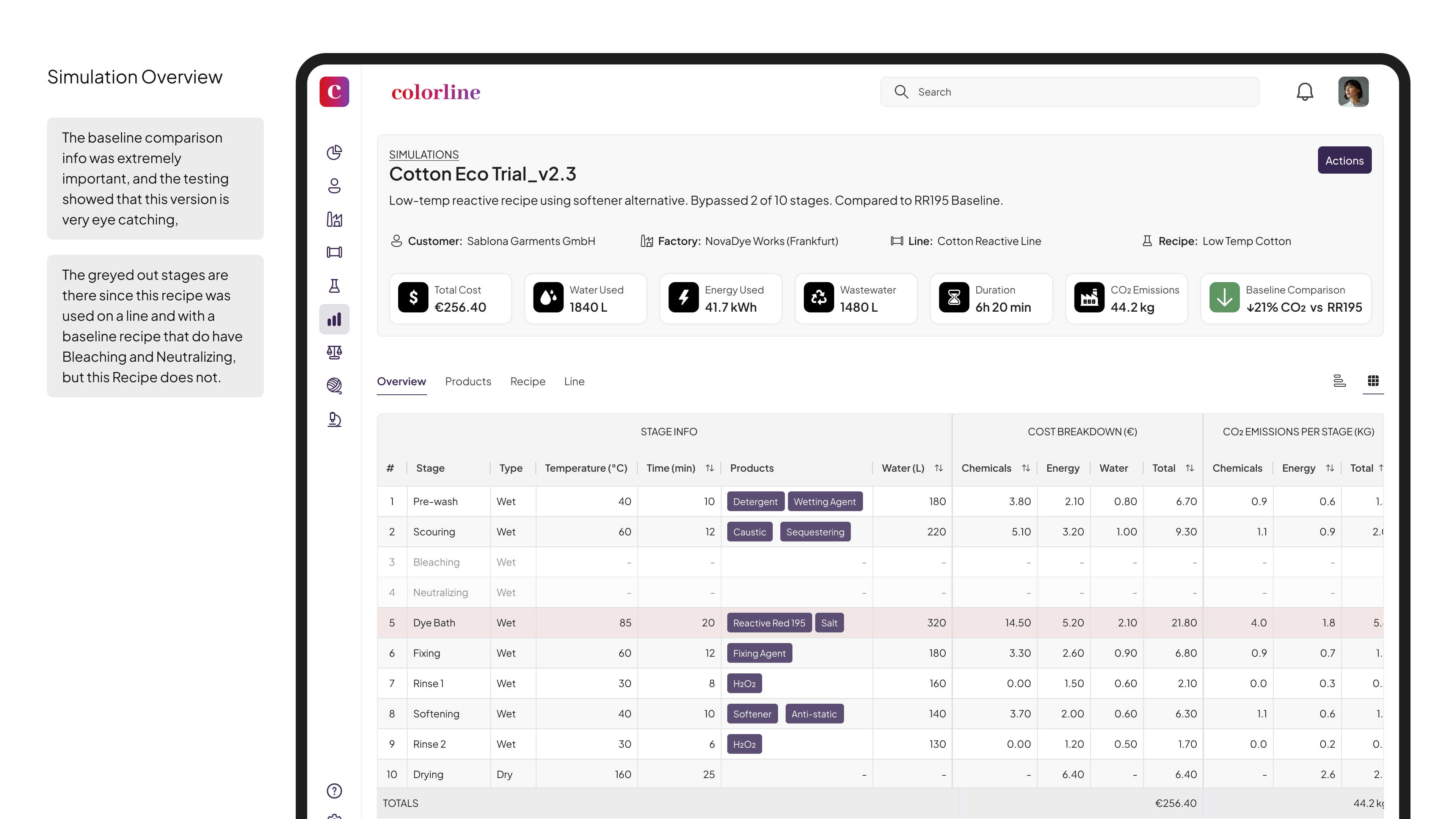
● Simulation & Optimization
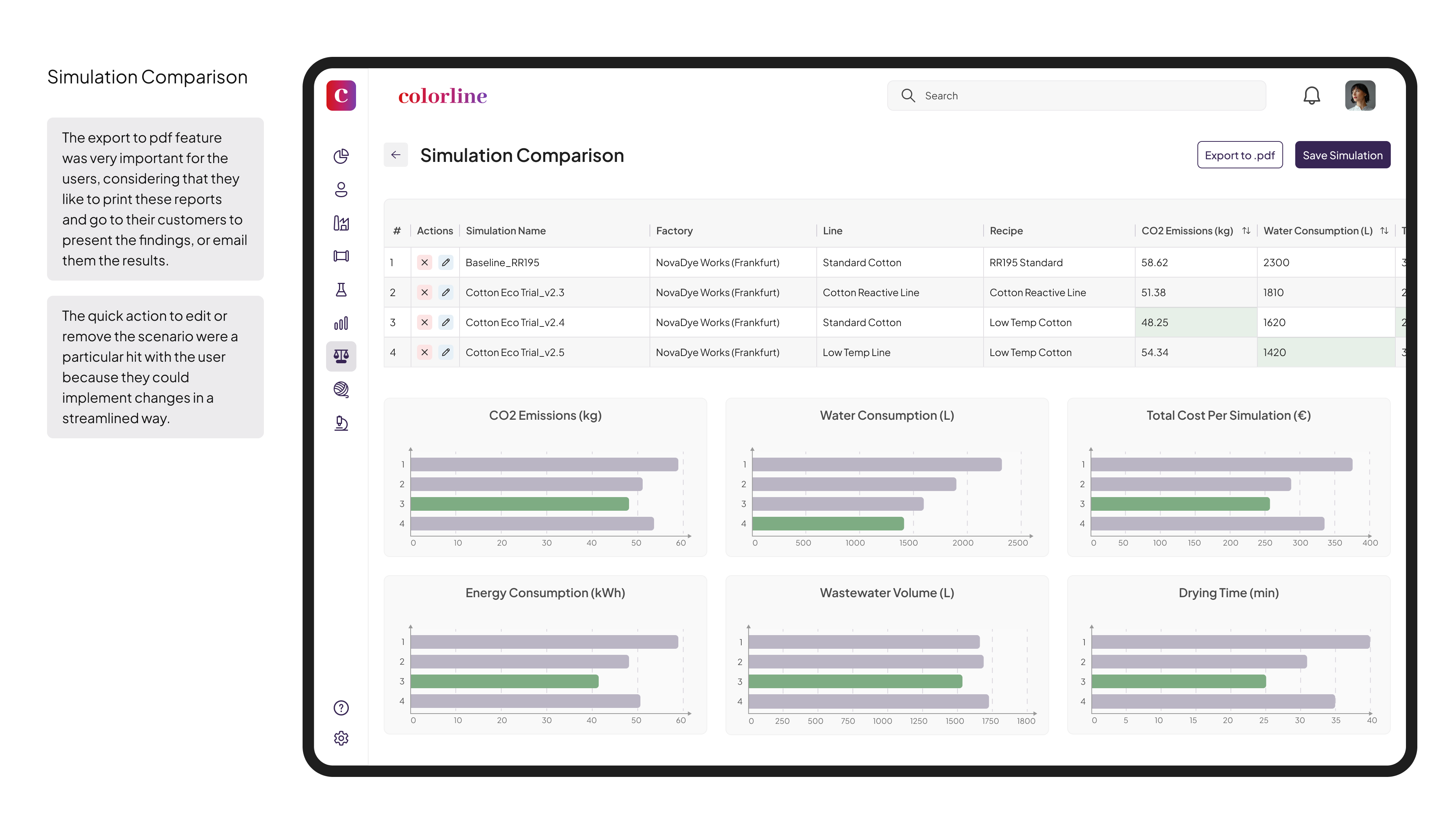
- Allows users to compare recipes against baselines with clear, color-coded deltas
- Offers a per-stage breakdown of cost, emissions, water, and energy
- Supports reusable templates for different fabric types and machine configurations
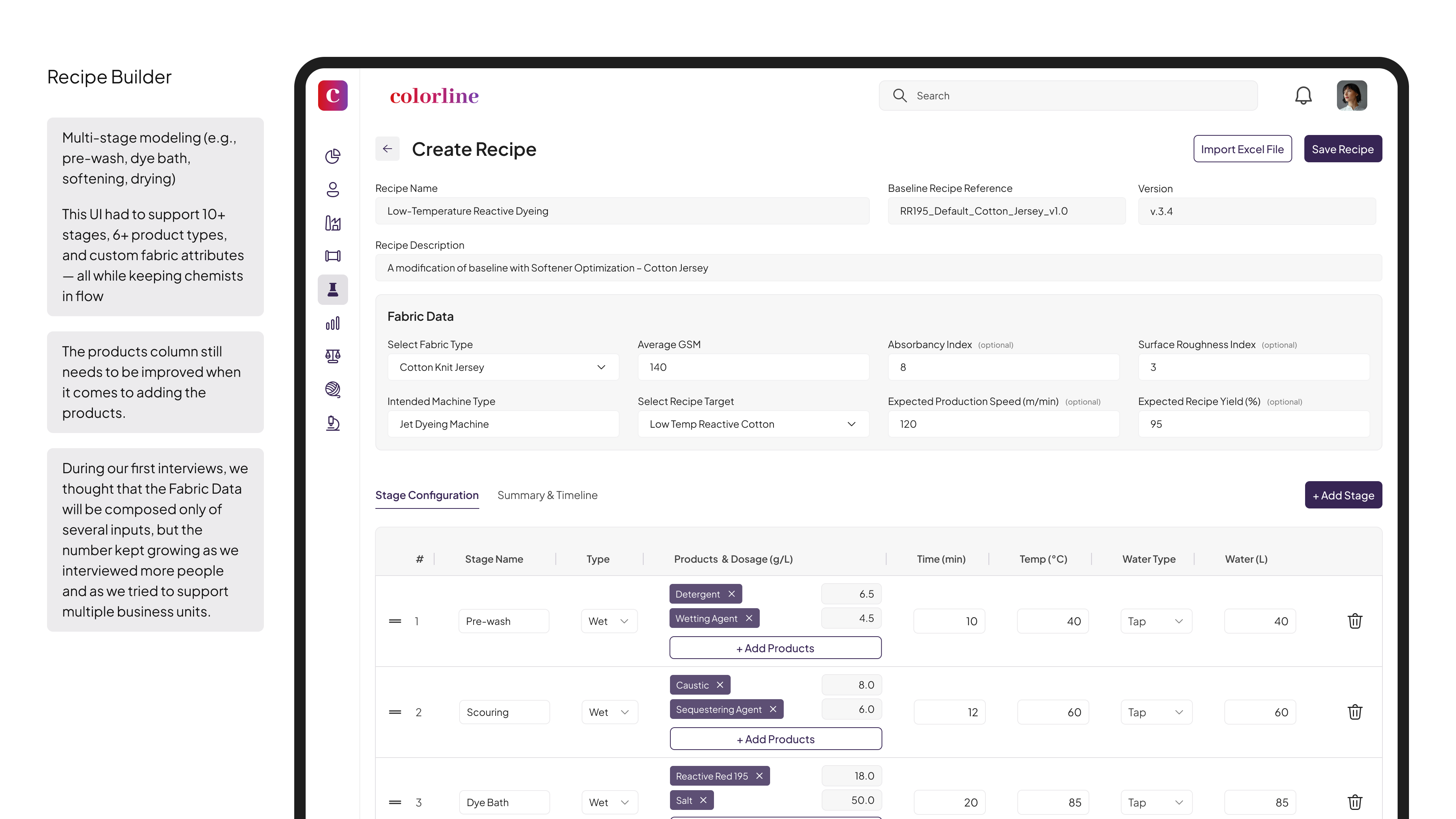
● Recipe Builder
- Models complex, multi-stage processes (e.g., pre-wash, dye bath, drying, etc.)
- Lets users input product dosage, temperature, water, and fabric-specific properties
- Organizes views via tabs for timeline, summaries, and per-stage configuration
📈 Impact and Results
This platform delivered measurable results across both environmental and UX metrics.
● Environmental & Operational
- 19% average CO₂ reduction across 250+ simulations
- 14% average water savings in optimized recipes
- 52% decrease in Excel dependency across pilot factories
● UX & Adoption
- 61% faster scenario setup
- 78% more consistency in output data
- 70% adoption rate in the first month
- 3 hours saved per user per week through automation features
Reviews
1 review

As a designer, I can still see the resemblance in the layout and familiar icons, but I’m curious about how steep the learning curve is for them to migrate from Excel to ColorLine?
Also, what a nice tone you have! I’m assuming the purplish button and reddish row are also derived from the ColorLine main color? I’m intrigued to see all the shades in the color palette 🤓
You might also like

Pulse — Music Streaming App with Accessible Light & Dark Mode


Islamic E-Learning Platfrom Dashboard

SiteScope - Progress Tracking App


Mobile Button System


FlexPay


CJM for Co-Working Space - WeWork

Popular Courses

Product Discovery


KPIs & OKRs for Products


Product Analytics
