Clean Mobile Signup Form

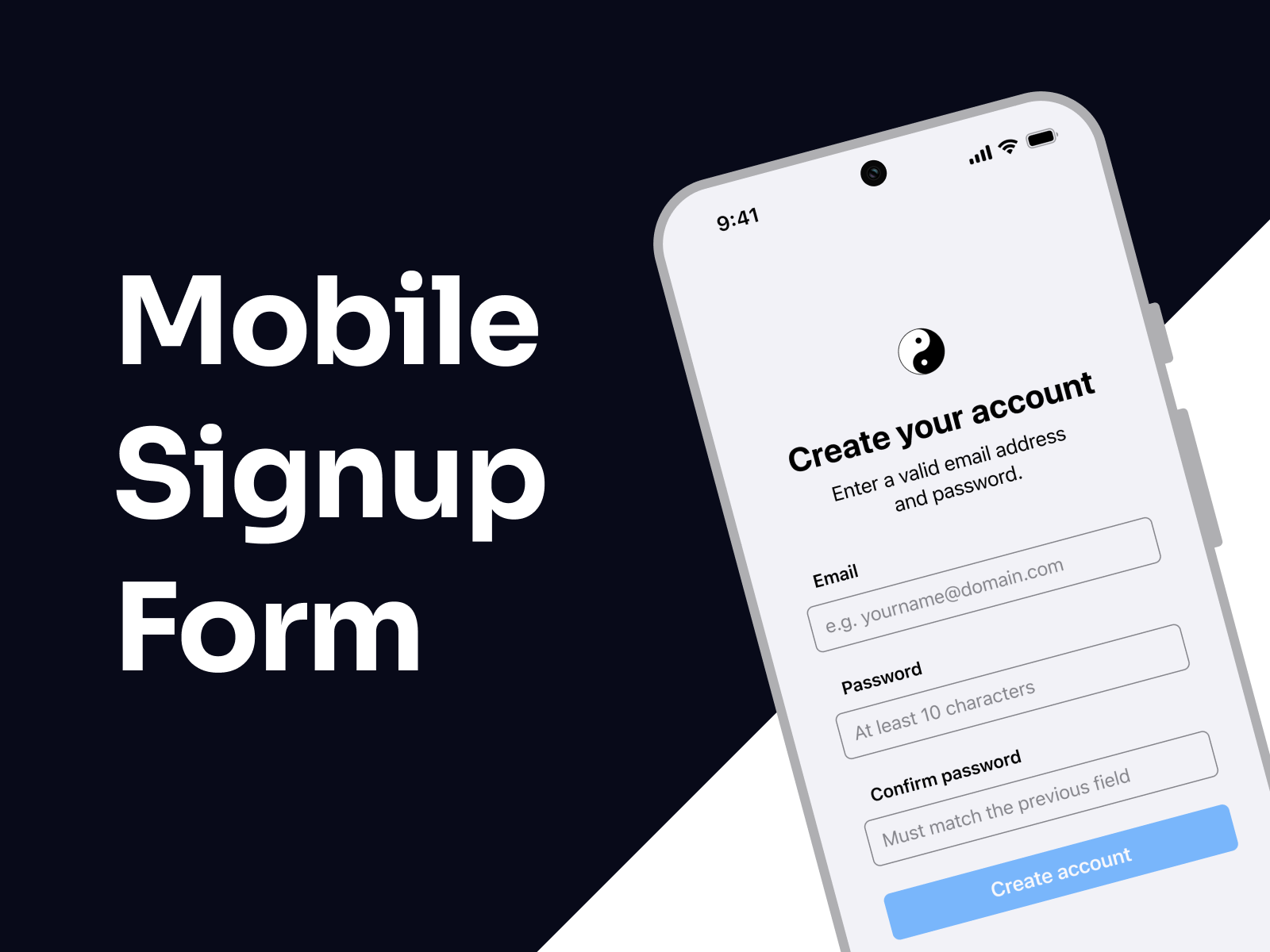
This prototype showcases an email-based signup flow designed for clarity, accessibility, and ease of use. Error messages are clearly highlighted to help users quickly fix any mistakes and move forward without frustration.
The goal is to make creating an account as easy and intuitive as possible.
I'd love for you to try it out — and if you have any feedback or ideas to make it even better, feel free to share!
Tools used
From brief

Topics
Share
Reviews
4 reviews

You're off to a great start with this flow — the overall presentation is clear, and the prototype is nicely put together. I especially want to highlight the animations — they add a layer of polish and enhance the experience without feeling overdone. Great job on that!
That said, here are a few actionable pointers to help refine your work even further:
On the first screen, I recommend increasing the height of the buttons to make them more accessible as tap targets. Since this interface will be used on mobile, it's important to follow the recommended minimum touch target size (usually around 44x44 pt according to Apple and Google guidelines). Right now, the buttons seem a bit small, which could lead to accidental taps — a frustrating experience for users.
On the second screen, you might want to remove the "confirm password" field. While this step is commonly included, research shows that on mobile devices it often causes more friction than value. Users frequently mistype in both fields and assume they match. A more user-friendly and mobile-optimized alternative is to allow password visibility toggling using an eye icon, combined with real-time validation and feedback. This approach reduces friction and improves the overall user experience while still ensuring password accuracy.
Regarding the error screen, it would be best to display error messages only below the relevant input fields instead of repeating them at the top or in a general message. Placing messages directly under the problematic fields provides context without overwhelming the user or forcing them to scan the screen multiple times. Keeping the messaging focused and inline reduces cognitive load and helps users fix errors faster.
Overall, you're doing a great job, and your effort really shows in the prototype. These small adjustments will make a big difference in terms of usability and polish. Keep pushing forward — you're definitely on the right track!

👏 Great work, Marco!
Your mobile signup flow feels clean, interactive, and thoughtfully animated — the motion adds polish without distracting from the core task ✨
✅ Loved your focus on clarity and error feedback, which keeps the experience frustration-free.
💡 A few refinements could elevate it further:
– Increase button height for better mobile accessibility (minimum 44 pt).
– Replace confirm password with a visibility toggle + inline validation to reduce friction.
– Show inline error messages right under inputs to keep context clear and user-friendly.
Overall, this is a smooth, well-executed signup flow that balances simplicity, accessibility, and style 👌

Hi Marco! Great start on the project — I really liked your prototype, it felt very interactive!
- For better usability and accessibility, consider using inline validation. This means showing an error message as soon as the user leaves an input field with incorrect or missing information.
- The input field component could be improved to make labels and placeholders easier to scan. If the current layout follows a zigzag pattern, it may reduce readability — you might want to research best practices for form design to ensure clarity.
Keep up with good work!
Yuliia

This could totally go live!
You might also like

Entrant - Analytical Dashboard


Transit Cairo — Digital Mobility Redefined


Entrant Accessible Signup and Login Forms

CJM x Mindspace case study - Ester Cinelli


LUMÉRA - Checkout Flow

A/B Testing for Bumble's Onboarding Process

Visual Design Courses

UX Design Foundations


Introduction to Figma

Design Terminology
