Checkout Page for E-Commerce Platform

Usability
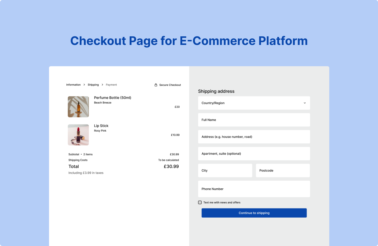
Microcopy: When users make a mistake or enter an incorrect format, clear error messages appear below the input field, directing users to use the provided correct format.
Accessibility: According to Baymard Institute studies, 9% of users abandon a website due to the lack of convenient payment methods. Giving users options, e.g. Different payment methods give the user variety and more choice in how to pay.
Scannability
Progress Trackers: By adding a menu breadcrumb at the top left, user can keep track of which step they are at. Giving them the reassurance and transparency of which steps are left to fill out.
Security Reinforcement: The secure checkout symbol reassures users, fostering trust in the process and helping to reduce checkout abandonment.
Visual design
Call -To-Action Buttons: The buttons are a dark blue that contrast well with the neutral white background, allowing users able to spot the action buttons easily.
Consistency: The workflow maintains a consistent visual hierarchy, enabling users to anticipate the next steps and the format in which they will be presented.
Tools used
From brief

Topics
Share
Reviews
1 review

You've done an excellent job creating a seamless user experience. The interface is clear and intuitive. The microcopy guides users smoothly. Providing examples in the form fields is a nice touch. This extra guidance reduces the chances of user error, enhancing the overall experience.
I also appreciate how you've allowed users the flexibility to change their mind at any stage of the process. Furthermore, the rationale you’ve provided for your design decisions, supported by relevant studies, really strengthens the overall presentation of your work.
Still, I have some suggestions:
- First screen title currently reads "Shipping address," but it also collects other details like the buyer's name and phone number. Maybe a title like "Shipping Information" might better reflect the content.
- The error message "Enter a First name" appears inappropriately near the "Address" field.
- Consider turning the "City" field into a dropdown menu, which could reduce user errors by limiting input options to valid cities.
- There is some inconsistency between sentence case and title case across the design. Maintaining a consistent format will help maintain a polished look and feel.
- It might feel more intuitive to place the "Billing address" setting on the same screen as the shipping address, as they are closely related and often filled out together.
- The payment process feels slightly friction-heavy. I guess one confirmation would be enough; what's more, it could improve conversion rates.
Overall, this is a well-thought-out design, and with these small tweaks, it could become even more user-friendly!
You might also like

QuickScan Onboarding

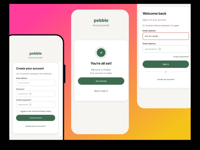
Pebble Accessible SAAS Signup Flow

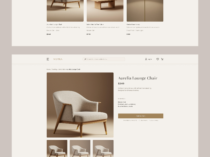
Nestra from homepage to checkout process


Islamic E-Learning Platfrom Dashboard


Pulse — Music Streaming App with Accessible Light & Dark Mode


Mobile Button System

Interaction Design Courses

UX Design Foundations


Introduction to Figma

Design Terminology
