Checkout Design for E-Commerce platform
Tools used
From brief
Topics
Share
Reviews
3 reviews
Hey Dumitru, awesome work on this checkout flow! You can really tell you dug into the research—things like the SSL badges, clear payment steps, and that always-visible order summary make the whole process feel super trustworthy and easy to follow. The drop in abandonment and boost in conversions is seriously impressive, and I love that you even thought about accessibility for payment fields.
If I had to nitpick, some of the confirmation screens feel a bit packed—maybe a little more breathing room would help. I’d also be curious to see how you’d handle edge cases like expired cards, and a quick mention of how this adapts for mobile would be cool. Still, this is a great example of turning real user pain points into a smooth, results-driven design. Nice job!
Dumitru, your checkout design feels really smooth and trustworthy 👏 — giving the confirmation screens a bit more breathing room could make it even clearer, but overall you’ve built a solid, user-friendly flow that shows real thought for the user experience.
Overall good e-commerce checkout design, very intuitive and a typical mental model a user would encounter when going through e-commerce platform checkouts.
However, on some aspects of the design might not need to be included or need to be divided further. For exmaple, in the "Check Your Cart" pagr there seems to be a summary link to the book. Features like this mos likely will not align with what the user's goals in this step of the user flow and there's no need to add extra feaures if they take up space.
Secondly, I would reccommend chunking information in the order confirmation screen and giving shipping address, payment method, and estimated delivery time their own sections below. This will especially be less confusing for users who are not as tech-savvy.
You might also like
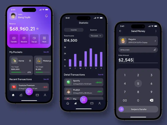
eWallet App Development Project
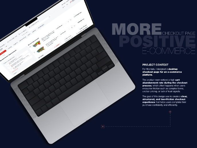
🖥 Desktop Checkout Flow Design
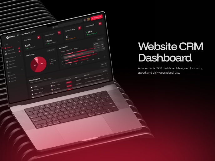
Website CRM Dashboard
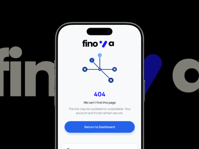
Helpful 404 Error Page for a Fintech Mobile App
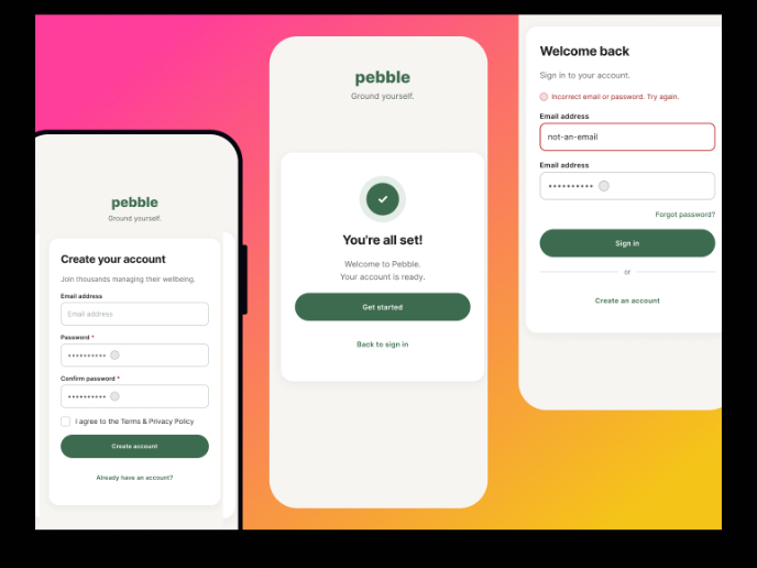
Pebble Accessible SAAS Signup Flow
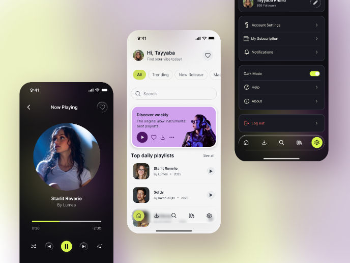
Music Player UI - Light & Dark Mode
Interaction Design Courses

UX Design Foundations

Introduction to Figma


