Basecamp Colour System Refresh
Design Brief:
Refresh the brand image of project management tool Basecamp, creating a distinctive and contemporary aesthetic that differentiates from competitors.
Concept:
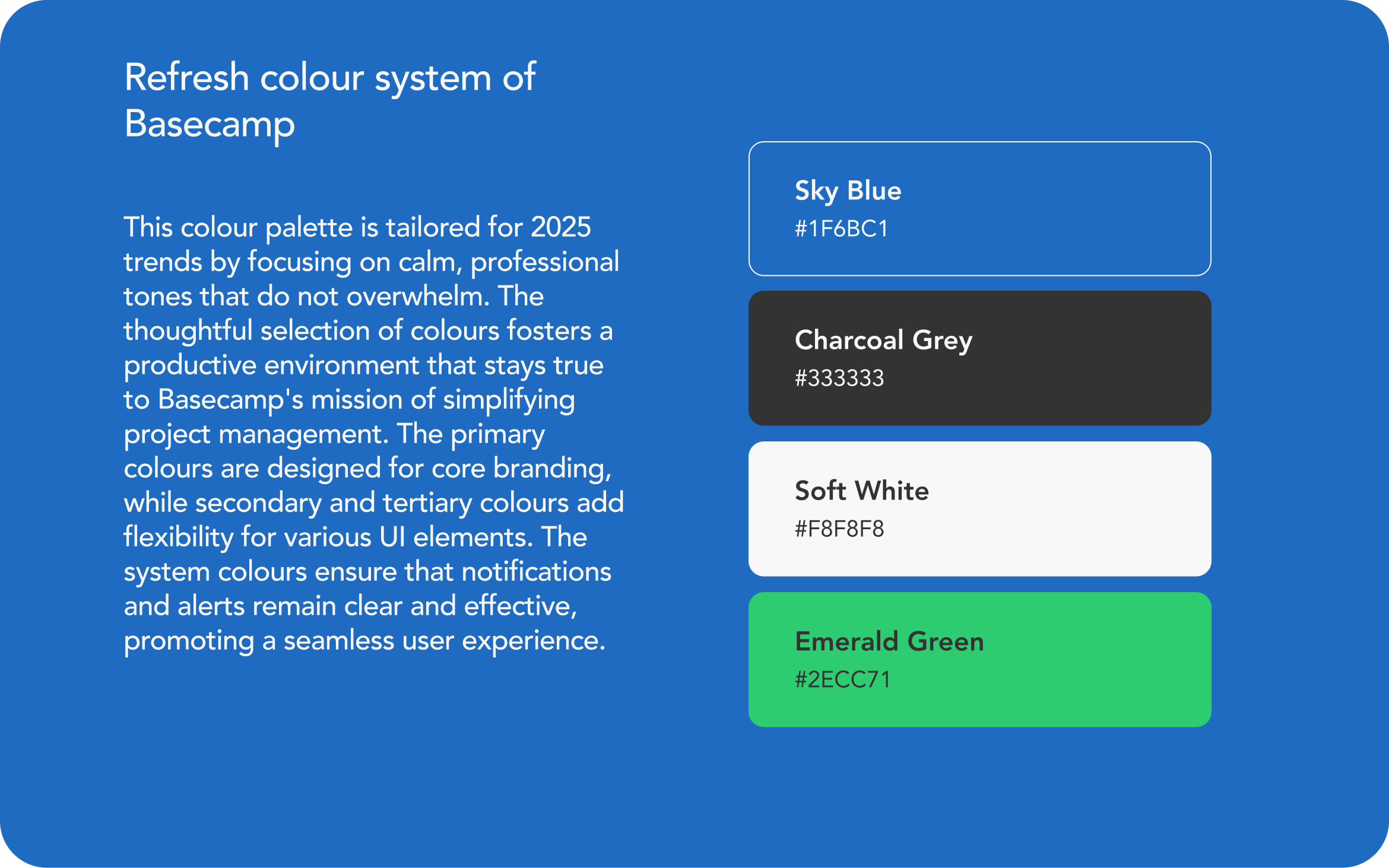
The refreshed colour palette for Basecamp is tailored for 2025 trends by focusing on calm, professional tones that do not overwhelm. The thoughtful selection of colours fosters a productive environment that stays true to Basecamp's mission of simplifying project management. The primary colours are designed for core branding, while secondary and tertiary colours add flexibility for various UI elements. The system colours ensure that notifications and alerts remain clear and effective, promoting a seamless user experience.
Tools used
From brief

Topics
Share
Reviews
1 review

Great foundation the flow is clean and the decisions feel intentional, setting up the UI phase nicely.
You might also like

Pulse — Music Streaming App with Accessible Light & Dark Mode


Islamic E-Learning Platfrom Dashboard

SiteScope - Progress Tracking App


Mobile Button System


FlexPay


CJM for Co-Working Space - WeWork

Visual Design Courses

UX Design Foundations


Introduction to Figma

Design Terminology
