B2B KYC solution
About
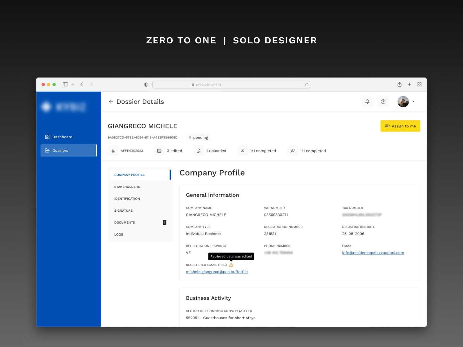
Before entering a commercial relationship, businesses tend to perform various checks on prospective clients. This platform facilitates such activity by integrating and streamlining the variety of steps a legal entity must go through to be eligible for a B2B contract. Through highly customizable workflows, a business can determine such steps, their order, and the depth of checks taking place on each.
Responsibilities
- Led the market research
- Defined the information architecture with the software lead
- Identified the main journeys and core behaviors that take place
- Determined the theming properties with the dev team
- Iterated the possible experience through clickable prototypes
- Built the Product Roadmap to streamline and prioritize development
- Wrote the user stories following the BDD approach
- Designed the UI components and the interface
Reviews
2 reviews
This design is solid. It’s clean, structured, and does exactly what it needs to do without unnecessary clutter. The way everything is laid out makes it easy to navigate, and the information is presented in a way that feels intuitive. A lot of thought went into making the user experience smooth.
But even great designs can be pushed further. A few small tweaks could make this even better.
"The company name could stand out more."
- Right now, "GIANGRECO MICHELE" blends in with the other text. Since verifying businesses is the core of this platform, the company name should be the most noticeable thing. A slight size or weight increase would make it pop.
"The sidebar’s active tab could be clearer."
- The sidebar is well-structured, but the selected tab doesn’t stand out enough. A more distinct highlight (like a filled background) would make navigation easier.
"Status indicators rely too much on text."
- The progress indicators (pending, edited, completed) are useful, but they require users to read them instead of recognizing them instantly. Adding icons or subtle background colors would make it faster to scan.
"Company Profile details look too uniform."
- Everything in this section has the same visual weight, making it harder to quickly find key details like the VAT number or registration date. Some subtle spacing adjustments or dividers would help.
"The Assign to me button is clear, but other CTAs could use the same treatment."
- The yellow button is great—it’s obvious and encourages action. But other interactive elements (like section tabs) don’t stand out as much. Making all CTAs more visually consistent would improve usability.
"Some elements could use a little more spacing."
- Currently, text like email addresses and registration details feel a bit packed. A little more spacing would make them easier to scan.
"How does this scale on smaller screens?"
- The desktop version looks great, but how does it adapt? Does the sidebar collapse properly? Do long company names or status indicators wrap neatly? Making sure it works across different screen sizes would make it even stronger.
This design is already in a great place. The structure is solid, and the way information is presented makes sense. With a few refinements, it could go from great to flawless. Keep pushing—it’s already a job well done.
Great job!
However, you might want to consider enhancing the color scheme, adding a slightly larger font size to improve readability, and adjust the spacing between elements a bit. It's a bit too "cluttered".
Other than that, nice project!
You might also like
Events Managment App
Customer Journey Map — Offsite Co-Working Experience
Mobile Onboarding: Casa di Pasta
Accessible Signup & Login Experience — Brainex
Accessible Signup Form
Accessible Signup Form
Popular Courses

UX Design Foundations

Design Terminology


