Artevo - empty state

📌 Project Overview
For this project, I designed empty state pages for Artevo, a fictional educational platform focused on art history. The goal was to create a seamless and engaging user experience, ensuring that even empty states feel useful, inviting, and aligned with the platform's identity.
📱 Device Type: Responsive design for both desktop and mobile
🎯 Objective: Transform traditionally "empty" moments into opportunities for engagement, guiding users towards their next action
🖌️ Designed Empty State Pages
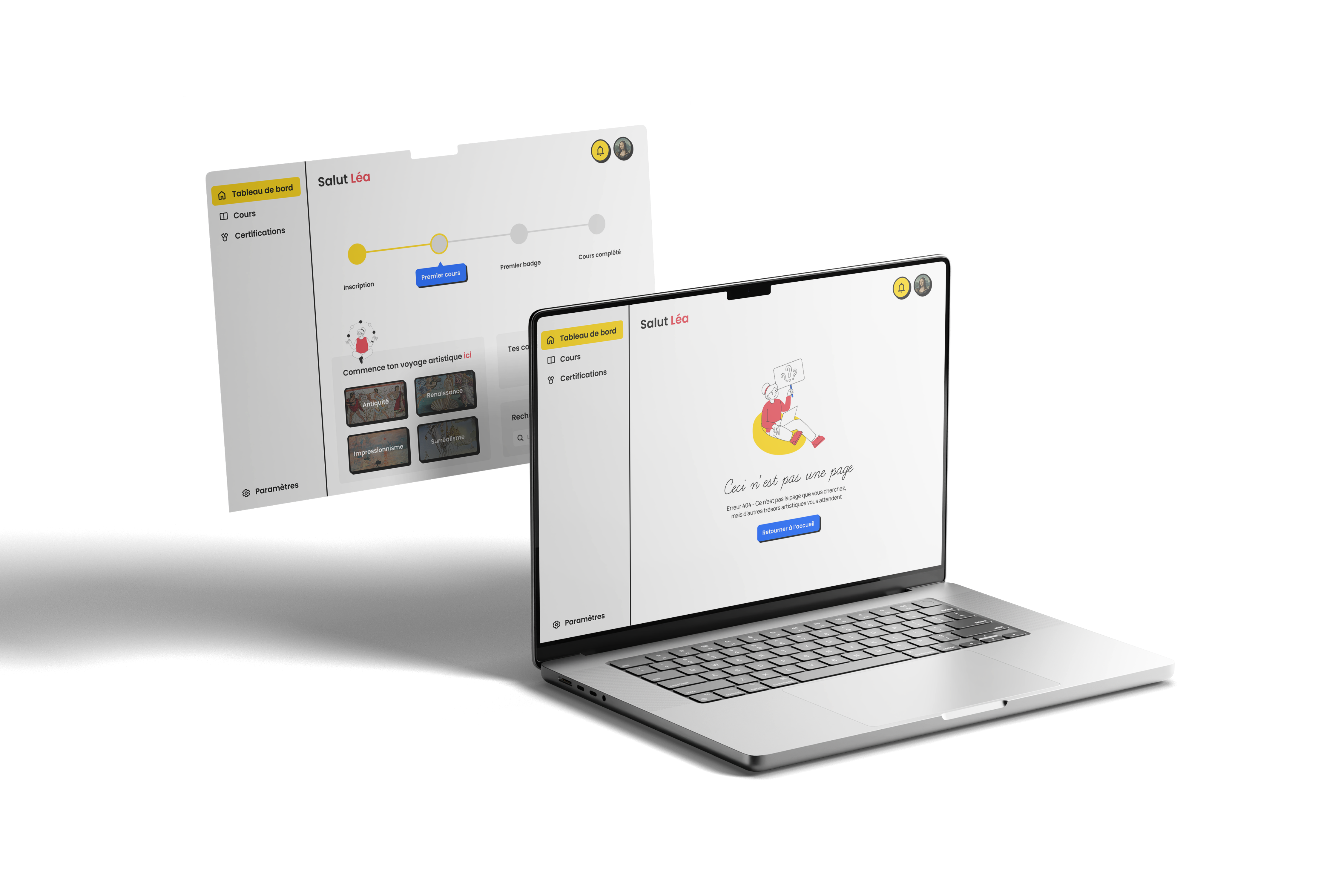
1️⃣ Error 404 – Lost, but not really!
Why? Users may land on a broken link or a missing page. Instead of a dull “Page Not Found” message, I added a playful illustration and a reassuring message (and an art reference):
- The friendly tone reduces frustration.
- The call-to-action (CTA) ("Return to Home") helps users navigate easily.
2️⃣ Dashboard – Your Learning Journey Starts Here!
Why? A user who logs in for the first time should feel excited, not lost.
- A progress tracker encourages them to take their first step.
- A highlighted CTA directs them to their first course.
3️⃣ Course Page – No Courses Yet? No Problem!
Why? An empty course page shouldn’t feel like a dead-end.
- A visual prompt reassures users they’re in the right place.
- A suggested course helps them take action right away.
🎨 Design Rationale
🔹 Brand Consistency – The UI maintains a clean, minimal aesthetic with a mix of bold typography, a warm color palette (yellow, red, black), and custom illustrations to reinforce Artevo’s artistic identity inspired by Bauhaus aesthetics.
🔹 Clarity & Guidance – Every empty state includes a clear message and actionable steps to keep users engaged.
🔹 Emotional Connection – Instead of generic placeholders, I used friendly microcopy to make users feel welcomed and motivated.
👀 Explore the Designs
You can check out the full project on Figma 👉 Artevo on Figma
Would love to hear your feedback! 🚀
Tools used
From brief

Topics
Share
Reviews
2 reviews

Hi Léa! Great job making Artevo’s empty states feel welcoming and on-brand 🎨 The playful tone and Bauhaus-inspired visuals really stand out. One thought: on the course page, there’s quite a lot happening at once — simplifying the layout or structuring it with filters/search could help users focus and act faster. Overall, strong work turning empty moments into engaging experiences! 🚀

Hi Léa! I like that you're designing with users in mind and helping them navigate the platform.
I wish the Courses page were easier to understand, as there’s a lot happening at once, making it harder for users to decide where to focus.
What if the page were more structured, displaying course options along with filtering, sorting, and search functionalities instead of an empty state? This way, the experience would feel more seamless and engaging for users.
Keep up with a great work,
Yuliia
You might also like

Islamic E-Learning Platfrom Dashboard


Pulse — Music Streaming App with Accessible Light & Dark Mode

SiteScope - Progress Tracking App


Mobile Button System


FlexPay


May.Da.Ma Candles & more

Content Strategy Courses

UX Writing


Common UX/UI Design Patterns & Flows


Building Content Design Systems
