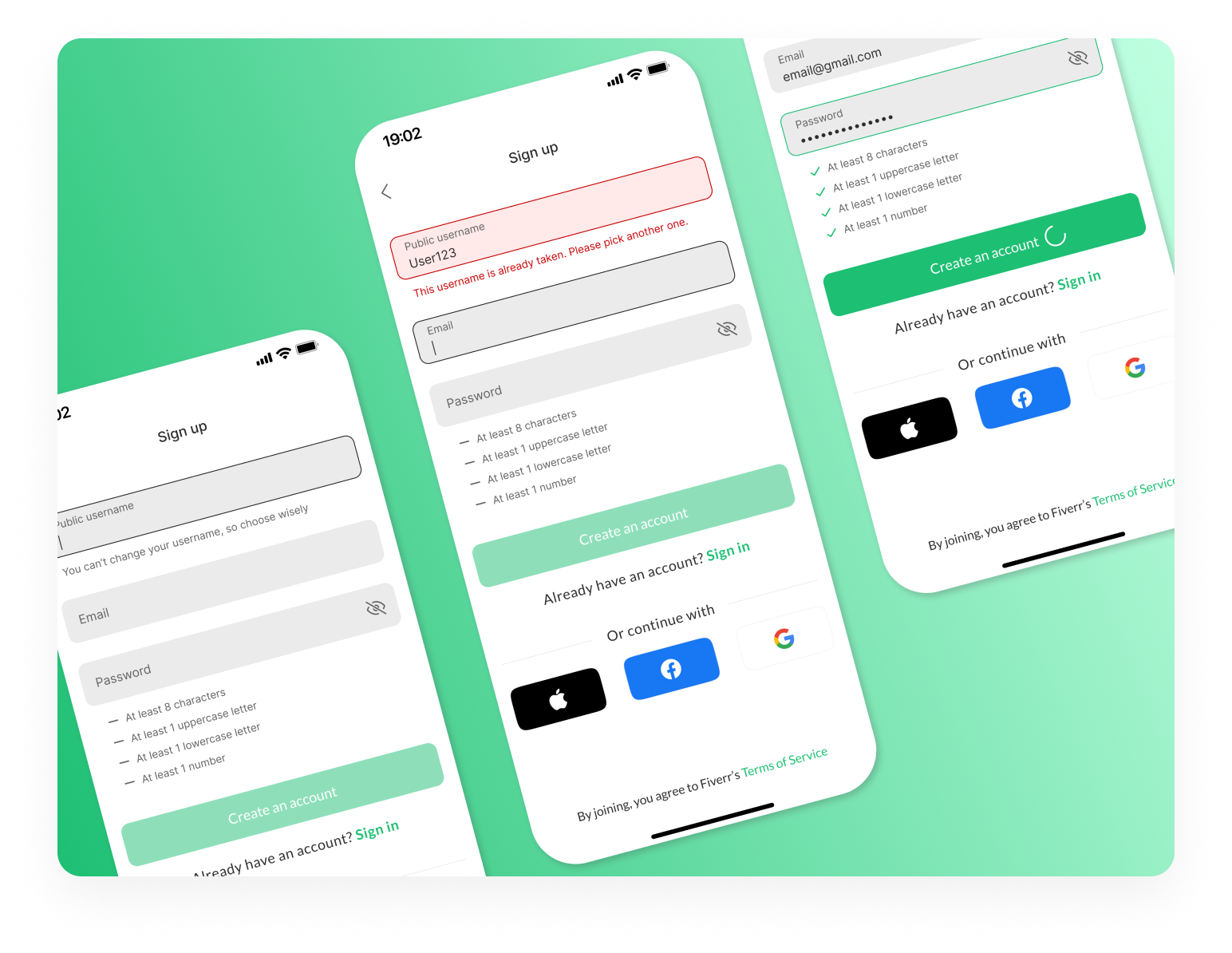
Accessible Sign-up Form for Mobile App


For this project, I focused on redesigning the sign-up page for the Fiverr mobile app, aiming to improve its accessibility, usability, and visual design. My goal was to create a seamless, intuitive experience for mobile users while ensuring compliance with WCAG accessibility standards for forms.
Key Optimizations:
1. Clear Focus State - A significant improvement in the redesign was enhancing the focus state of form elements. This change makes it easier for users to identify the active input field, ensuring a more intuitive experience, particularly for users navigating the form with a keyboard or screen reader.
2. Quick Login Using Social Accounts - The social login options were added directly to the main sign-up flow, eliminating extra steps and making the registration process faster and more convenient for users.
3. WCAG Contrast Optimization - The design was optimized to meet WCAG contrast guidelines to ensure text and interactive elements are legible for users with visual impairments. This adjustment makes the form easier to read in different lighting conditions and provides a more inclusive experience for all users.
4. Always Visible Labels - To enhance accessibility and usability, I made the labels for each form field always visible. This ensures users understand the purpose of each field without needing to rely on placeholder text, improving the experience for those with cognitive disabilities or anyone who may need additional guidance while filling out the form.
5. One-Click Sign-in/Sign-up Switch - A one-click toggle feature was added to allow users to easily switch between the sign-in and sign-up forms. This minimizes confusion for users who might accidentally land on the wrong page and ensures a smoother, more flexible process.
6. Instant Validation/Feedback - Real-time validation and feedback were integrated into the design, ensuring users are notified immediately if they enter invalid information. This instant response helps guide users through the process, prevents frustration, and encourages a smoother, error-free experience.
Design Rationale - The primary goal of this redesign was to create an easy-to-use, accessible, and user-friendly sign-up process for Fiverr’s mobile app. By addressing key accessibility challenges and optimizing the mobile experience, the design ensures inclusivity and enhances usability for a broad range of users. Features like social login, visible labels, and real-time feedback contribute to a more efficient and enjoyable sign-up process.
Tools used
From brief

Topics
Share
Reviews
1 review

Your submission is brilliant! You didn’t just redesign a sign-up form—you made it smarter, more inclusive, and actually enjoyable to use.
Accessibility That Actually Works
The "clear focus state" makes navigation effortless, especially for screen reader users and keyboard navigation. The "WCAG contrast optimization" makes sure everything is readable, and the "always visible labels" mean users never have to guess what they’re filling in. That’s how you design for real people.
"Instant validation" is another huge win. Instead of frustrating users with errors at the end, they get feedback immediately. This alone makes the form feel 10x smoother.
One thing you could add? "ARIA attributes" for error messages. That way, screen readers can announce them right away.
Usability That Just Feels Right
The "one-click sign-in/up switch" is exactly what every platform needs—no more backtracking or confusion. "Social login" is a smart addition too, cutting down sign-up time. The way you’ve set up "real-time validation" makes sure users never get stuck.
If you want to take this even further, a "password strength meter" would help users create secure passwords without guesswork. And maybe a "multi-factor authentication (MFA) prompt" for security without adding friction.
Clean, Focused, and Effortless Design
Everything is well-spaced, clear, and easy to scan. The "color contrast is solid," the "typography is clean," and the form feels light, not cluttered. "Social login icons" fit in naturally and guide users intuitively.
A minor tweak? Check the contrast on the "Sign In" text link. If it’s too subtle, some users might miss it. Also, a "subtle transition" when switching between sign-in and sign-up could make things even smoother.
Presentation That Stands Out
Your before-and-after breakdown is on point. You don’t just say the old form had problems—you show exactly how you fixed them. The "contrast test results" add credibility, and your explanations are clear, concise, and convincing.
Want to go the extra mile? A "prototype link or interactive demo" would let reviewers experience the improvements firsthand. And a quick mention of how "screen readers interact" with the form could further highlight your attention to accessibility.
This isn’t just a strong case study—it’s a reference for accessible form design. You’ve nailed "usability, accessibility, and visual clarity" while keeping everything practical and easy to implement.
With just a few refinements—like ARIA support, a password strength meter, and a small transition effect—this could be one of the best examples of accessible sign-up forms out there
You might also like

Entrant Accessible Signup and Login Forms

A/B Testing for Bumble's Onboarding Process

Dark mode Main page

CJM x Mindspace case study - Ester Cinelli

LUMÉRA - Checkout Flow


Tripit's Login and Sign Up Flow

Visual Design Courses

UX Design Foundations


Introduction to Figma

Design Terminology
