Tripit's Login and Sign Up Flow


Tripit is a travel planning and itinerary management app that I personally love using. For the most part Tripit's login and sign up flow are simple in nature but there are some usability and accessibility issues that could improve the overall experience.
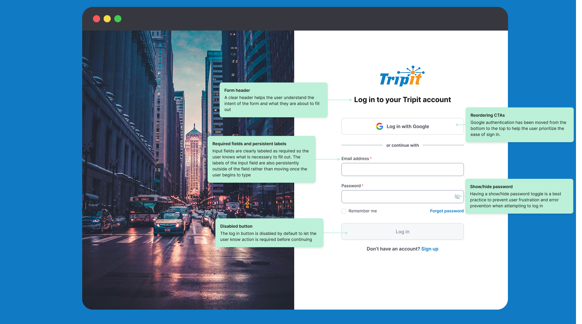
Let's break down the highlighted changes focused on simplicity and the reduction of cognitive load to help the user move through each flow:
Necessary Changes
- Addition of clear error states and error messages that correspond to relevant input field
- Persistent labels rather than floating labels to replace placeholder text while a user is typing
- Labeling required fields
- Addition of the show/hide password toggle
- Ensuring text meets WCAG AA contrast ratio
- Including form headers for login and sign up
Bonus Features
- Reordering and styling CTAs to prioritize ease of login/sign up
- Simpler, user friendly messaging
- Primary button color changes to differentiate between links and for better accessibility
Tools used
From brief

Topics
Share
Reviews
4 reviews

Hi Kristen!
From a product perspective, this feels calm and purposeful. Login and sign-up screens are rarely exciting, but they are foundational. What I appreciate here is the clarity the structure seems straightforward, reducing cognitive friction at a moment where users just want quick access.
There’s also a sense of alignment with the travel context. Authentication in a travel app should feel reliable and trustworthy, not overly experimental. The restraint in layout suggests you understand that trust and usability matter more than visual flourish in this space.
If I were to push this further, I’d explore how you could reinforce value during sign-up perhaps reminding users what they gain immediately after creating an account. Small strategic cues can turn a functional flow into a more compelling entry point. Overall, this feels grounded and well-considered.

Great job Kristen! The analysis of TripIt's current state is accurate and well-documented. All accessibility and usability issues have been properly identified. I particularly like that you pointed out the floating labels and their confusing similarity to links.
The proposed solutions are solid and address every point mentioned in the brief. Adding show/hide password, persistent labels, disabled button state, and better error placement. All of this raises the UX quality.
I have one note: on the "Thanks for signing up" screen in the current version, you have "Verify by signing in at gmail.com" as the main CTA, which is indeed confusing. Your solution with a single clear "Sign into gmail" is better, but I'd consider simplifying the copy even more "Check your email" could be more universal (not everyone uses Gmail).
Visually, adding the city photo on the left is a nice touch that warms up the interface and connects to the travel theme.
Overall, this is very competent work that demonstrates understanding of both WCAG standards and practical UX aspects. Perfect portfolio material! ❤️💪

Hey Kristen,
I truly enjoyed going through your project and appreciate the attention to detail and clear explanation you've put in. Great effort overall, keep up the fantastic work and I’m excited to see what you create next. Best of luck! 😊

Clear hierarchy, well-labeled fields, and thoughtful touches like the Google sign-in placement and password toggle make this easy to use.
You could slightly soften the background image or emphasize the primary CTA more to keep focus on the form. Overall, a solid and accessible design.
You might also like

Bridge: UI/UX Rebrand of a Blockchain SCM Product


Pulse Music App - Light/Dark Mode


Monetization Strategy


Designing A Better Co-Working Experience Through CJM


Design a Settings Page for Mobile


Zoom Sign in Screen

Visual Design Courses

UX Design Foundations


Introduction to Figma

Design Terminology
