Dark mode Main page
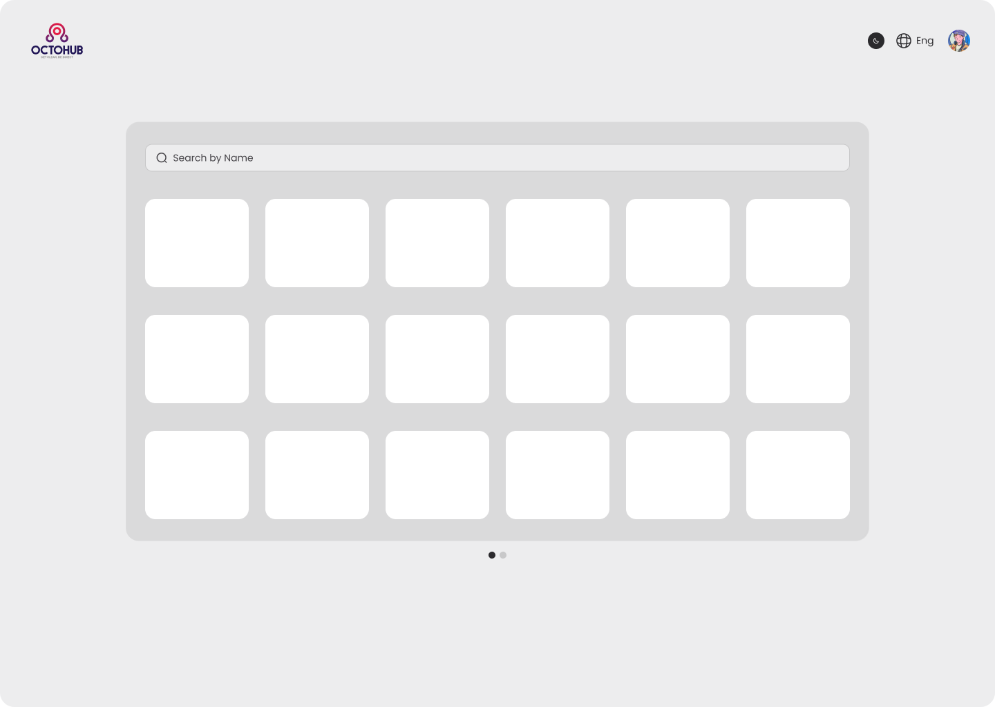
light mode

Reviews
3 reviews

Hi Amr, congratulations on the project!
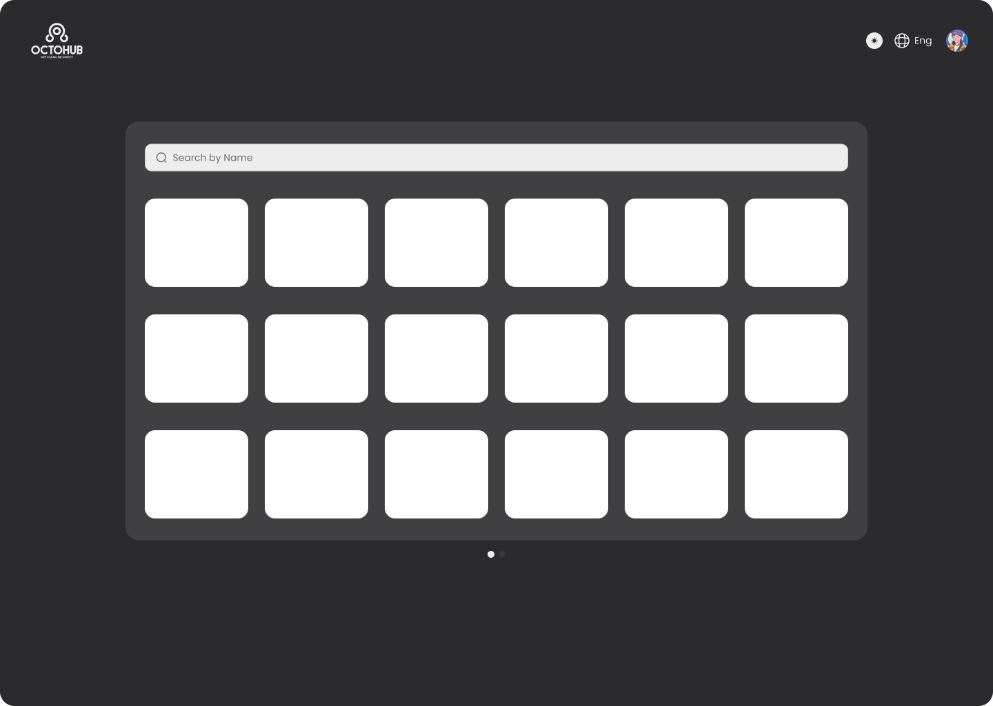
I’d like to highlight an important point related to the use of dark mode, as it directly impacts usability, visual consistency, and interface hierarchy.
In your current layout, dark mode is applied mainly to the overall background, while key components such as cards, inputs, and secondary surfaces remain white. This creates a visual system inconsistency, making the interface feel more like an inverted light mode rather than a properly structured dark theme.
From a UI perspective, a well-executed dark mode is not just about switching the background to black. It requires working with a hierarchy of dark surfaces, where each interface layer — background, cards, inputs, modals, etc. — uses controlled variations of dark tones to maintain hierarchy, readability, and focus.
To address this, I recommend creating a small style guide that includes:
- A color palette for Light Mode
- An equivalent palette for Dark Mode
- A grayscale scale (e.g., background, surface, elevated surface, borders)
In this context:
- Cards should not be white, but rather a dark gray slightly lighter than the background, creating a sense of elevation.
- Inputs and form fields should also use dark surfaces, with well-defined borders, focus states, and placeholders to ensure contrast and accessibility.
This approach significantly improves:
- Visual hierarchy
- Information readability
- Focus on interactive elements
- Overall design system consistency
If you need anything, feel free to reach out — I’m happy to help!

Hi Amr!
First reaction this dark mode feels intentional, not just flipped colors. The contrast looks controlled and easy on the eyes, which is a big win for usability.
I like how the hierarchy still feels clear even in darker tones. Nothing looks muddy or lost, and the accents seem to pop just enough without being aggressive 👌✨ That balance is harder than it looks.
If I’d refine it further, maybe stress-test it with dense content or edge states like alerts and long-form text 🚀 But overall, clean, polished, and thoughtfully executed dark UI. Nice work.

Hey Amr.
Besides the background and cards, it would be interesting to see how the interface behaves with more content and information. That would help better understand the hierarchy and how the design scales in more realistic scenarios.
That said, this is a solid starting point. At this stage, you could also highlight your color palette for both light and dark modes, including contrast values and the reasoning behind your choices.
You might also like

Smartwatch Design for Messenger App


Bridge: UI/UX Rebrand of a Blockchain SCM Product


Pulse Music App - Light/Dark Mode


Monetization Strategy


Designing A Better Co-Working Experience Through CJM


Design a Settings Page for Mobile
Visual Design Courses

UX Design Foundations


Introduction to Figma

Design Terminology
