Accessible Sign-up and Login Page for Relume

Overview:
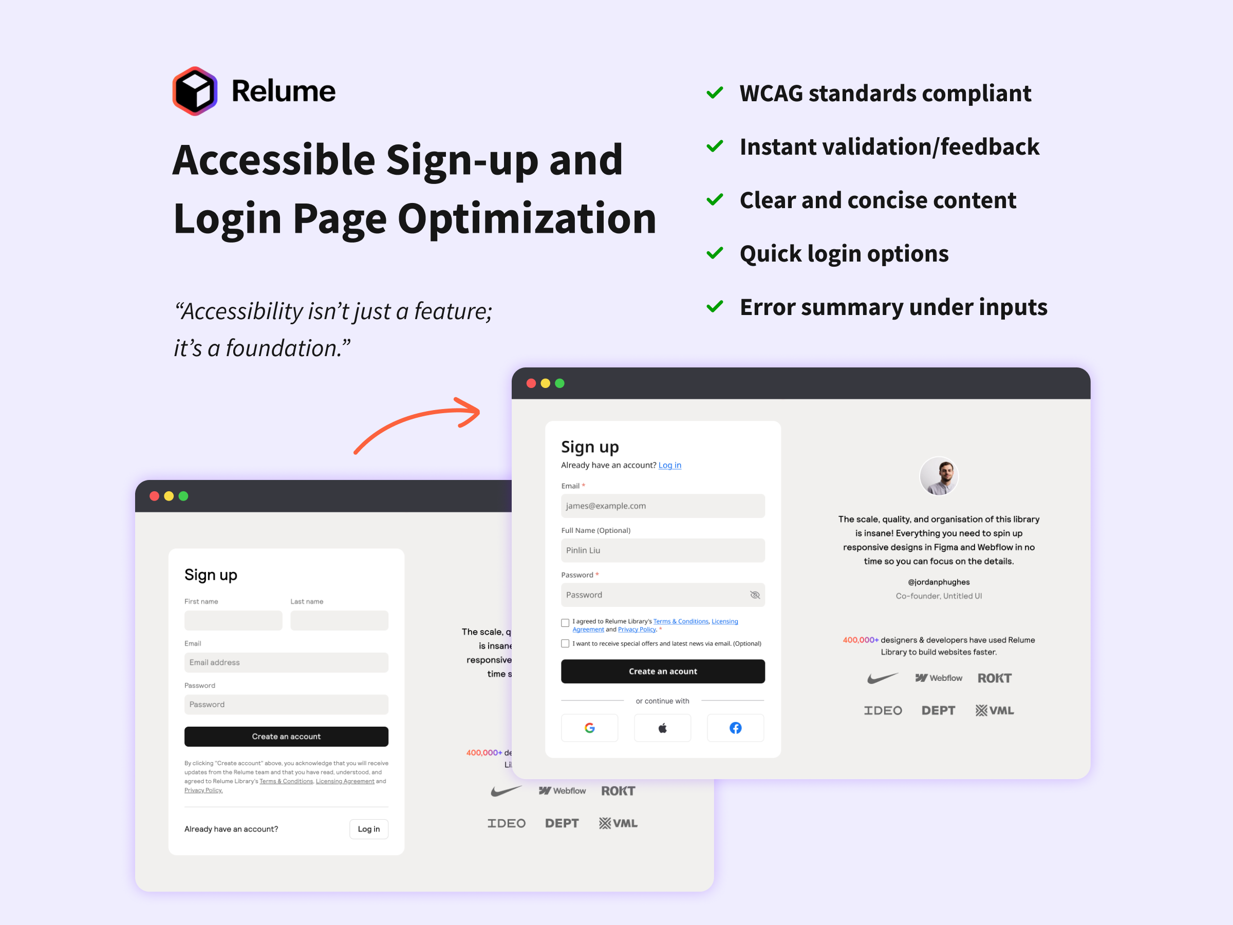
This project aimed to enhance the accessibility and usability of the Relume sign-up page. The original design had several accessibility gaps, including poor focus states, forced newsletter subscriptions, and limited login options, making it less inclusive for users with disabilities.
Key Issues:
- Strict name requirements – Users were required to enter both first and last names, which could discourage quick exploration of the app.
- Accessibility errors: The page did not fully meet WCAG standards, with problems like poor focus indicators .
- Forced newsletter subscription: Users were automatically subscribed without an option to opt out.
- Limited login options – There was no way to sign up or log in using third-party accounts like Google or Facebook.
- Delayed error messages – Users only saw password validation errors after submitting the form, leading to frustration.
- Lack of password visibility toggle – Users couldn’t see their password while typing, increasing the chance of errors.
The redesign has :
- Added third-party login buttons for a faster and more flexible sign-in process.
- Increased contrast on input fields to meet WCAG AA standards.
- Merged “First Name” and “Last Name” fields into a single “Full Name” field.
- Improved focus indicators and error messages by increasing contrast, adding warning icons, and refining borders.
- Added a password visibility toggle to reduce input errors.
- Made the newsletter subscription optional with a checkbox.
- Introduced real-time password validation to provide instant feedback.
Conclusion:
This project demonstrates how small yet impactful design improvements can enhance accessibility and usability. By resolving accessibility issues, improving form interactions, and giving users more control, the sign-up process became more intuitive and inclusive. These changes ensured a smoother and more user-friendly experience.
Tools used
From brief

Topics
Share
Reviews
3 reviews

Great job improving accessibility!
The added third-party login, better contrast, and real-time validation make the sign-up process much smoother.
Making the newsletter optional is a smart move.
Maybe consider adding tooltips for extra guidance.
Keep it up!

Hey Pinlin,
I’ve had the opportunity to review your submission and I’d like to share some feedback:
What You Did Well:
- Placing the Login option at the top is a smart choice, ensuring users can easily find it without scrolling to the bottom.
- Including checkboxes for Terms & Conditions and Newsletter subscriptions is a great usability practice, providing users with clear choices.
- Merging the First and Last Name fields into a single input is a good approach for simplicity. However, for marketing purposes, separate fields may sometimes be preferable—it depends on the context and data needs.
Areas for Improvement:
- Adding placeholder text for the Full Name input field would enhance consistency across all input fields.
- Aligning the Login process with the Signup flow (rather than displaying it as a centered pop-up) would create a more consistent and predictable user experience.
Final Thoughts:
I really enjoyed reviewing your project and appreciate the attention to detail in your design. These small refinements can further enhance usability and consistency. Keep up the great work, and I look forward to seeing more of your designs in the future. Best of luck! 😊

👏 Great work, Pinlin!
Your redesign for Relume’s signup & login flow clearly shows strong UX thinking and accessibility awareness 💡
✅ Love how you tackled real-world pain points — merging name fields, improving focus contrast, adding real-time validation, and giving users control over subscriptions are all spot-on decisions.
💬 The optional newsletter and third-party login add real inclusivity and flexibility.
You might also like

Smartwatch Design for Messenger App


Bridge: UI/UX Rebrand of a Blockchain SCM Product


Pulse Music App - Light/Dark Mode


Monetization Strategy


Designing A Better Co-Working Experience Through CJM


Design a Settings Page for Mobile
Visual Design Courses

UX Design Foundations


Introduction to Figma

Design Terminology
