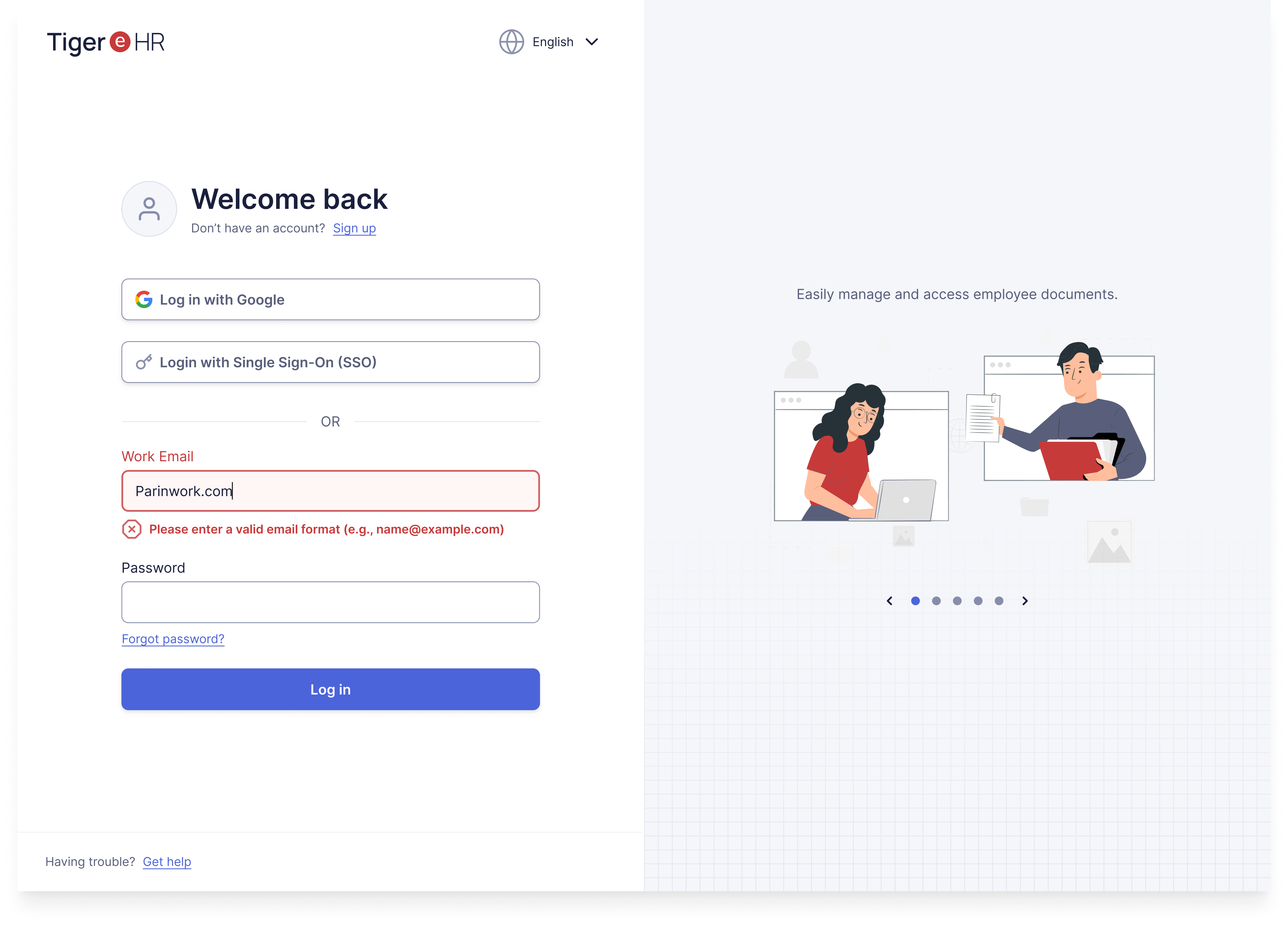
Accessible Login Form

Background
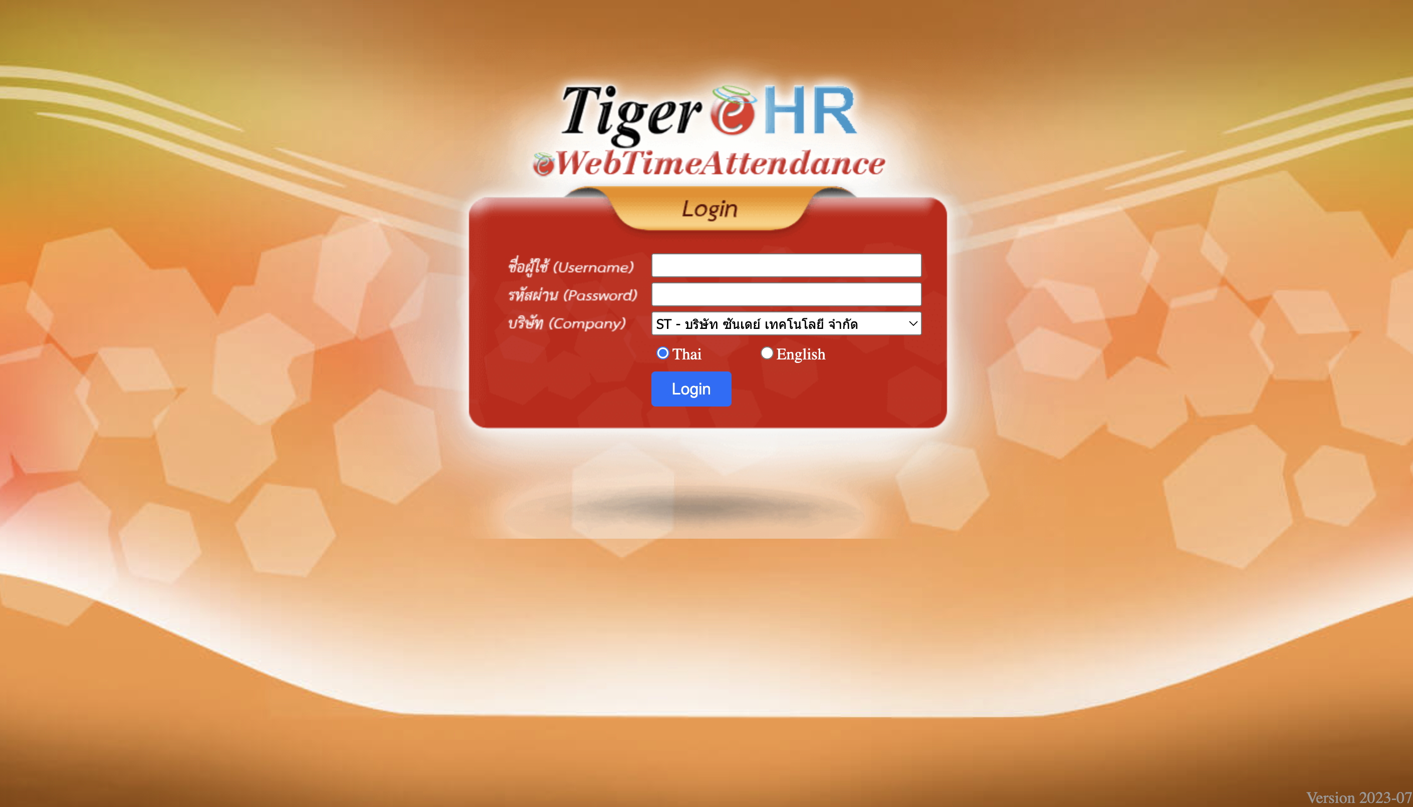
For this project, I based my design work on an existing HR platform called Tiger-e-HR, a platform used within my company for employee management tasks (e.g. Document management, leave requests, viewing payslips, etc.)
Problem
One of the primary issues with Tiger-e-HR login page is frequent user frustration with remembering their Username and Password.
- In this system, usernames are generated by the company and consist of an employee ID number, which employees don’t typically memorize. Passwords are also preset, not self-chosen, making them hard to recall.
- Even the Company dropdown menu on the login screen is frustrating. Every login session requires users to manually select their company from a dropdown list. (My organization has multiple subsidiary companies.)
- Currently, my personal solution is to check my onboarding email every time I need to log in, as it contains my assigned username and password. 😅

Redesign Solution | “Making login more accessible”
In my redesign, I focused on addressing these specific usability issues by introducing alternative login methods to streamline and simplify the login process.
- Additional Login Options:
- I incorporated options to log in via Google or Single Sign-On (SSO).
- This would not only reduce the need for username and password recall but would also require a change in the signup flow, allowing employees to create their own login credentials (or use work email). With this, they’d be more likely to remember their own login details.
- Automatic Company Recognition
- Instead of requiring users to manually select their company each time, the system could auto-detect the user’s organization based on their email domain during login (especially when using SSO or Google login.)
- Other Improvements in Accessibility & Usability
- Accessibility
- Added inline validation for real-time feedback when users input data, with clear indicators and guidance on errors.
- Updated font and color choices to meet AAA compliance standards, ensuring readability and clarity.
- Replaced the original decorative background, which previously served no functional purpose and added visual noise. The new background is more visually comfortable and purpose-driven.
- Usability
- Moved the language selection to the top header to help users focus on the main login task.
- Added options for users to reset their password and get support if they encounter login issues.
____________________
🙌 Feel free to share any feedback! 🙏
Tools used
From brief

Topics
Share
Reviews
1 review

The new UI is an improvement over the original. The decision to use SSO and switch to work email as the primary login method are both good moves.
I'm curious about the rationale behind placing the SSO option above the traditional login fields. Most users are accustomed to seeing SSO options below the standard login fields.
To make better use of the spaces, I suggest utilising the side space for tips or quick reminders. Instead of a carousel, which users might miss due to the brief interaction, consider displaying a single, randomly selected tip each time the user logs in.
You might also like

SONZ - Entertainment platform


Camp & Travel Explorer - App Design


Solar system Dashboard Utility

Uxcel Halloween Icon Pack


Signup page for a SaaS website


Color System

Visual Design Courses

UX Design Foundations


Introduction to Figma

Design Terminology
